My first project here at 37signals was to evolve our email marketing and triggered messaging design. I want to share some thoughts about my first Getting Real experience and the design decisions we made to highlight “free Campfire accounts” for Basecamp Max plan customers.
I get it now!
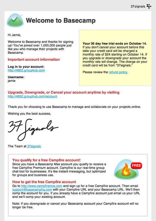
Jason asked me to design our Welcome to Basecamp sign-up emails. The emails were being sent out as plain text only. Important messages like the “free Campfire account offer” were difficult to highlight in plain text. Max plan customers were confused as to how to get their free Campfire account. I started designing and producing the email last week while Jason was at the Web 2.0 Expo.
We use Campfire here at 37signals nonstop to communicate with each other. I knew Jason was out, but he checks the Campfire transcripts regularly to keep updated with the day-to-day. I made sure to upload the design showing the “free Campfire” conditional block so that he could give me some feedback.

Sam started integrating the HTML template while I was waiting for feedback from Jason. After all, what would he have a problem with? It was looking great and we were hoping to deploy it before the week was over. Sam was nearly finished with integration when I finally received feedback from Jason: We should break out that free Campfire message into a separate email.
Fuck really? OK I agree. But really? I mean I was hoping to get this out soon. Like today! I checked with Sam.
“I have to rework that email.”
Sam says, “That’s OK. I’ll deploy this. Just get me the free Campfire email next week.”
“Deploy it? Wait but Jason wants that message broken out into a separate email.”
“Sure, but this is better than what we have now.”
So he deployed it. This is when I realized how trained I was in the processes at my former workplaces. This email would have been delayed until it was perfect at Crate and Barrel, and I had trouble releasing the design when there was a way to further improve it. After fixing this there would be another thing and then another thing. A 2-day project would drag on for a week of redesign, approval, and development. Instead we deployed what we had because it is better than what we have now. Done. I finally got Real. It’s one thing to read Getting Real and say, “Yes! I agree with that!” It’s another thing to actually practice the principles of Getting Real. That part is trickier than you think.
That stand-alone free Campfire accounts email
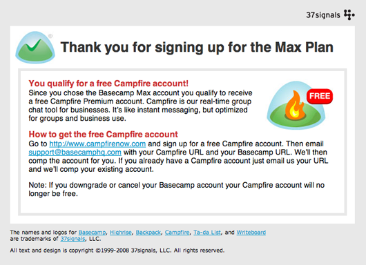
This morning I got a chance to hammer out that Campfire email. I started out by adapting what I had done with the part in the Basecamp Welcome email.

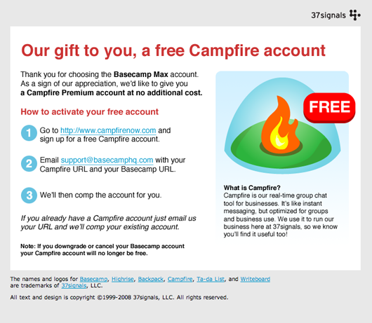
The problem was it looked like a big blob of text that no one would read. Why am I getting this Campfire account? What exactly are the steps to activate it? I made some adjustments.

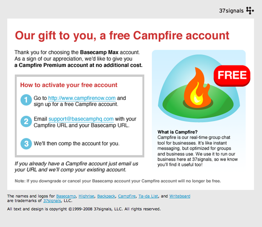
The steps to activate the account still needed some visual weight. Let’s separate them a bit from the rest of the copy.

Yes, that’s much better. Now I’ll be working with Sam to get this deployed. After that we’ll see how it does and keep on improving it!

John Kranz
on 22 Sep 08Jamie, great example and thanks for sharing with us the enhancements you made to that email. Looks good!
Matt Gorecki
on 22 Sep 08Thanks for sharing this. I like the screen shots of the iteration process. I thought the first image looked pretty good, but the third image is a massive improvement.
Alejandro Moreno
on 22 Sep 08Thanks, Jamie. It’s very interesting to see your growing pains :D
(Although I’m sure “pains” is not the right word for it!)
James Farrer
on 22 Sep 08I loaded this from Google Reader into my browser to view the comments… at the top of this post was a Job Board ad…
“Crate and Barrel is looking for a new Senior Internet Art Director”
:)
Evgeny
on 22 Sep 08But what does “camp your account” means? What’s “camp” anyway?
Does it mean there will be a Campfire tab in Backpack? Really?
- or -
Will the users still need to use two different services, Backpack and Campfire …
And if so, then WHY? When one company (37s) makes multiple products that work with each other in some way … wouldn’t it be logical that they be somehow integrated? Especially if you get one by buying the other.
This is really weird, especially for news users, I for example “did not get it” yesterday when I purchased a Basecamp account that had “free campfire”. Does it not mean that campfire will be a +feature of basecamp? Really disappointing that it’s not.
Dylan
on 22 Sep 08Thanks for sharing. Easily one of the best posts this month.
Joran
on 22 Sep 08Great post, Jamie. And great layouts and colors and design. I like. But I got the latest newsletter in this new template and I’m not enjoying it anymore as much as the plain text.
Reading email is like drinking coffee. And everyone takes their coffee differently. I use Mail and have my font and size set just how I like it. And I use this interface to read all my emails. And most of them are plain text and they fit in.
Then all of a sudden, wham boom and there’s an HTML email in the inbox? Bright shining colours, headlights glaring, and me I’m like spilling my coffee all over the show and gasping for air and my newspaper is getting soggy.
It’s like turning the page of your old weekend times and then there’s a big fifties jazz band jamming “It’s Not Unusual” and a cardboard cutout Elvis comes in from the side on an old Hollywood dolly with his right hand in the air shouting “Viva Las Vegas”.
I guess I’m just getting old.
JD
on 22 Sep 08Evgeny, “comp this account” means we’ll give you a complimentary (free) Campfire account.
JF
on 22 Sep 08Evgeny, Basecamp and Campfire work together. You can also use a single sign-on across Basecamp, Backpack, and Highrise using the 37signals Open Bar. We have more integration plans down the road. Integration is a tricky thing and it takes time to get it right.
GeeIWonder
on 22 Sep 08You know what would be great? Do it without images. Maybe even just copy.
If I an email like that got through my system, I’d adjust my filters.
Looking at the thing again though, the whole thing is pretty spammy—with the free and sign-up and similar stuff. I’m not sure I’d even want the plaintext one coming through.
lolwat
on 22 Sep 08GeelWonder, a free Campfire account email is spam?
GeeIWonder
on 22 Sep 08That’s not what I said, or at least not what I meant. The copy is the kind of thing that I would hope would set off bells, in my filter at least.
It’s a common problem for these types of emails.
ep
on 22 Sep 08I must admit that I’m not a fan of the new email designs. The proportions, type, line-spacing, white space and overall design choices give me an uncomfortable feeling that I didn’t experience with the sleek “Coudal-style” you used before. I don’t see an improvement, sorry.
Braxo
on 22 Sep 08@ GeelWonder
I make a lot of these types of emails too when people sign up for various programs at our retail stores. Even with the ‘suspect’ copy in the emails, we don’t receive a lot of calls or emails from people who had the email dumped to their bulk folder.
It is really tough though to write a good subject and copy when we legitimately send out emails who have opted into our lists in person. What would you suggest we do in emails that offer free products or services? Right now our only solution is to tell our customers to check their bulk folder if they don’t receive the email when they get home.
GeeIWonder
on 22 Sep 08If you figure that one out in any kind of bulletproof way, I’d like to know too. Some ideas? Sure:
Sign-up for your—> Get your
Free—> On the house
Less links.
Less ‘accounts’.
Or, if you’re using images anyways, put all the bad stuff on the image.
Paul Smith
on 22 Sep 08I actually prefer the second to last email better. The final one you chose doesn’t flow as well. The box just ends up being distracting, and doesn’t really improve anything, at least to my eyes. What do you all think?
ROI
on 22 Sep 08I for one am a fan of the new email designs. Nice and compact, above the fold.
Elizabeth Saloka
on 22 Sep 08Beautiful. I see a marked improvement in each email. I find the box directive, not distracting.
One suggestion on the final email, though: Instead of links within the text, I’d make the calls to action gigantic buttons that say “Sign up” and “Email us.” Or, at the least, I’d simplify the links to “sign up” and “email us” and not include the URLs.
Des
on 22 Sep 08Great work Jamie, and bonus points for making an interesting blog post out of it :)
JF
on 22 Sep 08One suggestion on the final email, though: Instead of links within the text, I’d make the calls to action gigantic buttons that say “Sign up” and “Email us.” Or, at the least, I’d simplify the links to “sign up” and “email us” and not include the URLs.
We want to keep the essentials as links in case someone doesn’t load images. Gmail doesn’t load images in HTML emails by default, for example.
Anson
on 22 Sep 08I just want to comment on the elephant in the room: Having to separately sign-up for campfire and then email your support team seems like a messy, inefficient process. It’s like a mail-in rebate kind of deal. Hassle city.
Spend some time making a coupon-system (so you’re just emailing a code) or create a special one-off link that handles all that mess for me and results in a free campfire account.
JF
on 22 Sep 08Anson, we could do that. We agree that would be better. But we’re focused on other things right now that benefit more people than just Basecamp Max account owners. We have limited resources and have to spend them wisely.
Rich
on 22 Sep 08What do you design these emails in? That is, what tool are you using to do the HTML?
Nick Hammond
on 23 Sep 08looks great, post more examples like this!
Steven W
on 23 Sep 08Guys:
Do you send out these emails through your own system via Basecamp or do you use a third-party system like mail chimp?
Thanks,
JF
on 23 Sep 08Steven: We send product-triggered emails (welcome emails, new account emails, etc) through our own system, but we send product newsletters through Campaign Monitor.
MT Heart
on 23 Sep 08“We’ll then comp the account for you”
This sounds very awkward and breaks the flow because I have to stop and re-read it. Why not just say what it means?
==> “We’ll then activate your free Campfire account”
JD
on 23 Sep 08Rich, I have been using Coda by Panic to do these emails. I’ve only started using it recently, but so far I like it!
Zach
on 23 Sep 08Comp sounds like interna lingo to me to. Yeah, I figured out what it meant fast, but not as fast as I could have.
JF
on 23 Sep 08I agree we can do better than “comp” and we will.
GeeIWonder
on 23 Sep 08Thanks for sharing your work/process though. Definitely got ye olde wheeles spinning…
Neij
on 23 Sep 08Whether you like images-based HTML email or not, I think 37signals and Jamie should be congratulated on breaking the normal corporate mould by sharing the process with us! I assume these e-mails are sent out irrespective of the location of the customer. Certainly from a UK point of view e-mails like this can come across as over-commercialised and “pushy”, and arguably the redesigned version looks more like that than the original… but if Microsoft doesn’t have the resources (or can’t be bothered) to localise properly for the UK market, then I suppose we can hardly expect 37signals to do so!
One thing that jars severely, though, is the use of the word “comp” – as Evgeny, MT Heart and Zach point out above, it sounds weird, almost like internal 37signals-speak. (For non-native speakers of English it’s also easy to confuse it with the “camp” of “Campfire” and spend minutes trying to work out possible meanings!)
Great post – please give us more like this on the internal design iterations at 37signals!
sheppy
on 23 Sep 08I love seeing other people’s design process as they refine something, keep up these design posts!
J Lane
on 23 Sep 08That’s awesome. I think if you could sum up Getting Real in a single sentence, that would be a contender.
Evgeny
on 23 Sep 08@JF yes Basecamp and Campfire might work together, but not Backpack. Even though there is an option to get a “comp” Campfire when signing up for Backpack premium/pro/whatever…
StartBreakingFree.com
on 23 Sep 08The design looks amazing.
Just a quick comment though, I thought your 2nd to last one looked better than the final version. Maybe the visual weight isn’t necessary.
Kevin Milden
on 23 Sep 08The signature of the company was a really nice touch. Very original and personal. Great work.
MattH
on 23 Sep 08I agree with StartBreakingFree, visual weight not needed.
Jordan Dobson
on 24 Sep 08Very well done. I think it looks great. And it’s very easy to follow.
I think a more subtle cue could be used for the numbered list. Perhaps a dim background instead or slightly indent the text?
It’s somewhat “belt suspenders” now.
The use of red for visual cues is pretty smart though.
Fred K
on 24 Sep 08I think the last iteration is the best of them, but that doesn’t mean it can’t be improved on. Scale down the FREE image for one thing, somewhere around in between the original size and the size of the latest version (but keep the margins to maintain visibility—the main problem with the original image was text crowding if you ask me…), add a minute negative letter-spacing to the top headline (it looks a bit weird in the screengrab to be honest) and a little more margin below the highlighted box. But the ‘visual weight’ is a big help I think.
That said, following the process is really interesting. Thanks for sharing!
Régis
on 24 Sep 08Thanks a lot for this feedback, always very interesting to see how the company works.
Richard
on 24 Sep 08Why do the users have to email you? shouldnt you be able to automate this somehow?
Joel
on 24 Sep 08Great post. Another inspiring read, as usual.
Andrew Cornett
on 24 Sep 08I hope to see more design posts like these, this was almost too stimulating for one day. Really nice job, and thank you so much for sharing!
Troll (probably)
on 25 Sep 08After much consideration, writing and an awful lot of editing i’d simply like to say;
Get Real, its no big deal!
This discussion is closed.