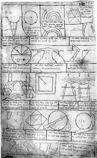
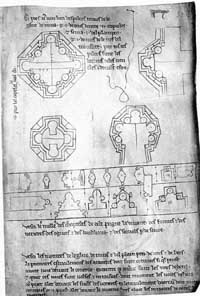
De Honnecourt’s architectural sketches
13th century French architect Villard de Honnecourt is known for his sketchbook of drawings and writings on architecture compiled while he travelled in search of work as a master mason. His sketchbook collection is viewable at The University of Newcastle’s site. Some examples:
Related: Sketchbook of Villard de Honnecourt [Grand Lodge of British Columbia and Yukon] and The Golden Ratio in graphic design [Bridgewater Review].
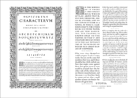
Renaissance typography
Web Design is 95% Typography offers the design shown below and says, “The argument that we do not have enough fonts at our disposition is as good as irrelevant: During the Italian renaissance the typographer had one font to work with, and yet this period produced some of the most beautiful typographical work.”
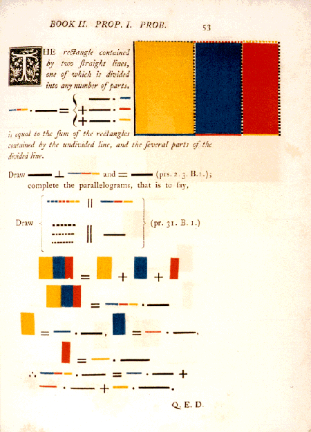
Minimalist Euclid
Oliver Byrne’s edition of Euclid: “An unusual and attractive edition of Euclid was published in 1847 in England, edited by an otherwise unknown mathematician named Oliver Byrne…What distinguishes Byrne’s edition is that he attempts to present Euclid’s proofs in terms of pictures, using as little text — and in particular as few labels — as possible.” Sample page below.


Tyson
on 30 Nov 06“During the Italian renaissance the typographer had one font to work with, and yet this period produced some of the most beautiful typographical work”
Agh! It’s typeface, not font. Helvetica is a typeface, Helvetica Italic 12pt is a font.
Hooray for irrational pet peeves!
John Arnor G. Lom
on 30 Nov 06Font derives from the good ol’ days of led (fount), and means (as you pointed out) to one set of characters in one size.
However, that definition has little use today, as people don’t use that same techniques anymore. So today, ‘font’ is used as a group name for a specific font-file on the harddrive. And those actually can contain even more than one typeface.
Italics being one of those. Italics actually have little to do with the ‘main’ typeface. Italics are quite simply another typeface, but often bearing certain resemblances (like the x-height) to the connected typeface, that they are grouped together.
The Garamond italics, for instance, were made hundreds of years after the death of Garamond himself. (So are many of the typefaces accredited to him, but that’s another story…)
But bottom line is that there’s still a lot of confusion around the correct typographic terms — and because of mistakes made in the earlly years of the DTP-revolution, we have lost a good word for a single size and weight of a certain typeface.
And soon we’ll have killed Helvetica.
andjules
on 30 Nov 06the Byrne illustration is given a whole page in Edward Tufte’s fantastic book, Envisioning Information. On the opposing page, Tufte cleans up and adds a little color to the classical (independent) Chinese proof of the same theorem, which is the best single illustration of why the hypotenuse is determined in terms of the squared factors of a & b. A google image search on “pythagorean proof” will reveal some other interesting uses of color in graphical proofs.
Luca Cremonini
on 30 Nov 06If you are looking for the best designers in history, you have to go back to Italian Renaissance. Especially consider the architects working in Florence.
Have you ever seen the front face of Santa Maria Novella by Leon Battista Alberti, in Florence? Wow, that’s design!
sham
on 30 Nov 06Sweet! I’ve been looking for those Euclid adaptations since I saw them in Tufte’s book. Since I’ve never gotten a chance to buy a copy for myself, seeing all those scans is the next best thing. Thanks again for the goodies.
Sam
on 01 Dec 06That Euclid was mesmorizing
Daniel
on 01 Dec 06Great post! We spent a year in Florence and are still inspired by the period’s design today.
But I do have to pick-a-nit. While I appreciate your desire to defend the use of the term “font” in your post, by most accounts, Tyson is right to correct you.
There are many opinions about the historical vs. contemporary use of the terms “typestyle,” “typeface,” and “font” but the general consensus in the design world is that the term “typeface” should be used to refer to the family design (Futura), while the term “font” refers to the variant design (Futura Extra Bold Condensed). And while it is true that the general public (and this includes most press men) use the term “font” and “typeface” to refer to the same digital file, it is important, and in fact quite helpful for designers to use exact terminology both in the process of development and in our final design process.
It is helpful because as design is so often a collaborative process, communication needs to be as clear as possible. There is much confusion around this simple concept, would it not be better if we held to a definition that served our profession, rather than just giving up (as in the death of Helvetica you cite, which was quite a nice link;-)
“According to Adobe’s type gloassary: “A font is one weight, width, and style of a typeface. Before scalable type, there was little distinction between the terms font, face, and family. Font and face still tend to be used interchangeably, although the term face is usually more correct.” “
More links supporting this view: http://www.will-harris.com/font_vs_typeface.html and http://designforum.aiga.org/content.cfm?ContentAlias=_getfullarticle&aid=291450
Thanks for indulging me. Great site!
This discussion is closed.