Today we announce a new way to share pages in Backpack. Now when you share a page you can decide who may edit the page and who may only view the page. This allows certain people to be responsible for editing pages and to allow others to read their pages without allowing the others to make changes. It’s a very useful feature, especially for larger teams.
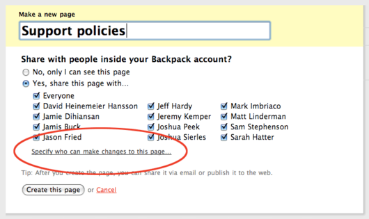
Here’s how read-only pages work. When you click “Make a new page” you’ll see a link below the people checkboxes that says “Specify who can make changes to this page.”
The checkboxes are replaced by a table when you click the “Specify…” link. The people on your account appear on the left-hand column with the familiar checkboxes to give them access to the page. Then to the right of each person you can set whether they can “change the page” or “only view the page.” Two links above those right-hand columns allow you to apply the same setting to all people at once. By default everyone can change the page.
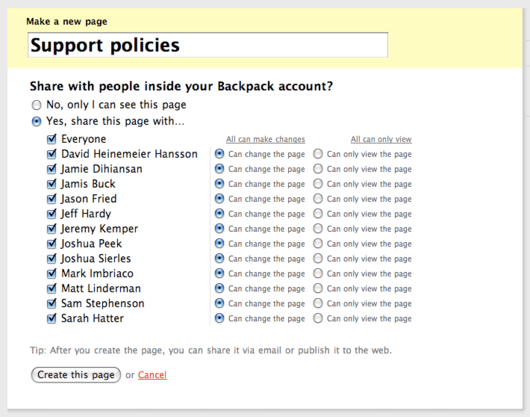
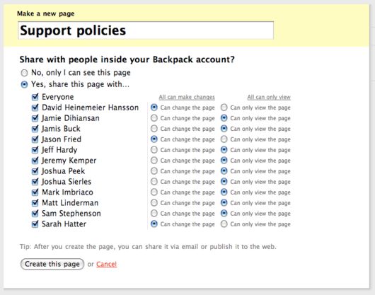
In this example we want to allow David, Jason and Sarah to change the page. Everyone else will have read-only access. The settings look like this:
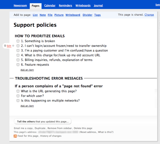
When David, Jason or Sarah open the page they will see the usual editing options. They can add information to the page, edit what’s there, and move things around like any other page. Here’s how the page looks to people who are allowed to make changes:
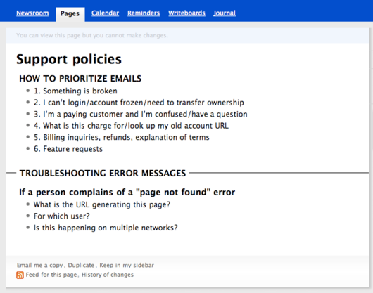
Everyone else on the account will see the read-only version of this page. There are no links on the top of the page to add content. Instead the header says “You can view this page but you cannot make changes.” There are no links to add content, no edit links, no delete links, and no drag handles to re-order page elements. Check boxes cannot be checked or unchecked. This is what people see when they are only allowed to view the page:
Read-only pages are a very useful addition to Backpack. We hope they inspire your team with new ways to share Backpack Pages.
“All Pages” is updated with page icons
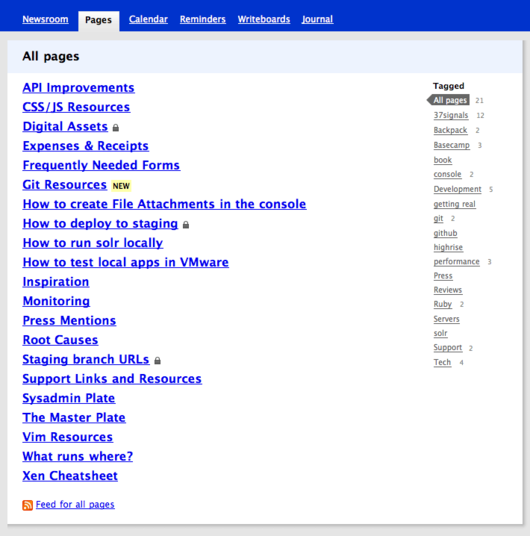
In addition to read-only Pages, today’s update includes a refreshed design for the “All Pages” screen. The old design was a plain list of links and often half of the screen was empty space:
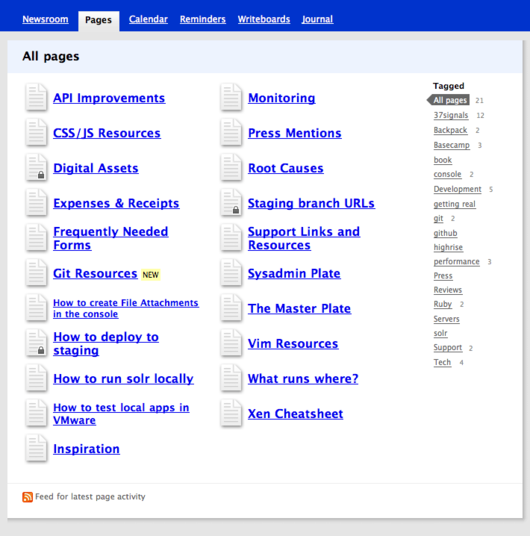
The new design uses two columns to better fill the page. New icons give the screen more style and interest:
Collapse and expand completed list items
We’ve also answered a frequent request regarding completed list items. People were frustrated by the way their lists got longer and longer as they completed more items. Eventually the page got too long, and the only option was to delete the completed items. This is a problem because many people prefer to keep their completed items for future reference or for reasons of accountability. Here’s an example of a long list of completed items:
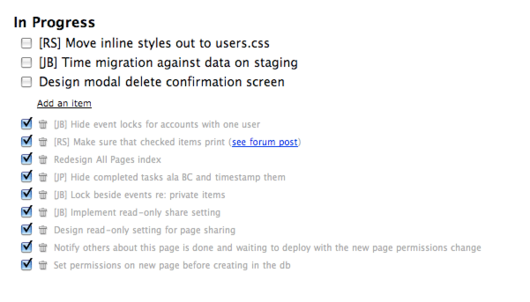
We’ve solved this problem by collapsing all but the last three completed items:
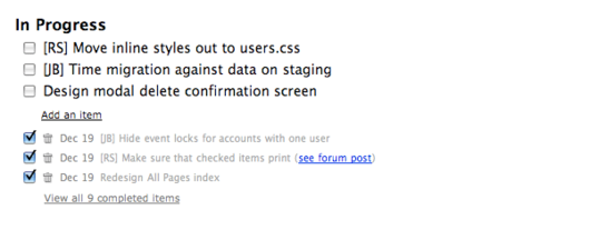
Click the link at the bottom of the list to reveal all the completed items:
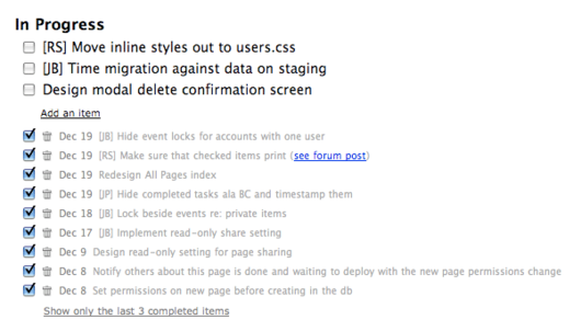
You might also notice we added dates to the beginning of each checked item. Those dates are very useful when your team collaborates on a list and you wish to keep track of when the different tasks were completed.
We hope you like the updates
We’re really happy with these updates to Backpack and we hope you find them useful. Thanks for your continued support!

Emil
on 20 Dec 08The collapsed To-Dos’s is really nice! I’m not sure about the page list though… it’s still a mess if you’re viewing a bunch of pages now you need to jump between two columns. How do you guys tag pages when working with BP as Intranet?
Noel Hurtley
on 20 Dec 08Nice upgrades. I love the collapsible lists!
Philip Arthur Moore
on 21 Dec 08You guys and gals consistently outdo yourselves. Thank you!
@Emil: Agreed. I wish there were a better way of viewing pages in the sidebar, both from a usability standpoint and a visual standpoint. I think a parent/child page setup would help out a ton.
Nik
on 21 Dec 08“The new design uses two columns to better fill the page. New icons give the screen more style and interest”
The page is just as long but now instead of a list to scroll through you have two. I’m confused by this change. Filling the space doesn’t seem to solve a real problem.
What about a way to filter pages instead? Or using the space to show a blurb of text from the actual page?
Marc
on 21 Dec 08I love to see little improvements like this, keeps the app feeling fresh.
@Nik you can filter via tags on the right.
deime
on 21 Dec 08The day I upgrade from a free account comes with a nice update, Great ! :D
J
on 21 Dec 08What about a way to filter pages instead? Or using the space to show a blurb of text from the actual page?
That’s what tags are for. You can tag pages in Backpack then click the tag on the All Pages page to only see pages that match that tag.
PS
on 22 Dec 08I like how pages on ‘All Pages’ are listed alphabetically in the first column and then the second, as opposed to flowing left to right.
One thing though – I wish I could bookmark an individual tag on that page but the link for each is ’#’ so it doesn’t work.
George
on 22 Dec 08I’m a little bit disappointed with the list changes. All the improvements you are making to Backpack are oriented around your small business users. That’s absolutely fine, because you probably get a lot more from them than you do from a Solo account holder like me, and because they are invisible to me.
But the list changes have added unnecessary cruft to my lists. It’s a minor thing, but since you pride yourselves on simplicity, I wanted to point out that I don’t think your solutions are particularly good ones this time.
Also please speed up the calendar. It has been very slow recently. Thanks.
Robert Hoekman, Jr.
on 22 Dec 08RE the sharing options page: why split it into two steps? Why not show the second screen by default and avoid the extra click?
Merengue
on 22 Dec 08When you share a page with someone, you are automatically giving this person permission to view the page as minimum, which makes the third column (who can only view the page) redundant. Therefore, this column should be removed. If you dont want someone to view the page, you just stop sharing the page with that person. The main task of the page is to give permission to change the page and this extra column just adds noise.
The link “specify who can make changes to this page” can make you think that people with whom you are sharing this page can only view it and you are going to allow to some of them to change the page, but they all have permissions to change it and to view it by default. If they only have permission to view it, then the link makes perfect sense, but that’s not the case. I think the link shoud read “Specify who can only view this page” because that is the change that we are making because Jason, David and Sarah ended up with the same permission they had originally(view and change), but Jamis, Jamie, Jeff, Joshua, etc. permissions changed to allow them now to only view the page and NOT to change it.
What permission does everyone have at the end?
JF
on 22 Dec 08RE the sharing options page: why split it into two steps? Why not show the second screen by default and avoid the extra click?
Because we don’t want to show three toggles for each person when someone creates a page. It’s intimidating and it looks like work.
Bill
on 23 Dec 08First, a big THANKS for the page sharing options. The one thing I’ve been really worried about was someone improperly changing or deleting an important page. This is great.
Second, what happens when I add a new user in a few months? Say I have a bunch of pages that are shared with everyone in my company, but are View-Only (or are like your example, with Viewers and Changers). Will the new user automatically get Change access on all these pages? Will I have to go back to each page and change the new user’s access to View?
Matt
on 23 Dec 08It’s nice to see such regular improvements to Backpack. Now that you use two columns in All Pages, it would be great to see the option of two columns in regular pages as well, particularly when displaying 2 lists. I can see how this might get confusing to users, but so many of us have bigger or even wide screen displays nowadays.
Also, while the All Pages icons are neat, how do they give a page more “style and interest?” As far as I can see, there’s only 2, regular and locked (private?). It would be much more interesting if there were at least a few different icons or colors.
M
Anonymous Coward
on 23 Dec 08@PS Bookmarks would be great and fit 37s approach to web dev, it doesn’t add any clutter and we organize ourself (...run fluid with the bookmarks bar for each tag… mmm)
Michael
on 23 Dec 08Thank you so much for the read-only permissions. Without them, we could not even consider Backpack.
This discussion is closed.