Animators deal with art, story, etc. so there is a lot of intuition and “feel” required. At the same time, effective design is key; Animations have to communicate concrete ideas and emotions. It’s an interesting intersection of intuition and reason. The drawing class notes (book form) of Walt Stanchfield, drawing instructor for Walt Disney Studios, provide a fascinating look at the process. Below are excerpts from Stanchfield’s handouts (all links go to PDFs, bold emphasis mine).
Simplicity for the sake of Clarity:
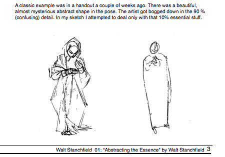
The artist, when he first gets an inspiration or tackles a pose in an action analysis class, sees the pose, is struck by its clarity, its expressiveness, then after working on it for a while that first impression is gone and with it goes any chance of capturing it on paper. That’s the reason. we should learn to get that first impression down right away – while it’s fresh, while it’s still in that first impression stage – before it starts to fade…
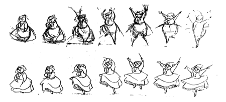
The reason I keep harping on ‘forget the detail’ for this particular type of study is, the detail doesn’t buy you anything at this stage of the drawing. Doodling with detail will cause you to lose that first impression…When I say locate and suggest, that is exactly what and all you need. What you are drawing is a pose not parts. The simplest kind of suggestion is the surest way to a good drawing. I have xeroxed a little series of drawings from “The Illusion of Life” to show how an extremely simple sketch can express so much and thereby be a perfect basis for the final drawings.
A sure way to keep from making static, lifeless drawings is to think of drawing “verbs” instead of “nouns”. Basically, a noun names a person place, or thing; a verb asserts, or expresses action, a state of being, or an occurrence. I speak often of shifting mental gears, and here is another place to do it. The tendency to copy what is before us without taking time (or effort) to ferret out what is happening action- wise, is almost overwhelming.
(A similar thought can be found at The life of products: “Products are not nouns but verbs. A product designed as a noun will sit passively in a home, an office, or pocket. It will likely have a focus on aesthetics, and a list of functions clearly bulleted in the manual…but that’s it. Products can be verbs instead, things which are happening, that we live alongside…a product designed with this in mind can look very different.”)
Getting At The Root Of The Problem:
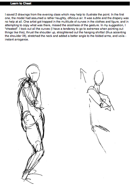
By cleverness and superficial arrangement of line and flurries of “action lines”, one can very often come up with a nice looking drawing. But to continually draw meaningful drawings that portray a desired effect (tell a story), you have to develop the roots of draftsmanship, that is, the principles of good drawing, fertilized and watered by a good feel for acting, story telling and some plain old fashioned insight. If you try to make a nice looking drawing without including all the above, you are batting against pretty high odds. In tennis we call it a low percentage shot. Any line or shape you put down on the paper should mean something to the pose. If it doesn’t the odds get higher. If it helps to reveal the pose or the gesture, good, that helps you to proceed because you have something down for all the rest of the lines and shapes to relate to. For surely, every line and shape you put down should relate to every other line and shape and to the over all gesture itself. Every line and every shape!


Ryan M
on 13 Dec 06Great instruction for all parts of life. I’d forgotten much of this since taking drawing in school. It’s easy to get bogged down in the technicality of creating. Good stuff.
John S. Rhodes
on 13 Dec 06Not 100% sure why, but this reminds me very much of Scott McCloud’s Understanding Comics:
http://www.scottmccloud.com/store/books/uc.html
...perhaps all line drawings make me think of comic books and graphic novels. Does that happen to other people too?
brad
on 13 Dec 06I’ve always had a hard time capturing the essense and leaving out unnecessary detail when I do drawings, but I had an art teacher once who gave me some great advice: “take off your glasses.” I’m extremely nearsighted, so taking off my glasses forces me to see only the essential elements and none of the details. This actually works well for web design as well, and I sometimes use it when working on sites. If you have perfect eyesight, you can train yourself to unfocus your eyes.
Rajiv Kaul
on 14 Dec 06For over 5 years in designing wrist watch dials for HongKong and Swiss market. I’ve found Swiss people appreciate design with minimalistic detail – just impressions of hr markers with different finishes on dial bases. Adding hints of different art periods in numerals and appliques on 12, 3, 6 and 9 and not to all. Keeping simple sticks on 12 and making totally different style date window. But on the other hand if we go to HongKong there they want almost every detail on the watch with mulitple finishes. Big numbers clearly saying 1 2 3 .. and 12.
Does detailing in objects and particularly depends on culture and people you are working in and working for?
Rajiv Kaul
on 14 Dec 06Last line should have been - Does detailing in objects and particularly art, architecture and design depends on culture and people you are working in and working for?
Zach Baker
on 14 Dec 06As a programmer, especially one working in games, I’ve learned so much about attitude and focus from animators and animation directors. These guys have immense dedication to a great product, strong vision and in-depth thinking about detail. Seeing Frank and Ollie (the 1995 documentary) near the beginning of my career really made things click for me. It was so exciting to see the performance, the heart, the dedication and the desire these guys put into what they did. I wanted to put that into what I did.
This discussion is closed.