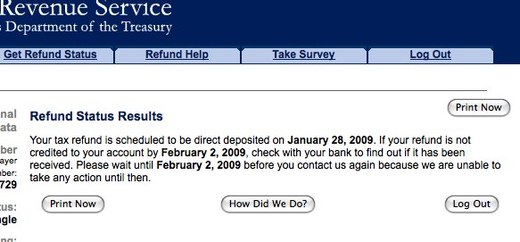
What? A win for the IRS website? In this case, yes, for their clearly designed and concisely explained “Where’s my refund?” section. I especially like the last line and how politely they ask you to not ask them things they have no idea about.
You’re reading Signal v. Noise, a publication about the web by Basecamp since 1999. Happy !

What? A win for the IRS website? In this case, yes, for their clearly designed and concisely explained “Where’s my refund?” section. I especially like the last line and how politely they ask you to not ask them things they have no idea about.
Zach
on 27 Jan 09Now…if only they didn’t have so many identical buttons floating around such a small amount of text.
Don
on 27 Jan 09Baby steps, Zach. Baby steps.
(Although the new whitehouse.gov site is a giant step in the right direction)
L.A. King
on 27 Jan 09Having worked with the IRS as a UX consultant, I know that it is like pulling teeth to get good design implemented on IRS.gov. I didn’t work on this page specifically, but I have proposed multiple designs that have been shot down because the stakeholder (i.e. not a designer) had a “better opinion” on how to design it.
Ben
on 27 Jan 09ha! I agree with Marroq… this is awful no matter which way you cut it. I think you all just like it because it’s “minimal”.
L.A. King
on 27 Jan 09And yeah, the four equally weighted buttons around a paragraph of text is a pretty good example of crappy design.
Ed Willers
on 27 Jan 09Our expectations of the IRS are so freaking low, and rightfully so, that when a page is not outright horrible it is a win.
Ryan Bates
on 28 Jan 09I recently signed up for an EIN on irs.gov and was surprised how smoothly the process worked with little hassle. It was like a normal, functional website.
josephcp
on 28 Jan 09I bet that one single feature saves them a ton of money in call-center costs (I know I’ve called and asked “Where’s my refund?”).
Keith
on 28 Jan 09Actually the only multiple buttons I see is the print now and that’s clearly just in at the top of the page and again after the content.
On this page it seems cluttered because there is so little copy, but on longer pages my guess is that this is a handy feature so you don’t have to scroll back up to the top to get a printer friendly version.
So I’m not seeing that as bad design necessarily it’s just a case where it isn’t as aesthetically pleasing as it might be.
Graham
on 28 Jan 09Yup, I agree with Keith, I think the duplication of the print button looks awkward here, but is part of a larger design scheme that’s not too bad.
As for the weighting of the three buttons being equal, I have no problem with this. All three buttons are optional next steps that you can take, but none are necessary, so there’s no “Next” button that needs to demand your attention. I think if it was me, I would have put the last sentence in its own paragraph or highlighted it a little differently, but overall I do agree that this page does a good job of communicating the message.
SH
on 28 Jan 09“It was like a normal, functional website.” Sad, but surprisingly true. Their website is fast to use, pretty navigatable, if not the prettiest thing out there.
“So I’m not seeing that as bad design necessarily it’s just a case where it isn’t as aesthetically pleasing as it might be.
Exactly, @Keith. The page design does need some more work, but compared to something like, say, cyberdriveillinois.com, this page is an excellent improvement to the normally awful municipal site.
Sometimes if you have good, clear copy, little design details don’t seem so bad.
GeeIWonder
on 28 Jan 09Compared to something like, say, cyberdriveillinois.com
I think for a fiar comparison you should be comparing other federal sites.
And ideally, picking a site where they’re facilitating taking your money (as the IRS does) as opposed to a site that facilitates your access to services or information.
Also, there’s no excuse really for that pop-up not to block out the other “Print Now” button, which is presumably on the page below it. I’m almost giggling thinking what happens when you press the HDWD button and another “Print Now” button appears on top of the other two.
Michael
on 28 Jan 09GeelWonder, Cyberdriveillinois takes our money. It’s where we go to form businesses, pay vehicle fees, etc.
GeeIWonder
on 28 Jan 09Michael:
Fair enough. And so does Threadless. But that’s more of an exchange, ain’t it?
Daniel Massicotte
on 28 Jan 09Wow, that’s early. I wish we could get our federal and provincial buddies here in Canada to get their act together.
This discussion is closed.