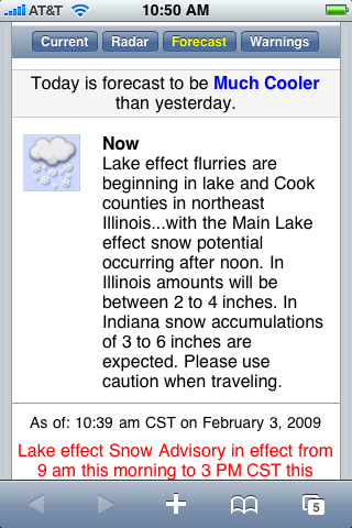
Weather Underground’s iPhone-optimized version is the best weather experience out there. I love how their forecast explains today’s weather relative to yesterday’s weather. I highly recommend bookmarking it on your iPhone home screen.
You’re reading Signal v. Noise, a publication about the web by Basecamp since 1999. Happy !

Weather Underground’s iPhone-optimized version is the best weather experience out there. I love how their forecast explains today’s weather relative to yesterday’s weather. I highly recommend bookmarking it on your iPhone home screen.
Chris
on 03 Feb 09I’m not sure I agree.
This looks like a big block of text I have to read. In the example you provide, not only is the icon small, but I’m also surprised the app simply mentions snowfall in Indiana and Illinois, as if the clouds know where the state line is. Last I checked south western Illinois could reasonably experience different weather than Chi-town.
Plus, “much cooler” is a completely relative, abstract description.
Personally I think 35 degrees is much colder than 45, but does everyone? A few weeks ago in DC, it was 5 degrees out one morning, and 25 the next morning. Is that much warmer (after all, it’s basically 5 times as hot out)? Or is it still Butt-Cold?
Mark
on 03 Feb 09From your screenshot, this only appears to be useful if you were out in the weather yesterday. If I were chillaxing in my temperature-controlled environment yesterday, this tells me nothing.
Just tell me what it is now and what it’ll be throughout the day and I don’t need any comparison to yesterday.
Bruno Miranda
on 03 Feb 09Chris, I agree. That is a prime example of overdoing it. Much cooler? What is that? 60? 50? 40?
I just flew in today, it says it will be cooler than yesterday, too bad I am not omnipresent, yet anyways.
Walt
on 03 Feb 09I like it. But moving beyond that three word opinion, I like it because it’s simple. Weather sites have a tendency to go overboard on information. While weather geeks like myself want to access to that stuff, I don’t need everything at the same time. And, honestly, most of the time, I’m looking for the same thing everyone is looking for – what’s the weather now / tomorrow / the next day. WX Underground has done a good job at providing what people really want.
Second, I’m a big fan of the National Weather Service forecast, and WX Underground gives it to me straight up. One more click, and I can see the “Scientific Forecaster Discussion” (i.e., the meteorologists explaining their forecast). That’s really useful, especially in borderline situations, and helps you understand what 50% chance of snow really means.
NOAA’s own web site, weather.gov, isn’t the most user friendly site. It’s nice to have someone give that information quickly and easily.
Dave
on 03 Feb 09Totally agree. Weather Underground’s forecasts are also very accurate. The phone app allows you to see local radar, 7-day forecast, weather bulletins, current conditions. All on one screen load.
SeanPC
on 04 Feb 09As with most iPhone pages, this makes a GREAT fluid.app on the menu bar:
http://premiercorporations.com/images/iwund_fluid_shot.jpg
JoeMac
on 04 Feb 09So… are you Bipolar or something? http://www.37signals.com/svn/posts/60-learning-from-mistakes-friendster-etc
Geoff
on 04 Feb 09I share Ryan’s appreciation for wunderground. Weather.com has, however, recently stepped it up with their decidedly un-weather.com-like iPhone app.
@ Chris, Mark, and Bruno: in defense of wunderground, Ryan didn’t share the entire screen—when the screen first loads, wunderground gives you the major deets. When you scroll down, you get that description that he showed above. Having used it a lot, I found the context in the “much cooler” description to be helpful.
Berserk
on 04 Feb 09Oh, no… You cannot (well, you obviously can) do that with Fahrenheit (or Celsius, or any other scale where zero isn’t the actual zero). You must first convert to Kelvin, 25F is ~269K and 5F is ~258K. That is, it was 5% warmer (but still Butt-Cold :)).
I do agree on your point though. I much rather like to see an actual temperature.
I generally like Weather Underground though, and everyone should read about Hunting Hugo...
Ryan Graves
on 05 Feb 09Ryan I’m pumped you pointed this out. I’m headed to China next week and have been watching weather closely. I’ve been so unsatisfied with the level of info from iPhone’s native weather app, this one is solid. Thanks!
Brian Christiansen
on 06 Feb 09I agree it’s the best weather site out there, desktop or mobile. I use it on the desktop as well. It’s not perfect, but it’s fast and to the point. The design is invisible… it gets out of your way and lets you get the basics, while allowing you to dig deeper if necessary.
I hope their desktop site (which has improved dramatically since about a year ago) gets close to this level soon. Their site has an amazing array of information that’s long been buried thanks to a lack of quality UI.
(@SeanPC – thanks for the menu bar idea! I haven’t used Fluid that way before!)
Chris Carter
on 06 Feb 09“Much Cooler” gives me no basis for reference. I’d rather just see the difference in degrees, color coded. I get the feeling many “designer” software developers are becoming obsessed with copy in an attempt to not confuse people with those dreaded “numbers”.
People – numbers are useful. “65°F (-15°F)” is much shorter and far more informative than “Much Cooler”, and it didn’t take me any more brain power to figure out that a drop of 15 degrees is cooler. Want to make it even quicker? Keep the blue coloring on the -15.
This discussion is closed.