
Now that we’re almost done redesigning our product sites it’s time to turn our attention to the mothership: the 37signals site. A large portion of traffic to our product sites originates from the 37signals site. It’s important that we direct potential customers to the right products that meet their needs.
There is currently a page—37signals.com/which—that does a decent job of informing the customer which product to choose. However we are all in agreement that this is a temporary solution and it can be done better.
Yesterday I was experimenting with a different approach that would help these customers choose the right 37signals product. Right now it’s just a concept that might not even see the light of day (except on this here post). The copy is also not final. The overall shape, arrangement, and wording will ultimately determine if this concept will fail or succeed. Nonetheless, it’s an early iteration. Here’s a sample slice of the illustration:
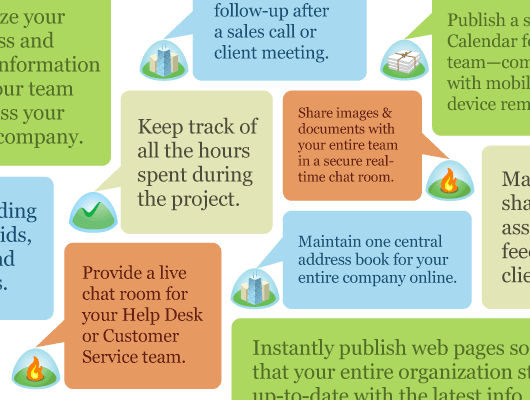
The idea here is that software feature charts are boring. Maybe there’s a better and more interesting way to help people see what each app can do. The customer would click on the “word bubble” that is closest to addressing their need. This would link them to the relevant site: Basecamp, Highrise, Backpack, or Campfire.
What do you think? Trying to be too clever or am I onto something here?
Erik Frick
on 17 Feb 09The idea is great, but this seems really busy to me. The color coding for each product is smart. The idea of having a slew of problems/questions linked to the product that solves them is fantastic but maybe a “cleaner” solution would work better. My eye is jumping all over the place, even on this small snippet…maybe it’s because things are cropped off on the sides and a ‘block’ of a bunch of bubbles with white space might feel better.
Neil Kelty
on 17 Feb 09I think you’re onto something, but it propbably needs a bit more revision – from that image above it looks like that page would be REALLY busy.
Almost like information overload. Reminds of the one page I dislike on the Basecamp marketing site: http://basecamphq.com/buzz
It’s a different take on the “Help me choose!” step-by-steps that just never seem to cut it for me – I’d like to see that model done better and maybe you’ve found it.
Greg McDonald
on 17 Feb 09I really like trying to break away from a feature chart, but I feel like the design in its current form is way too much text. You want users to be able to skim fast and find the product that matches their needs—not have to read and think about every separate bubble.
Presenting the information visually could help (i.e., a diagram of an address book to accompany “Maintain one central address book…”, a phone for “follow-up after a sales call or client meeting”, etc.)
Damon
on 17 Feb 09too clever.
Jason Santa Maria
on 17 Feb 09It’s definitely an interesting solution. I think it’s tough to say if it will be too busy or not because the slice above is misleading. It feels cramped because of the crop, not necessarily because it is cramped. I think we’d need to see it in context to get the full effect.
The bigger sticking point for me is that you’re potentially bypassing utility for novelty. The nice thing about comparison charts is they are an easy read; you can quickly ascertain the information and relate it to what appears nearby. The above example is placing the “work” on the viewer by 1) quickly learning the system (color coding) 2) understanding that these are features and not comments (the talk balloons suggest something they’re not) 3) digesting that information in relation to the rest of the info (viewers need to hold a lot in their heads to compare since the visuals don’t provide an easy path).
The real problem is maintaining the utility of a feature chart but finding a way to make it less boring. The answer might be that boring is OK because they utility is so good. You could always find a way to work some personality into the design in other elements.
Evan
on 17 Feb 09It looks attractive, but a little too busy – plus where’s the organization? It feels a bit like reading random factoids on the back of a cereal box. I don’t know where to start and I end up taking a random path through the whole info, jumping from one product to another and back.
I like the main idea of the logos speaking about their capabilities, though. Maybe take that, and boil it down to reduce it to one or two balloons per product – and give them a more organized layout?
DL
on 17 Feb 09As others have mentioned it’s too busy. I’m not sure what to read first. I have to read it all to know what I’m supposed to do with the information.
Charts are boring but they’re also effective when done right, that’s why they’re everywhere. I do think that you’re onto something here but it needs to be extracted more. 37s have many offerings that overlap in functionality, you might be able to use a drill down approach based on these high level functions to show people what 37s offerings do x.
John Kuehl
on 17 Feb 09It looks nifty, though I suppose the ruling on too clever vs. promising depends on the actual users of your main site.
This seems like an ideal approach if most of the traffic on the main 37Signals.com site is comprised of people that know you offer simple software solutions for small businesses and individuals, but know much more about their own needs than they do about the individual titles.
On the other hand, if you know the majority of the audience on 37Signals.com is already knowledgeable about what makes Basecamp different from Backpack different from Highrise, etc, and their primary goal is to get to a sign up page for their product of choice, being presented with this more atypical interface could just be an impediment to the registration process.
Chad Sakonchick
on 17 Feb 09We’ve been talking about this internally as we will soon have the same issue with our product line.
What if you made it more of a quiz?
“What are you trying to do?”
Give users four options (your current bubbles as multiple choice answers without showing what product each description is talking about). After they select each answer, show them another list. One for each product. Do this 5 times then show them which product they’re best matched for and what answers they gave that led to that conclusion.
Doug R
on 17 Feb 09Why not just test it? Come up with a few different iterations, including your current site as a control, and randomly serve them up. This can be done in a weighted manner. (You might want to do some IP logging to help enforce that the same person gets the same view on multiple visits.) Then check your conversion rates, or your Google Analytics, or whatever you’re using to track traffic, and pick whichever one works best.
Everyone on this board is going to have an opinion (I personally like the concept), but the test numbers will tell the real story.
Science, art, and business can all play together.
Like it
on 17 Feb 09Only one way to know… put it out there and test. Go for it. Then, tweak a bit…test…repeat.
jforth
on 17 Feb 09I like it, innovative thinking. Although my eyes are focusing in and out of the design. I say to myself wow! These guys can do all this? Great. Now how do i find out more info?
JB
on 17 Feb 09No, sorry, I don’t like it, it’s too cluttered, it’s not aligned with the generic visual clues of the products, it doesn’t help… And I’m a comic’s fan guy!
jb
Glenn
on 17 Feb 09The snippet seems to be too busy but I love the concept. I really like the use of different font sizes. May just need a little more white space in between. Maybe the use of different font styles. Or it may look fine in context to the rest of the page. Hard to tell.
Thanks for sharing.
Kenny
on 17 Feb 09I like the concept and think it could work with a bit of tweaking. However, seeing as this is aimed at new customers, I think that leaving the product names off the graphic hinders its usefulness, and breaks the “don’t make me think” rule…
Josh Ferguson
on 17 Feb 09The problem I had with it is that I have to read through every line of text to figure out which product does what I need. I don’t really want to read through every bubble. It feels like I have to read two paragraphs of text to figure out what each of your products does.
I have to agree with Jason Santa Maria that the utility of tables and charts is to ability to perform quick lookups and comparisons. I don’t think this particular design lends itself to either of those things, mostly because the information isn’t very “dense” in the Tuftian sense.
The design is aesthetically pleasing, but I’m not sure I would choose it for conveying this kind of information.
Mark
on 17 Feb 09I like feature charts because they’re so quick and easy to scan. I can typically tell what I need from the first 3-5 rows of data.
If I ended up on the page above I’d click back and keep looking (unsuccessfully?) for a feature chart, personally.
Innovative ideas are great but I don’t think throwing this up in front of the purchase funnel is necessarily a good idea. At the very least users should still be able to see a standard feature table, even if it’s not as prominent.
Abraham Pinzur
on 17 Feb 09My 2-yr-old just pointed at this image in my blog reader and exclaimed, “Oh, wow – cute!!” Not sure if that’s the response you’re looking for, but surely it means something. =)
Ryan Heath
on 17 Feb 09I like it. Naturally, though, it’s not quite right just yet. I agree with most of Jason Santa Maria’s comments.
Just taking this a step further…
What if there were a left-hand sidebar/column that listed the products, big, bold, and distinctly sectioned (resembling the boldness I get from the new footer). When clicking the icon/section for that product, it highlighted (color matched) all of the “features” that were sort of floating out in the right-hand side.
It’s initially a pool of all of these great things 37s applications do, and the left-hand sidebar could just be a filter that brings out which application does what. It could either change the color of the selected features, or just gray out the rest, or make them larger, or a combination of all three.
I think at the core it’s a lot like what you’re thinking, just trying to think of a way to sort of hide the rest while focus is on a certain application. And I know 37s has plenty of javascript talent to make the interface incredibly slick and fun, which also would bring out the type of interface 37s builds.
In short: I think for something like that to work, there needs to be some sort of filtering mechanism to take away that initial overhaul of color/features, and bring some order to it when desired.
Having said all of that, I definitely think you’re onto something :-)
Micheal
on 17 Feb 09I would like to see the front page of 37signals be closer to the “which” page than the current picture above or the current site.
http://www.37signals.com/which
Johan
on 17 Feb 09As one of the previous readers said: why not just test it?
I think you are a little bit against it but why not hire a proper usability company that have a usability lab and let them test with participants from your target groups? A little bit expensive in the short run, but very rewarding in the long run.
kasnj
on 17 Feb 09Like so many things in life, it depends on how you want to use it. When someone is getting ready to make the “purchase” the more traditional grid is the way to get. But to market an idea, something like this can be a great way to grab their attention and start communicating not only what’s available but how they “fit” together.
IMHO, YMMV
kasnj
on 17 Feb 09^^ Err, way to go, not way to get. ::blush::
Matchu
on 17 Feb 09I personally think it looks REALLY cool. But probably isn’t the most effective tool.
Jack
on 17 Feb 09Seems like a little too much copy right now.
How about a mindmap-like layout with 37signals at center, the product icons arranged around it and their value adds arranged as clusters of bubbles (?) off them?
Gustavo
on 17 Feb 09You should just have a big search box that asks:
“What do you want?”
and then have artificial intelligence do the rest. Run it by DHH, I’m sure he can tackle that puppy haha :)
Dylan
on 17 Feb 09I think it LOOKS great but imho it’s too difficult to read. Although I’m sure a quick A/B test would give you the answer you’re looking for :)
Martin
on 17 Feb 09I don’t like it. It feels like I’m in a room and people are screaming different things at me.
Chris Papadopoulos
on 17 Feb 09I love the general concept of having a selection screen that is filled with explanations like that. I might even use actual customer quotes there if I had enough clear ones.
But I personally don’t like the unnecessary repetition of the logos though, so I’d move them to the center and array the quotes around the logos in a 4-part grid. This forces you to group use-cases together so each product is more understandable to the customer and also leaves a tad bit more white-space throughout to make it look more elegant.
Either way though, the general concept is really cool and the colors rock.
Rohit Sinha
on 17 Feb 09“The customer would click on the “word bubble” that is closest to addressing their need.”
How will the customer know they are supposed to click the “word bubble?” It’s not obvious or apparent just by looking at it. Or do you plan to add even MORE text there, telling them to click the bubble that appeals to them? ;-)
Jérémy Pinat
on 17 Feb 09I appreciate you publish those “early iterations”. Too many companies reveals their promotion page only when it’s finished, engraved in stone.
I also appreciate that you insist on “what you can do with this product” and not “Here is product [name X]”.
GeeIWonder
on 17 Feb 09Reminds me of wallpaper. Neat idea, but I think that’s probably all.
aimee.mychores.co.uk
on 17 Feb 09Good for you for trying something different … but i really don’t like it.
Not good for a dyslexic brain that needs to be directed where to look rather than bumped around all over the place.
However, i do like the colour coding. Perhaps put the speech bubbles of the same colour together to give some sense of order to the picture?
Zinni
on 17 Feb 09I think it is a great concept, however it may be better utilized as an addition to a chart. I could picture an area where “problem bubble” elements like this are either randomly loaded or continually changing.
short version: could be a great supporting piece for a traditional chart
Chuck
on 17 Feb 09The idea of a page like this is to make information manageable for normal people, but this looks too disorganized to do that effectively IMO. There’s no obvious starting point or hierarchy, so the reader’s brain has to process all that stuff at once — and I don’t know about you, but my puny little mind can only handle a few things at a time.
I think you could keep the “task cloud” concept if you introduced a little more organization. You could do it by app like Chris Papadopoulos suggested, or by type of customer, or some other division into categories. The point is to make it easy for the reader to filter out some of the information that he isn’t interested in right now.
David Andersen
on 17 Feb 09Nothing wrong with an easy to read feature chart if the features are understandable (or clearly explained when not) and the list isn’t a mile long. Group them if possible. I don’t think you need to reinvent this wheel.
Crystal
on 17 Feb 09What I’m thinking would probably have to be done in Flash – collapsible bubbles. Just the logos on the screen, occasionally popping up a bubble. Intrigued, you mouse over it, and the other logos fade out, filling the screen with the bubbles specifically relating to the product you moused over.
As it is, it looks like the products are unevenly weighted – towards highrise and backpack, and away from campfire. Is this deliberate?
JD
on 17 Feb 09Thank you all for your comments. This is very helpful. One thing I forgot to mention is that while a chart would make it easier to read, we are in fact comparing 4 different products.
A chart works when you’re comparing different tiers of the same product (e.g. iPod Classic, iPod Touch, iPod Shuffle). Using the same metaphor: it wouldn’t make sense to create a chart differentiating between a Macbook, iPhone, and Mac Mini. Maybe it would, but you’d probably have 3 different charts.
That being said, we’re trying some other experiments and ideas showing the differences of each of our products. Keep the feedback coming. I am intrigued by how much meaning is derived just from this small sliced-up view.
Thanks, Jamie
Devan
on 17 Feb 09I find it a bit too ‘cluttery’. My eye tends to jump around one or two boxes before I find myself wanting to look away at something else altogether.
As previous commenters have pointed out, you feel like you have to read ALL the boxes to get a grasp of which one to click, and it seems really busy and overwhelming which reduces the motivation to do so.
David Andersen
on 17 Feb 09it wouldn’t make sense to create a chart differentiating between a Macbook, iPhone, and Mac Mini.
It would if it wasn’t clear to the user how they differ and therefore which one to investigate in more detail. Who is your audience here? Someone who has no idea what your 4 products are? If yes then I think a direct comparison is apt, at least at a high level.
Brian Pan
on 17 Feb 09we are in fact comparing 4 different products.
You need http://www.37signals.com/what not http://www.37signals.com/which.
Al Abut
on 18 Feb 09Sticking with Jamie’s Apple analogy, this reminds me of the “which mac are you?” page:
http://www.apple.com/getamac/whichmac/
One thing they do that you could explore is to group your products into categories, like they do with “laptops” and “desktops”. The first clunky labels to come mind are “Project and Knowledge Management” (Basecamp and Backpack), “Contacts and Communication” (Highrise and Campfire), and “Also” (Tada List, Writeboard, Ruby on Rails, Getting Real, Job/Gig Board, SVN Blog).
Al Abut
on 18 Feb 09Oops, live link below:
http://www.apple.com/getamac/whichmac/
Doug R
on 18 Feb 09After further review, what I like about it is that it is worded in terms of solving the user’s problem, and not oriented towards a list of features. Simply knowing which features a product has is meaningless if you don’t know what problem they are intended to solve. I also like that it is a bit whimsical; it has personality; it’s unexpected.
That said, it is also a bit cluttered and chaotic. The message might not cut through strongly enough for somebody unfamiliar with your products.
Still, the concept is nice. Thanks for sharing it with us.
David Ham
on 18 Feb 09Thanks for asking! I get a lot out of your design process posts.
I’m afraid I don’t care for the design, for a couple of reasons. The features listed in this bubble are too granular at this level. You’re describing products whose features may be similar, but whose purposes are different. The kind of feature exploration you suggest here would be confusing for the home page. Also, while the icons are attractive and share a design language, they also kind of look the same, and in the speech bubble jumble it could be hard to tell which is which. The product names are better differentiators.
One thing I’ve always liked about the existing product sites is that they distill the essence of the product into a short phrase or sentence. I think these would be effective for the 37S home page, and would help guide people to what they’re looking for more easily. The “which” page is a good start, but too wordy. The name, the icon, the catch phrase, and a screen crop are what you need (I love the screenshots on the product pages because users might have seen the pages on a friend’s account, but might not remember the product’s name). Give each product a big quadrant of the page.
If you want to cross-pollinate a bit and guide users from one product to another-like if they like Basecamp’s messages but they need something more flexible-sidebar cross-links to other products with similar features might be useful, but in the product sites themselves, AFTER the user has already made a choice of one of the products.
Thanks again for showing us.
Mark
on 18 Feb 09If you already have a problem in need of a solution, it seems this “fishing” logic might be frustrating. And only us seasoned 37s app users are familiar with the visual logic of the logos well enough to immediately associate them with their apps. Millions signed up with your old visual logic, schemata, and strategies, and boring to you is not boring to new prospective users. Many of the new marketing pages across the product line seem crammed full of ideas, which is exactly the opposite visual logic that drew me to (and keeps me at) 37s. But, then again, you seem to report that your testing indicates otherwise. So much for visual “logic.” Whatever the fine tuning produces…great stuff 37s…
Stacy
on 18 Feb 09This design works the hell out of a “potential” user. It is not simple.
Everybody knows what “project management” and “contacts” mean. Why complicate the issue?
What’s happening here is that YOU are getting bored with your existing site and want to change it in a BIG way. Don’t. Make small incremental changes or delete something. Work on the words using your feedback.
Alex
on 18 Feb 09who is your audience? where do they come from and why? Now the page is more focused on the product (name) and not so much on the needs of potential customers. A small but maybe effective tweak would be to interchange the font size of the product name and the product description.
Online contact manager and simple CRM
Keep track of who your business talks to,
what was said, and what to do next
Learn more about Highrise
That feels like a more natural order of information for me.
Bence Kucsan
on 18 Feb 09I’m going with Stacy here, that’s not simple. I have to put energy into the understanding of it and I’d feel if I’m missing a bubble maybe I’m missing an important feature.
Chris
on 18 Feb 09I work for a supermarket company in the UK.
We spend our lives dealing with this very problem – how do customers approach and shop a section? How do we lay it out to maximise sales?
Jamie – In the end I think you have 2 competing forces – people who know what clump of features they want (traditional feature chart) and those who want to be inspired in some way (new style feature bubbles).
We do a piece of work on every section called “customer decision trees” – this basically researches what the priorities of most customers are when they approach a section. i.e. for Wine -> Colour -> Country -> Region ->Grape -> Producer -> bottle size
I wonder if applying some similar logic might help with your design?
Nael
on 18 Feb 09I think you need to go 37signals on it but the idea is great. Maybe one keyword search field at the top with the different product icons at the bottom. User searches for keywords like “track hours, share documents, live chat” and only bubbles that match the keywords would pop out of the icons. If the user clicks on the icons at any point all the bubbles for that icon would popout so they can see what else on top of what they need this product provides. Even with this, it could still get too busy – definitely not something I would put on a home page, but on its own separate page.
I agree that the standard feature chart does not really work here because I don’t think there are many features that overlap across these products – unless I am wrong, it could work if there is more overlap.
Goodluck!
Helgi Thor
on 18 Feb 09Hi Jamie, great stuff!
1) You are definitely addressing a need – even knowing all of your products, I still get confused advising which one fits which job.
2) I agree with other comments: It’s a little busy, but I’m sure you’ll work through that.
3) Can I suggest a split-page/two-page design? Thing is, I think you have 2 different groups of “evaluators”: Group A: I know my needs, what options do your products offer? Group B: I know my problem, but I’m not sure what would be the best way to address it. Fit everything into Basecamp or use both Basecamp (for projects) and Backpack (for content editing/proofreading)?
Look forward to seeing more, I urge you test it the same way you did with the Highrise marketing page!
rlicata
on 19 Feb 09The idea is cool, but it is busy.
How about relating the product to users? I could see opening up the “bubbles” a bit with some white space, and adding XBox360-like characters for each bubble. The product could be on their generic white t-shirts, and to take it a step further, they could be users that are already featured on the web site.
Joe
on 19 Feb 09Not Busy Enough. Make them fade in on mouseover, or instead of making the features come out of the icons – display the features and have the icons materialize on a mouseover or something. Like if you can identify the problem you’re having – then here’s a possible solution.
Mike Riley
on 20 Feb 09I don’t like the idea very much because you are limiting the number of things you’re claiming the products do, this might be useful for the most common functions people use 37Signals services for, but what about the uncommon?
The customer support system over at MediaTemple does something that I think you might want to consider here. Basically one of the steps in filling out a customer support ticket does the following:
1. You start filling the field in with your support request. 2. The field sends an AJAX query to their knowledge base and displays a list of items related to the support issue you’re experiencing. I imagine this probably takes some tricky parsing of what is being typed in, but in my opinion it’s phenomenally useful and worthwhile.
Check out this screenshot: http://weblog.mediatemple.net/weblog/wp-content/uploads/2008/06/getsupport_screenshot.png
In your case, you could make the page really simple:
1. Just have one field in the middle of the page that says “i need/want to:” and then put a field in there after it where your prospective customer would type in what they are trying to do. Maybe to help people out you could put in a suggestion, like: “keep my contacts organized”. 2. This next part is going to be difficult, but if you made it accurate enough, and put enough time in populating the list of items, it would be great: as they are typing you display a list of the relevant “features” of each product, and a link to some relevant page within that product site.
Just some food for thought :)
Sash
on 20 Feb 09What about adding something nice to filter or grey out the options they dont want?
What is your need?: [..........................................] Get rid of the noise words and look for matches on your page?
Sash
on 20 Feb 09Doh.. just read the full thread and realised someone had suggested my first post already :( Im too slow!
DavidC
on 21 Feb 09Agree to find out new way (and not wipe out comparsion chart). As a newcomer I usualy look for task to acomplish. Track time on project, share docs and specs with client and so on. My query is not about product but task I need to be done. Time (clock icon), contacts, sharing,... and then decide, which product best suites my needs. Time icon can mean multiple tasks but then each task leads to (usually) one product. I think something Greg and Al was talking about.
BenSky
on 22 Feb 09Looks clean and is an interesting concept, i think it is however somewhat confusing for people to look at, maybe try ordering it a bit more to make it less of a jig saw of pieces. Love the icons.
This discussion is closed.