We get a steady stream of requests from people who have apps that integrate with one of ours asking to be included on the Extras page (here’s the Basecamp Extras page, for example).
A nice move whenever someone sends one of these: When they include a badge image that’s the right size and text that’s the same length as the other entries on the page. It’s just a little thing but it really makes a difference for the person who has to add that extra. It saves a step and makes the request ready to go “out of the box.”
It’s funny how little things like this can have an impact. When someone sends in a request like this, it comes across as them saying, “I’ve thought about what this request entails for you. And I’m guessing this might be a pain point so I’ve gone to the trouble of making it as easy as possible to take care of.”
We tend to think of usability as applying only to interfaces. But it’s so much more than that. It’s about delivering something that’s fit to be used. That means it’s about writing copy that’s understood the first time. It’s about requests that are as easy to accomplish as possible. It’s about manuals that are one page instead of 40. It’s about code that you can paste in and works right away.
It’s about putting yourself in the other person’s shoes. It’s about looking into the future, foreseeing any potential obstacles, and removing them. And that’s a great way to get people on your side.
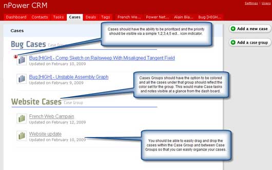
Update: Here’s a related example. Someone mocked up a screenshot of a Highrise feature request the other day.

Neat way to “get real” with a feature and show exactly what you have in mind.

Michael Dubakov
on 26 Feb 09Nice point about usability, but I think it is better to call it “understandability”. User guides that are easy to use and easy to understand may be two different things. Also it is close to simplicity.
“Make everything as simple as possible, but not simpler” Albert Einstein.
Marc Hughes
on 26 Feb 09My app is listed on your extras page. I did send the image and the copy when I asked to be added to the page. I felt like I was rewarded by you taking care of it very quickly (next day I think?), and even mentioning it on your blog. I appreciated that a lot.
Thanks guys!
David Minton
on 26 Feb 09Great point. I have found a great challenge getting clients to understand that every time that ask for something, without providing enough information to do it, just costs them extra money.
For some reason every client thinks we know every page on every website we maintain by whatever name they refer to it by (even if that is not the title or headline), rather than providing the URL when they send a request via email. Bot only would their request get finished faster, it would cost them less money.
pwb
on 26 Feb 09Yes! I get the same feeling with so many of the job seekers that email in either missing a cover message or not personalizing the message. So many people mistake quantity for quality. Probably due to the age-old question: “So, how many resumes did you send out today?”
Peter A. Laudenslager
on 26 Feb 09Making sure the things we send other people are fit to be used is a great idea. I know I do this sometimes, but probably not as often as I could.
The converse, of course, it to make sure people know exactly what I need from them. To build on David’s example, if we find that our customers don’t provide enough / proper information in their request, are we giving them an easy way to figure out what the right information is? Maybe a template that says “look here, and copy this information”.
When we do this right, it is the essence of good teamwork. I know what you need from me, and you know what to expect from me. And neither of us expects the other to magically know what we want – we provide details, and ask questions.
Marcus Blankenship
on 27 Feb 09I think the key is to empathize with the receiver of our requests, and think through what steps they must take in order to “use” what we’ve sent (or accomplish our request).
Asking yourself, “What else will they need to get the job done?” is often sufficient to move us from “fit to get-more-information” to “fit to use”.
Marcus
Vincent Franco
on 03 Mar 09I can’t even begin to express how frustrating it is every time a client sends an “elephant for me to squeeze into a phone booth.” I try to help as much as I can buy have short notes on CMS fields like (Keep it short!, Try to think of it as a newspaper headline ie “Potluck This Saturday”)
Or something along the lines of that ;)
This discussion is closed.