
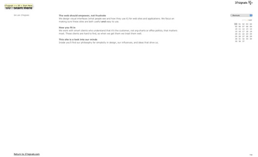

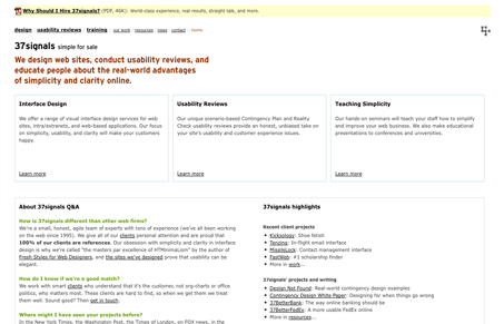



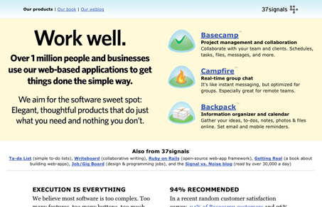

View the original version (the 37signals manifesto).
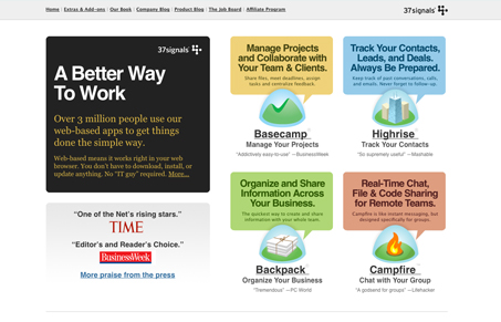
View the current version.
Unmatchedstyle.com takes a look at the evolution.
You’re reading Signal v. Noise, a publication about the web by Basecamp since 1999. Happy !


View the original version (the 37signals manifesto).
View the current version.
Unmatchedstyle.com takes a look at the evolution.
Charlie Park
on 30 Mar 09Man, I remember that first version. And the second. In fact, I found a locally-saved copy of that second one on some old disks I was cleaning out a few months ago.
I’m still surprised the term “HTMinimaLism” didn’t catch on more than it did. Google’s showing only 497 results for the term. I’m glad you’ve kept the manifesto around.
Anton Dubina
on 30 Mar 09Somehow I think rev1 is still the best.
Micheal
on 30 Mar 09Without a doubt, the 4th is the best for the sole reason that you clearly understand it’s a product site describing 3 different products.
The new/current site makes it difficult to distinguish that fact b/c of those darn square bubbles above the product icons.
If you simply removed the bubble icon and put the copy from those bubbles under the actual product name … the site would work and be more effective.
Harold
on 30 Mar 09I don’t know the first one still feels pretty evolved honestly. I bet it would stand up pretty well against some of the arguments for clarity that Jamie gave over the weekend.
I’d be curious to know how many hits the manifesto site gets each month.
WD
on 30 Mar 09new site = too busy, did not read
Maurivan Luiz Padilha
on 30 Mar 09Nice idea of the show in the Signal Vs. Noise Blog the evolution of the 37signals site, very good! – Congratulations!
Clean!, Less is more ever.
[]’s Maurivan Luiz
nickd
on 30 Mar 09many congrats to jamie for his work on this!
chris
on 30 Mar 09I’m not a fan of the most recent design. I think I like the two before that better, with the stone age being the best.
chris
on 30 Mar 09Oh, and what were the dates for the various front pages? Maybe I missed it, but that would be interesting to see.
ratchetcat
on 30 Mar 09I like the fact you guys keep moving forward rather than adhering to one approach forever and ever. That takes guts.
Even if the latest design isn’t successful in some eyes, it’s taught you something new and the next one may be better than all that came before.
Keep up the good work.
JiPé
on 30 Mar 09I agree with Micheal, the latest 37Signals home page is not memorable as the 4th one was. That single yellow background with a big huge statement and 3 products was clear and simple. The last home page is, yes, more stylish and visually appealing, but I find it more difficult to retain the appropriate information. I wonder if focusing only on 3 main products will not be enough, and also as Micheal suggested, removing the colored bubbles will probably help also, as they are competing with the icons/logos and more importantly with the names of your products. It’s like your product are now color coded and I don’t think it is the goal of the exercise. In your 4th version of the home page, the logos and names of the products were predominant while their descriptions were very accessible while not being the main focus. The rest of the current home page, bellow the fold, it’s perfect for me, but I think the first impression and what you would like your future customers to remember should be clearer in order to be more memorable.
Micheal
on 30 Mar 09So, I decided to put my money where my mouth is and do a quick mockup refresh based on my early comments.
It can be viewed at http://img16.imageshack.us/img16/6231/37signalsrefreshl.jpg
All I did was use modify some of the CSS, using Firefox’s Web Developer plugin.
Here’s the CSS modificationsh3, h4 {display: none} .press {display: none} body.home2 div.basecamp {background-image: none} body.home2 div.backpack {background-image: none} body.home2 div.campfire {background-image: none} body.home2 div.highrise {background-image: none} .statement img {display: none} .inner {background: #ccc; -moz-border-radius: 12px; } .inner img {display: inline} body.home2 div.statement div.inner p {background: none; color: black} body.home2 div.statement div.inner p.webbased a {color: blue} body.home2 div.statement {background: white}
Ric
on 30 Mar 09I prefer the newest revision to other recent versions. I especially like the part of the page you see first (‘above the fold’ if you will): I like the cleanness of the design there. Below the fold, it’s a little bit busy for me, but still effective.
The original manifesto site was a great design in my eyes.
I disagree with JiPé about the bubbles – I think that the message about what the products can help you achieve is more important than the icons.
dejon97
on 30 Mar 09I ike the new design – good use of color, graphics and space. But….IMHO of course, you are asking the home page to do too much. Let each product’s landing page actually sell the benefits. The home page should succinctly say “we got great stuff check it out” and then direct the visitor to the more specific product pages.
But what do I know, I’m trying to be like you guys. :-)
Jussi
on 30 Mar 09What I see is a journey from a professional services firm to a company offering their own software products, all the while maintaining the same philosophy. That is really cool!
If I was to use this as a measure we’d be at approximately step 2 right now :)
Cheers
Adam
on 30 Mar 09I would have to agree with Ric about the most recent homepage. Above the fold looks OK although it seems like too many colors are being introduced right away. Everything below seems a bit busy for me. My eyes don’t know what to focus on first. Sometimes less is more.
Eric Anderson
on 30 Mar 09Looks good. My only complaint is that on my computer not all your major products are above the fold. I can see Basecamp and Highrise but Backpack and Campfire just have their bubbles peaking up just a bit. On a 30000’’ screens you guys probably designed this on I’m sure it looks great. But not everybody has one of those. Especially many of your customers.
Rick
on 30 Mar 09I agree that the 4th design is the clearest and allows for easiest comprehension and retention. The use of the colored boxes in the latest iteration suggests that each is a like type, which they are not.
Also, the placement of the product logo between relevant text about said product forces my eye to jump across space after using the logo to locate the product.
The fourth design made for a very logical progression of my eye from left to right (two columns: value proposition and services) and top to bottom. The new grid layout again forces me to work harder to understand what I’m being presented.
Obviously it’s picking nits and the site is light years ahead of most, but this is a case where the busier version was still more easily interpreted—by my amateur eye at least.
James
on 31 Mar 09Had never seen it before, but that first one is super cool.
Ric
on 31 Mar 09Eric’s got a good point about all the products not fitting in above the fold on low res screens. Didn’t notice it at first on my 15” MacBook Pro.
daemonx
on 31 Mar 09I wonder, what would be the next figure?
Terry Sutton
on 31 Mar 09The first site is unbelievable (the “in the beginning) screen). I have very rarely seen clarity like that on the web.
Stuart
on 31 Mar 09In general I like the redesign though one thing that jars with me is the opening salvo which states that “3 million people use our apps”, immediately followed by “Tell me why web-based software is better”.
Where’s the voice coming from? You or me?
Wouldn’t “Find out why web-based software is better” be, er, better?
Happy
on 31 Mar 09Curious to know: why did you remove the ‘blog’ links from the top of 37signals.com?
Micheal
on 31 Mar 09@Eric, @Ric, et al
For those noticing that the products don’t fit above the fold, is my version any better of the front page?
http://img16.imageshack.us/img16/6231/37signalsrefreshl.jpg
Refer to my previous comments.
david
on 31 Mar 09I still love the first version, so clean. I’ve got the tee-shirt as well (are they still on sale?).
Adam
on 31 Mar 09There is no fold.
Tim Jahn
on 31 Mar 09I applaud you guys for evolving and moving forward as always. But the latest 37signals homepage disappointed me greatly.
To me, you guys are the voice of simplicity and effectiveness. Frankly, the current homepage looks like you just slapped as much information on the page as possible. Which I feel is totally against your culture.
I actually didn’t read the whole home page because there was simply too much information with very little organization. I feel like this iteration was a step back rather than a step forward.
But that’s just me. Feedback is yours to do what you wish with. :)
MIchal
on 31 Mar 09The latest version is absolutely the best. I liked the first one too:)
scott
on 31 Mar 09just like to point out that it’s not evolution if you’re thinking about it…
This discussion is closed.