Pioneer Theatre

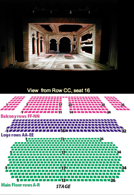
Rich Corbridge writes, “The Pioneer Theatre in Salt Lake City provides not only a seating chart of the theater but an interactive ‘here’s what the view would be like from the seat you’ve chosen’ feature — very useful to a customer who has never been there before (follow the ‘Seating Chart’ link in the body of the page).”
Current time at MailBuild
 Brandon Silverstein writes, “I love how the MailBuild support page tells you what time it is locally right underneath the office hours. You can tell right away if the office is open or closed…This especially helps MailBuild customers in the United States that are not aware that MailBuild is based in Australia.”
Under suspicion at Firefox

Daniel Scrivner writes, “This came up in my Firefox brower earlier today. And I was immediately impressed that it recognized the forgery and alerted me so well. Just another reason I love Firefox!”
Got an interesting screenshot for Signal vs. Noise? Send the image and/or URL to svn [at] 37signals [dot] com.

Scott Brooks
on 10 Jan 07That is a really cool way to do a seating chart. What more do i have to know when buying a ticket? Aside from knowing who is sitting next to me i know exactly what my seat offers as far as view.
I would be interested to know a bit about how they did it …how long the pictures took. Going to pass that along.
Cool pick up.
cheers
scott
Prophetess
on 10 Jan 07Best seating chart ever! If I were in SLC, I would definitely make a point of going to that theater.
Now if only the theaters in Boston would pick up on this. :)
Manny
on 10 Jan 07RE: seating chart: Lots of venues have this.
This one is better:
http://www.xcelenergycenter.com/seating/
Manny
on 10 Jan 07In fact, upon second review, the chart they use for the theater is counter-intuitive . . . the seating chart should be presented with the stage at the top of the seats, so as you move away from the picture, the seat moves from the stage.
Doh.
Jake Good
on 10 Jan 07I like the seating chart idea… it’s almost a “it’s all about content” kinda thing. The idea has probably been tossed around for a while, it’s merely a “who will take the hit and add the content” type.
The office timestamp visualization is neat. I think that’s quite the nice little perk. It could be improved by having some sort of visual (green/red) that symbolizes if you can actually call. Not some big cheesy online/offline thing, but some smaller notification.
:: shrugs ::
PDHoss
on 10 Jan 07Put some folks in the seats! Then you really get an idea of the view.
Anonymous Coward
on 10 Jan 07Agree with Jake that the MailBuild page would be more effective if it just told you whether or not the office was open, and maybe how much longer it will be open/how long until it opens? As is you have to look at the open hours, look at the current time/date, look back up at the open hours and figure out if it’s open.
Geoffrey
on 10 Jan 07I had a chance to work on a similar project with a seating chart that does much the same thing. It’s really a great feature. I’ve seen similar ideas at baseball parks as well.
Seating Chart: 5th Avenue Theater
jenn.suz.hoy
on 10 Jan 07Excellent seating chart! That would have cut my decision making down considerably when I was recently buying hockey tickets as a gift. I had no idea what the view would look like, even though I had been to the arena before. I had only seen it for basketball, and from nowhere near the seat I was looking to buy.
In the end, I made a good choice, but a 5-minute task suddenly took 45-minutes as I stared at their seating chart, trying to decide what I was going to see from there.
jakob
on 10 Jan 07I got a nice seating chart for you at http://www.sodrateatern.com/
If you are reading the page in swedish, click on the english flag and then search for TICKETS > AUDITORIUM LAYOUT.
I find it very useful and sweet.
Anonymous Coward
on 10 Jan 07Spammers and Phishers can thank Daniel Scrivner for being someone who is gullible to open phishing emails.
(How else would he have come to that page?)
mark
on 10 Jan 07The first thing I noticed was that I had imagined my seat opposite what I’d first perceived. This is a great application.
Dushan Hanuska
on 11 Jan 07I like the way the local time is presented on the support page.
I though that it was a great idea and was going to suggest it for our company website too. However, when I looked at our support page http://www.atlassian.com/about/contact.jsp I realized that we had it long time ago.
Minoru
on 11 Jan 07Re: seating chart - we work a lot with performing arts companies, and this is a common idea that’s being implemented more and more. This particular example is not the best I’ve seen - for one there is a limited number of photos, but that’s not clear until you click on a few. Plus even with the row and seat number info, it’s difficult to know exactly where each photo was taken from. Manny and Geoffrey have already cited other examples, but here’s another one from 37s’s backyard: Steppenwolf—select a section (main floor or balcony) and then select “photo preview” to see photos as you see exactly which seats are still available.
There are other ways to “skin this cat” as they say—but overall it’s a good direction that more arts companies want to give up the control and let the user decide where to sit, as opposed to seating them using some obscure algorithm for “best available.”
karl
on 11 Jan 07Maybe
Office open. Closes in 2 hours
or
Office closed. Opens in 3 hours
and then
Opening hours + local time
This discussion is closed.