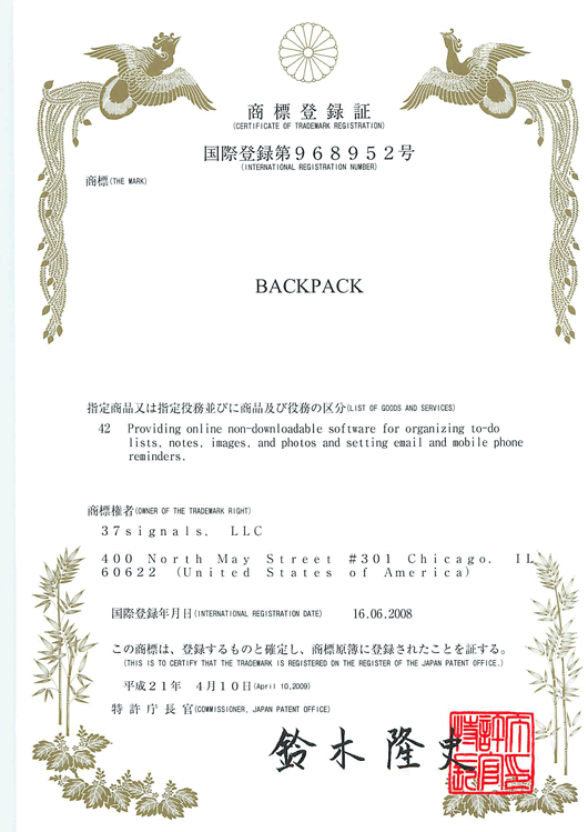
You gotta hand it to Japan – Our trademark certificates arrived today on heavy cardstock, printed with bright gold foil and striking red ink. I keep saying I want to frame these suckers:

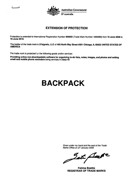
These stand out because from the rest of the world, the same certificates look like this:

Thank you, Australia, for being particularly boring.

Luca Guidi
on 27 Apr 09Really awesome, love japan culture!
Cameron
on 27 Apr 09Nice. But whats the point?
dansays
on 27 Apr 09Why is the English letter kerning always screwed up on Japanese typesetting?
Alejandro Moreno
on 27 Apr 09@dansays, there is no kerning, that’s why.
I think Japanese type is strictly monospaced, and so the Japanese fonts probably include monospaced roman letters.
Chris Palmieri
on 27 Apr 09@Cameron
Alejandro is right, although most contain both monospaced and proportional character sets. The roman character sets are usually also really badly designed, with no good relationship to the style of the Japanese characters and crappy kerning tables.
For this reason most Japanese designers will find a decent Roman-only typeface to replace the Roman characters in the Japanese typeface they’re using. Some Adobe software even lets you create “composite fonts” which automatically choose one font or the other based on the type of characters you input.
This document (or this part of the document) probably didn’t see the hand of a designer, or had some sort of logistical requirement that forced them to use the full-width Roman.
Trent
on 27 Apr 09The Australian document is essentially a receipt though right? It looks like a supporting document rather than the original certificate, whereas the Japanese one looks like the first time the trademark was registered – would they send out a renewal or provide additional information on the same stationary or just a form letter? The Australian trademark certificates have a foil seal, or at least the seal imagery printed onto the certificate. Still a fairly typical bureaucracy document, but not as bad as that above.
Christopher
on 28 Apr 09BACKPACK
Anthony
on 28 Apr 09Someone has to be the most boring in the world. In this case, it was us in Australia.
pacey
on 28 Apr 09geez, fellas. lay off a bit with the boring…. it’s just a government document. i think that we can go a bit too far sometimes when it comes to this sort of thing. 37signals profess to produce simple, yet functional products. why are they putting so much emphasis on this type of thing? does the australian version of the document fulfill its function? does it miss anything out? for something that quite possibly will be filed (or scanned) away and not put out on display, i think that the aussie version is quite ok.
Angus
on 28 Apr 09LOL. Lets not too heavy on Australian government documents. (yes i’m an Aussie).
Has anyone ever filled out a USA Flight Arrival / Visa Document (the green form) when they arrive in the US? Its the most ugly user-unfriendly document I have ever seen.
I suspect the US government back in 1946 printed 1 trillion of them and they are still making their way through the stock pile.
Sean McCambridge
on 28 Apr 09Wow, the Chinese one is really nice. Wish our documents had a more exciting aesthetic. I have a visa from Germany that is kind of fun to look at.
What are the fees like for all these countries? They could really add up.
charly
on 28 Apr 09Japan, an almost perfect mixture between traditional culture and modern world. It looks awesome.
Turgs
on 28 Apr 09Mate… you’re welcome. Our aim is to make everyone else (like Japan) look friggn awesome!
Jesper Larsson
on 28 Apr 09In Sweden you at least get a certificate from “The Kingdom of Sweden” back: http://www.creatorsinn.com/index.php/2009/02/creators-inn-fit-for-royals/
Andy
on 28 Apr 09I wonder how much it cost to get a worldwide trademark. I guess it is hell expensive (incl. laywer fees) and about half a million or more – right?
dusoft
on 28 Apr 09Certificate from Japan looks kitsch-y. Ugly as well.
@Angus: You got the point, user-unfriendly etc. What’s the point of asking someone if he is a terrorist or transporting firearms or drugs?
coskunlar vinc
on 28 Apr 09I think Japanese type is strictly monospaced, and so the Japanese fonts probably include monospaced roman letters.
Oli
on 28 Apr 09So does this mean you are considering localising some of your apps into Japanese? That would be nice…
Brade
on 28 Apr 09Oh noes, Vinc has invaded 37signals! Has our A.I. overlord finally arrived?
keepitsimple
on 28 Apr 09I thought simple was better.
Ivan M
on 28 Apr 09I would frame the Japanese patent certificate yes :) Looks awesome.
I’m just wondering though, what 37signals does with the patents? Is it something the company typically does? And what do you do if you find someone infringing on the patents?
To me, “online non-downloadable software for organizing to-do lists, notes, images, and photos…” is something hugely obvious, and done to death. I’m not saying anyone else has done it as well :) , just saying they’ve done it. At least as separate products, no? Am I missing something?
Should the rest of us begin to look at patenting our products?
Henrik N
on 28 Apr 09I like that both of them make the trademark stand out. Whitespace, all caps, large type. Shows they put some thought into it. They could have just made it part of the text, but didn’t.
coskunlar vinc
on 28 Apr 09i love japan culture too :)
Jay
on 28 Apr 09@Ivan: it’s a trademark for the word “BACKPACK” associated with the software description, not a patent.
Juiced
on 29 Apr 09I don’t see anything wrong with the Australian one. It looks quite professional to me.
Iain Dooley
on 29 Apr 09Well, I couldn’t resist. I got out my Kanji Dictionary (Spahn & Hadamitzky for those in the know) and tried to figure out what those four big characters at the bottom of the Japenese certificate said.
Now I could find the last three, although I couldn’t find a compound word using all three. They were (meaning followed by Spahn Hadamitzky index):
tree, wood (4a0.1) flourishing, high, noble (2d8.6) history, chronicles, record (0a5.38)
Okay so that kinda makes sense … trees are like paper, high, noble, chronicles, history. High and noble paper history, right? But I can’t for the life of me find what the first character is!! I’m sure it must be an 8a radical, but I’m shit out of lucky trying to find the meaning. Any Japenese out there care to shed some light on the situation?
Incidentally, if you want to see some boring Australian design, check out the Woolworths Home Brand Design Guidelines.
Oh, and incidentally, we’re too young a country to include any meaningful cultural icons on our government documentation; unless of course the Government chose to adopt an Indigenous artistic design which would, of course, be a blatantly see through attempt at reconciliation without actually dealing with the issues of reconciliation.
Give us a few centuries and we will have sorted that shit out :)
random8r
on 30 Apr 09(Oh this is so delicious): No wuckers, mate ;-)
em
on 30 Apr 09It was interesting. I have never thought about it closely because I am Japanese, living in Australia :)- I have my life worth of this kind of designed (?) certifications. I must check them out.
Ivan M
on 30 Apr 09@Jay Thanks! That’s what I was missing…
Michael
on 03 May 09How could anybody call a document signed by somebody called Fatima Beattie boring?
This discussion is closed.