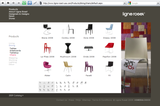
Natasha Lloyd writes, “I thought it was cool how Ligne Roset shows a small thumbnail view of the pages on the bottom to help you navigate. It just shows the shapes of the products in the thumbnail, which is a actually a great navigation tool for furniture and other products that are distinguishable by shape. I think it’s a great take on the typical pagination pattern.”

Crystal
on 07 May 09It is pretty sweet, but it would only work if your content was reasonably static. On a site with chairs, that’s fine; chairs are relatively timeless. But on a site for technology or more frequently-shifting fashions it would be too much of a pain to keep updated.
And unless you wanted to redo all the thumbnails each time you wanted to add a product, you’d have to add products to the last page, which is counterintuitive if you want them to be seen.
Dan Conner
on 07 May 09Also seen on thesmashsite.com
Danny
on 07 May 09The slickest implementation of this style of pagination I’ve seen is on http://www.luigibormioli.com
Carlos Taborda
on 08 May 09Thats a screenshot in FF Windows! Blaphemy
Afrak
on 08 May 09No you wouldn’t. Use a graphics library to generate the thumbnail blocks, when you add a new product add the product+thumbnail. Then let the website or a cron script figure out when the order has changed and re-generate the thumbnail blocks automatically
Dan Boland
on 08 May 09It’s a nice idea, but it isn’t executed as well as it could be—navigation overall is a little lacking because of the size and location of the main nav menu, and the page refresh takes away from what could be a really nice UI.
Chad Garrett
on 08 May 09All this discussion about technique, but nobody visited the site to check up on theirs.
These aren’t “thumbnail blocks.” It’s 3 tables of 16×16 dynamically generated thumbnails.
I’ll admit that this means the overhead of 30 image downloads, but it’s certainly maintainable. They could have replaced those 30 calls with 3 dynamic combined images.
This discussion is closed.