I want to share with you the process that we used to develop the Flash animation that appears on Backpack homepage. The Flash animation itself isn’t a technical or design feat. There are many more examples of that online. It is how we got there that I find pretty cool.
First steps
We had previously launched 3 successful redesigns for the Basecamp, Highrise, and Campfire marketing sites. It made sense for us to approach Backpack in a similar way. Following that system: the main feature is comprised of a headline stating the big idea and to the right an image of a page within the app.

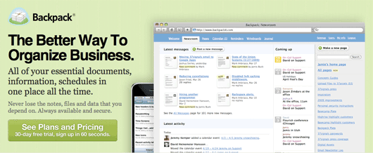
The page view I initially chose to feature was the Backpack Newsroom (above). The Newsroom shows all sorts of activity within Backpack. One glance shows that Backpack can be used by a group of people to share information throughout the company. The Newsroom is also a beautifully designed screen.
Jason, Ryan, and I discussed the design. What would the Newsroom screen communicate to someone who has never heard of Backpack before? It turns out not a whole lot. Is Backpack the Newsroom? How is this going to help a business organize clutter? The Newsroom screen is pretty, but ultimately we all agreed that Backpack was about Pages.
Focus on Pages
I initially struggled with the idea of putting a Backpack Page in the feature area. You can fill a Page with all sorts of content. How could I create a single Page that would resonate with Design firms, Lawyers, Non-Profits, Retailers, etc.?

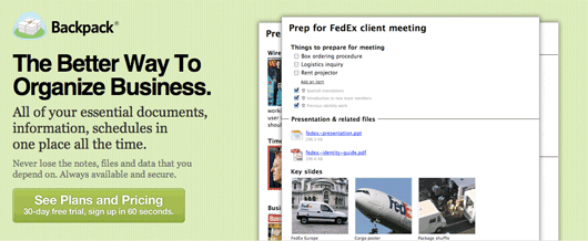
I mocked up design that featured Pages more prominently (above). Jason, Ryan, and I agreed that the design as a sales pitch was pretty underwhelming. As we were talking out loud one someone said, “What if it was a slideshow of different pages?”
What a perfect idea! We can show all sorts of different pages in an elegant slideshow. I created a few different Backpack screens depicting different Page scenarios. Sam whipped up a great slideshow script in no time. I dropped in the screens and voila: a slideshow of Backpack pages.
It’s about creating Pages
There was a problem with the slideshow. It looked great, but we were still depending on the viewer to make that mental leap. Backpack is Pages. OK is it Geocities? What is it? It still wasn’t completely clear what Backpack could do to help organize a business.
Ryan asked, “Wouldn’t it be cool if we could show a page being built using the slideshow?” I thought about using Sam’s slideshow script to fake a page being built. That would require a lot of PNGs. The animation would be a slow dissolve between frames too.
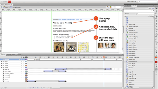
I said sheepishly, “I could try doing it in Flash. Do you care if we use Flash on the site?” I was surprised when Jason said, “No.” If that was the quickest way to communicate best what Backpack could do then yes, we’d use Flash.
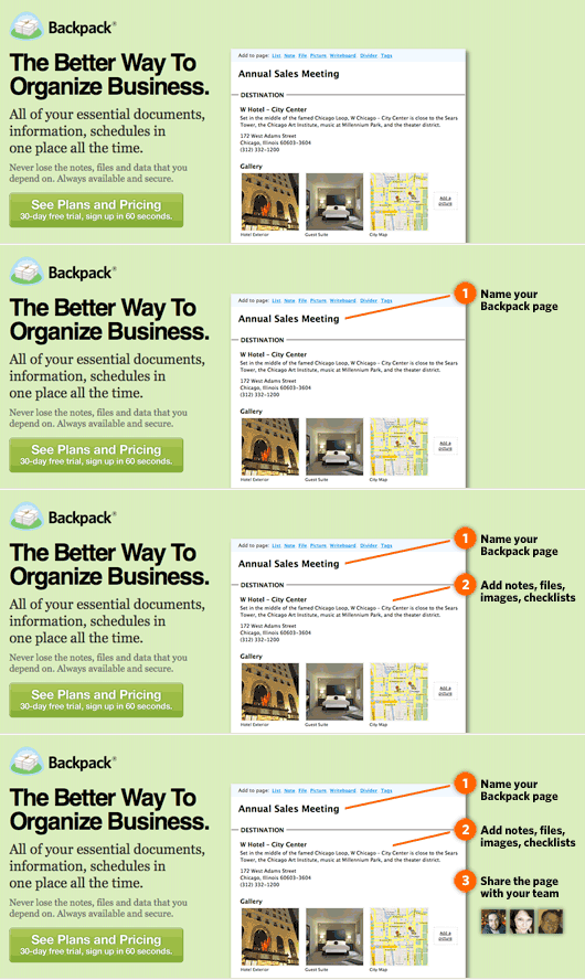
As you probably know if you’ve worked with Flash you need to storyboard first. I also wasn’t completely sure if Jason would like this animated approach. The storyboard was created in Photoshop. If Jason liked the animation then I could use those assets in Flash. I exported the entire sequence as an animated GIF and threw it in a browser for review (sample below).

This animated GIF storyboarding turned out to be invaluable. We were able to get a feel for how the information was presented while also generating assets for use in the final Flash animation. Jason was able to make content changes before I went into Flash production.
The total development process from that first initial Newsroom design to the final Flash animation took about 2 days. That was pretty quick when compared to previous experience.

It is funny looking back on suggesting Flash for the Backpack homepage. I was a bit embarrassed. Flash is such a dirty word especially when it comes to the audience reading this blog. I shouldn’t have been surprised though. 37signals is all about simple solutions. A Flash animation was the simplest way to communicate the usefulness of Backpack Pages.

TR1
on 08 May 09I agree that Flash is a dirty word to a lot of developers/designers, but only because so many people have used it in the wrong way.
Like any technology, there is a time and place for it. Too many people make an entire site in Flash, only because they dont know better. Making a widget like this is a prefect enhancement to a site.
ML
on 08 May 09Flash doesn’t shoot people, people shoot people.
Bruno Abrantes
on 08 May 09Very nice writeup of your design process, and I personally feel the final product really gets it and is able to clearly show what Backpack is all about. What prompted me to write this comment was not only the need to send some props your way, but rather what you said about Flash being “such a dirty word”. I believe this kind of situation (a sales pitch slideshow) is exactly what Flash was developed for, and what has turned it into a dirty word is overuse by developers who build whole sites with it just because they can.
texec
on 08 May 09Looks very good now … but you should adjust the image quality. Currently it sucks if you load it for the first time.
tim Chilcott
on 09 May 09The only thing that irks me is the fact that the bullet points in flash are red, and then on the site below it the bullet points are orange, just a minor consistency detail.
Mark Bottita
on 09 May 09All comments thus far have hit the bullseye: Bottom line is that this application of Flash on the new Backpack marketing page serves several functions; it’s not just thrown in as a cool design element. It saves valuable space, depicts the unfolding of a process (the ease of making a page), and helps the prospect envision how their own pages (and thereby their own organizational improvement) could be realized if they give Backpack a chance.
Jason himself said it best when he spoke of the underlying 37s philosophy in the 9/26/05 BusinessWeek article featured on the 37s homepage:
“Cool wears off. Usefulness never does.”
stefano
on 09 May 09great ! But … Wait … My iPhone can’t display Flash animations :(
Bruno Figueiredo
on 09 May 09BTW isn’t the newsroom screenshot in the tour outdated? It’s not what it looks like now.
Douglas Neiner
on 09 May 09I think the greatest thing about technology is that the developer can choose the BEST solution for the task… which is exactly what you did by making the decision to use Flash! My problem is that every time I use Flash it takes so long ;)
One important note, however, is you need an alternate content for devices and computers not able to view your Flash pres. (Think iPhone). I personally use swfobject (http://code.google.com/p/swfobject/) to show an alternate image for users without Flash.
Luke Stevens
on 10 May 09Nice writeup! I’ve been researching software marketing sites for an upcoming book, and noticed a number of iPhone app sites using animation (be it flash or embedded .mov) to show off their app, and thought ‘Wow, that’s really powerful, more app sites should do this!’ So it’s interesting that you guys ended up there organically. It’s a fairly natural way to give a quick demo of the app I think. It certainly takes the burden off the visitor to mentally put together how it works from a screenshot and feature/benefit list. It’s ultimate value is what it does to the conversion rate though, of course, but I’ll assume it’s positive :)
One small thing – when watching the animation it feels like there’s the animation and ‘the rest of the page,’ i.e. two different contexts and when the animation ends you’re kicked back out to ‘the rest of the page’ (not a bad thing, just an observation). So I’d just suggest putting a call to action button at the end of the animation itself, as if you’ve captured someone’s attention – right then and there – and given them the pitch, it seems like a bit of a missed opp to just say ‘Reply’ and not ‘Try it out!’ right there as well. fwiw!
aris
on 10 May 09Wow. You guys are developing a pretty strong reality distorting field ! ;)
PS. Flash is cool so long as there’s an alternative presentation.
Tim
on 10 May 09Why didn’t you just make the final product an animated GIF (instead of using Flash on the site)?
This discussion is closed.