The idea
Jason Fried sent me a text Saturday morning a few weeks ago: “Pumped about an idea for a ‘meet our customers’ page. In on Monday??”
The idea, I learned Monday, was pretty cool. First we’d ask customers (on our blog and on Twitter) to send in photos of themselves. These photos would be printed out and pinned to a Customer Wall in our new office — an entire wall covered with the smiling faces of our customers. Then we’d create a page on our website that would simulate this office Customer Wall for everyone to see. Within 5 minutes of our discussion, Jason asked customers on the blog to send their photos and bios to me. The photos and bios started arriving immediately. I started designing.
Design and production
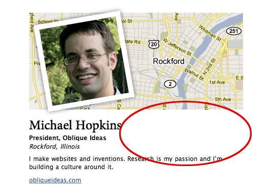
The design of the Customer Wall page is pretty simple. There are only 3 real elements: a photo, a map, and a block of copy.

Making sure that the balance and proportions were right was the tricky part. I used real customer photos and bios for my designs as the emails started coming in. Here are all of my iterations of the customer bio design. Some of the changes from iteration to iteration are seemingly minor, but extremely important for arriving at a tight page layout.
#1 and #2

The first challenge was determining the size of the photo in relation to the size of the map. Some customers submitted long copy and others short copy. Clearly #1’s photo and map were too small based on the copy that was submitted. Here experimented with making the map do a little more work by not spelling out the city and state within the copy. #2’s photo was much too large and the map seemed arbitrarily placed. There was also a huge gap between the imagery and the copy. It all feels too disconnected.
#3 and #4

I thought that I could just set the map at a constant height and the copy could be edited to fit. I attempted this in #3. The photo and the copy seemed to align perfectly. However the map felt like an afterthought. #4’s balance started to feel better. The copy was close to the map. The image size felt right in proportion to the map size.
The problem

Jason’s feedback, however, was that there was still too much whitespace (illustrated by the red oval above). It is true that some people have longer names, so some of that whitespace was necessary. However there must be a way to tighten up that area.
The solution

To shrink the whitespace I reduced the width of the customer bio block by about 100 pixels. I also faded the map background slightly into the customer’s name so that the whitespace felt shorter. Jason also had the great idea of treating the “city, state, country” like a newspaper article. That saved another line. For the final design we even cut out the website link and made the customer’s company name clickable.

Great results
Seeing the Customer Wall come to life has been a blast. It is a great reminder that people all over the world — from our hometown Chicago to Beijing, China to Manchester, UK to Commerce Township, Michigan — depend on our products.
I’ll be adding new customers each week. We’d love to have you on our customer wall! Send us your name, title, company, location, a brief description about what you do, and a list of 37signals products you use — along with a photo — to [email protected] with the subject “Customer Wall.”
©2010 Google, Map data ©2010 Google, Tele Atlas

sebastian
on 15 Oct 10This is a wonderful thing.
Companies that don’t make this are guaranteed to have a lot less rapport with their customers.
Don Schenck
on 15 Oct 10These types of posts - where you explain your thinking and step-by-step decisions - are extremely insightful and helpful.
Thank you.
Dean
on 15 Oct 10Thanks, Jamie… the results look marvelous.
I’d like to implement something similar on profile pages for our genealogy research providers (since where they’re located is pretty important to their potential clients.)
Are you picking the Google Map image manually to optimize the location of the city wording with respect to the customer image? Or is there some algorithmic approach using the Google Maps API that might work?
Jake
on 15 Oct 10Nice idea, but I’m pretty sure Google doesn’t like their maps being used this way. From their Permissions page: “If you want to use Content from Google Maps, Google Earth, Street View, etc. on your website, embed it within the site rather than uploading screenshots.” I believe this is partly because Google is licensing some of the data from other companies (Tele Atlas, etc.).
Bleepins
on 15 Oct 10Looks good… but I think this a violation of the Google Maps TOS (and, more generally, copyright).
Bruno Sutic
on 15 Oct 10Hi, this post is great – showing how the design idea formed. If you have more stuff like this keep them going!
Timothée Boucher
on 15 Oct 10Do you have a picture of the actual customer wall?
Also, any reason why the email address in the last paragraph from that page (and that post incidently) is not a mailto:?
...to [email protected] with the subject ‘Customer Wall.’…
JD
on 15 Oct 10Timothée, the actual physical customer wall is still in the works. Stay tuned.
Ashit Vora
on 15 Oct 10Like the final Design.
Generator Rentals
on 15 Oct 10EXCELLENT Idea! I like the concept of actually seeing your actual customers, regardless of where they physically are. Gives me thoughts for some local businesses to use.
Randall
on 16 Oct 10Jake, Bleepins: Some reasons this use of map data is kosher:
First, under copyright, it’s clearly a fair use by a few of the criteria: it pulls in a tiny fraction of the map data; the use is “transformative” in the sense that this use is very different from Google Maps (it’s not being used for navigation, it’s being used to illustrate the variety of locations 37signals customers come from); and it has no effect on the market value of Google’s map data.
Second, the terms of service are a contract, not law. I’m not a lawyer, but Google probably doesn’t have much it can do to enforce the TOS in court (as opposed to through technical means, etc.) if there isn’t any provable money damage done to Google. That might be different if Google offered a way for companies like 37signals to license a map tile image for a page like this (so Google could say 37s is costing Google the license fees they would otherwise pay), but they don’t.
(Even then, a court might say, no, you can’t take away someone’s fair use rights with a site’s TOS. But courts haven’t been super generous about fair use rights lately, so I wouldn’t count on that.)
Related to that, Google probably wouldn’t find it worth the money to send a cease and desist letter. If anything, it’s good for them that a cool company likes their map product.
Third, they’ve noted that the map data is copyright Google, which is at least part of what Google requires and might be all of it.
Jo
on 16 Oct 10The idea is spiffy and the execution is gorgeous in the screenshots… However, got a bit of a problem with the “pretty factor” of the final product in Linux-land here, I’ll let the screenshot speak for itself. Firefox 3.6.10 on Mint. :)
Francisco Sáez
on 16 Oct 10It builds trust with pontential customers. Fantastic idea and great design.
Jacob DeCuir
on 16 Oct 10@Jo i have the same problem in chrome (on win), but in firefox everything looks fine ;-)
David O.
on 16 Oct 10Nice work, another example of how everyone in 37signals is involved in the marketing and cross promotion.
Eric
on 17 Oct 10A good way to benefit both yourselves and your customers.
Stanley Cai
on 18 Oct 10Very nice article. Learned a lot.
Berserk
on 18 Oct 10@Randall: So it’s ok to do something against someone’s wishes (and contract!) if it “probably [isn’t] worth the money” for that someone to do something about it?
Regarding the copyright information, I’m fairly certain that Google clearly states that the copyright information on the maps is not to be tampered with or hidden in any way (think of it as the copyright law equivalent of Creative Commons Attribution required in the manner specified by the author). Can displaying the creators name in the way the creator wants be seen as infringing fair use?
Note also that the information (displayed on untampered Google maps) clearly states that the copyright of the map information doesn’t belong to Google. Those are not noted on the Customer Wall.
Now, 37s might have an agreement with Google to use the maps this way – but I wouldn’t use this page as an inspiration.
Ali
on 19 Oct 10The white space could have been used to include the icons of 37signal products the consumer was using, (Basecamp, Highrise, etc).
click here for find more online info
on 20 Oct 10The indeed looks quite marvelous, I must say that this is indeed a very good work on your part and I think that it would be a very good thing to have some good effects such as this. It doesn’t some as a surprise if there are many people who are after this services as it provides results that are indeed quite fabulous.
Wholesale Flea Market Items
on 22 Oct 10This is a good piece of information providing some good information about using the technology in the best possible way to the best possible extent. I think that it would be a very good thing to have good benefits as this would assure you to have some good progress in the filed of business.
This discussion is closed.