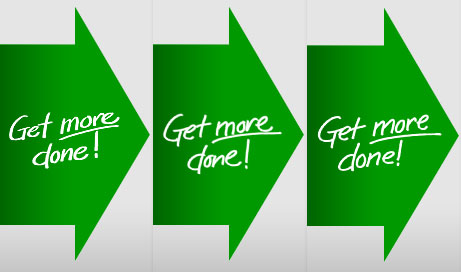
For my first project since joining 37signals I’ve been working on an update to the venerable Account (Upgrade/Billing) screen in Basecamp. We’ll post more about that update and the process to get there soon, but I wanted to share an experience I had as part of this design.
We had decided to include a few short handwritten phrases as graphic elements. Sometimes in the perfect world of web design, elements that have an organic, handmade look can soften the message and draw the eye. These phrases enhance the message but don’t convey any hard data that is intrinsic to the upgrade decision. That makes them a good place to have a little fun and lighten things up.

So, I wanted to make them look as if they’d been casually written directly on the page. They needed to look casual and authentic so no fonts. It can be tempting to use a script or handwriting font for an application like this, but they never fool the eye. I learned a long time ago that you can’t fake it — if you want something to look handmade, make it by hand.
But what I found is that this task was a lot tougher than it sounds. I must have written and re-written some of these phrases more than 50 times trying to get just the right flow, the perfect amount of flair, and a cohesiveness with the other phrases. But “perfect” was exactly the wrong approach here. Handwriting isn’t perfect and the irregularity is where the character and charm I was going for would come from. So I settled for “good enough”, which turned out to be ideal.
So instead of carefully drawing each letter and placing them together, I practiced a few times and just wrote each one out as quickly and naturally as if I was writing in my notebook.
My fingerprints — almost literally — are going to start showing up in 37signals products in the coming weeks. I’ll be sharing more of the process as we go.

Jannus Meyburg
on 11 Jun 09Just yesterday one of my friends said that we would like to see more handwritten elements on web pages. You guys are always one step ahead it seems. Big ups on sharing your first bit of 37S experience… looking forward to hearing more about your design processes.
pwb
on 11 Jun 09One of my new favorite apps: Balsamiq.
Nate
on 11 Jun 09Speaking of Balsamiq and hand written, this was a neat idea for marketing materials they put together. Hand written and useful apart from marketing Balsamiq.
Peter Christensen
on 11 Jun 09Funny, I wrote this earlier today about how I used perfectionism as a stall technique. It’s funny when you find something exactly in tune with your thoughts at a given moment.
Stalling
Brenton
on 11 Jun 09A few years ago, I got tired of trying to use WordPress to display my illustrations, so I knocked out a Flash gallery to do the job. The UI isn’t great, but it’s really easy for me to update (which was key).
I too sought out a hand-drawn aesthetic. The static text (title and signature) are indeed hand-drawn, but the section titles are introspected from the file system – if I want to add a new section, I just need to add a new folder to the FTP.
There was a tool that came with my TabletPC to create your own fonts. I made one for The Illustrated Life (my sketch gallery) and embedded it into the SWF.
Admittedly, the kerning looks a bit off if you look at it typographically, but it fools most people. It’s neat to have your own handwriting font, too. =)
Tathagata Chakraborty
on 11 Jun 09Great post! I have been thinking on these lines for a while now. Would it not make sense to have something that does this automatically for you? (Rather than having to scribble out the text dozens of time, to get it near about right)
Matt
on 11 Jun 09A mentor of mine used to say, “Perfect is the enemy of good enough.”
Classic. Simple. Forever true.
Jules
on 11 Jun 09Great post! Your handwriting isn’t bad, either.
GeeIWonder
on 11 Jun 09Good is much better than good enough, and perfect doesn’t exist.
MtnDweller
on 12 Jun 09To get a natural feel you really have to do it without thinking about it. Some of my favorite illustrations are done while I’m just drawing to be drawing with nothing planned. Just doing what is natural can be the perfect end-product sometimes.
Jake
on 12 Jun 09Good post. Musicians have known this for a very long time. Recordings have more flair and personailty and flavour when they’re not over edited.
Paul
on 16 Jun 09Write them out really big with a marker, then shrink it.
This discussion is closed.