You’re reading Signal v. Noise, a publication about the web by Basecamp since 1999. Happy !

Jason Z.

About Jason Z.

Jason Zimdars joined Basecamp in 2009 as a UI designer. Most recently he worked on Basecamp for iPhone and iPad. He thinks about Basecamp constantly.

Building Basecamp 3: Mobile Prototypes

Jason Z.
Jason Z. wrote this on 8 comments

Interactive prototyping was essential to designing Basecamp 3 for iOS and Android. In this article we’ll look at how we chose a prototyping tool and take a peek at a few of our prototypes.

At Basecamp design happens through iteration. We don’t make highly-polished comps but instead work right in Basecamp’s code making hundreds (even thousands!) of tiny revisions until the design is just right. We can then see and click the work-in-progress design just like our customers will the finished product. We’ve done it this way for years—our workflow and development stack are highly optimized for it.

When designing Basecamp’s mobile apps it was a completely different story. Even for the simplest of changes the difference between refreshing a web browser and building an app to a device (or simulator) is orders of magnitude slower. It’s worse when you consider that making even seemingly minor visual changes to iOS or Android designs in native code can take much more time than you might expect. Over the course of a day that time adds up. All told, we had to find a better way.
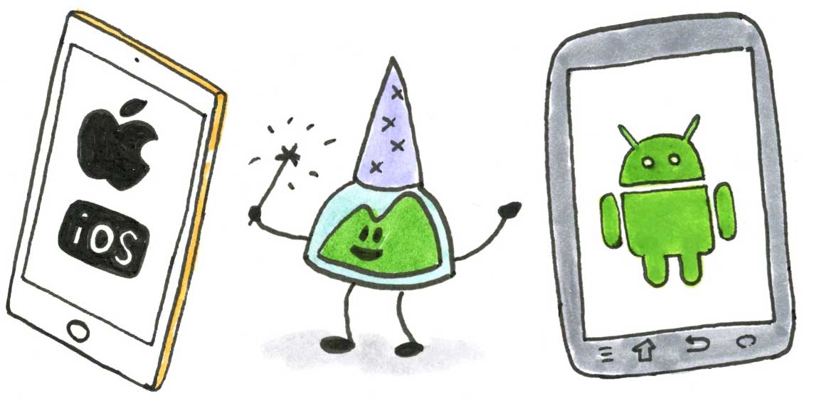
Basecamp 3 mobile wizard

Solution: interactive prototypes

We knew right off that static Photoshop mock-ups weren’t going to cut it. We wanted to see and touch our designs on real devices. It was tempting to simply make prototypes in HTML, CSS and JavaScript—tools we’re very familiar with—but it turns out they’re a poor fit for the kinds of designs we wanted to try. Simple things that are essentially free in native code can be difficult or quirky in web browsers. For example, full-screen transitions or fixed navigation bars.

So we set out to find a prototyping tool that met these requirements:

  1. Fast. Above all a suitable tool had to be faster and easier than putting something together in native code or even HTML/CSS. It was equally important that the round-trip was short between making changes, previewing them, and making further tweaks.
  2. Real devices. We wanted to see and touch designs on real devices, desktop emulation alone wouldn’t cut it.
  3. Shareable. Prototypes would serve two purposes: Quickly sharing work-in-progress designs for critique and sharing the final, high-fidelity reference designs with our programmers.
  4. Cross-platform. We’re all developing on Macs but it was important that any tool worth considering would be suitable for prototyping both iOS and Android app designs.

We looked at a ton of tools and put several through their paces including Quartz Composer w/Origami, Form, Pixate, and Briefs before settling on Framer.

N.B., We evaluated these tools nearly one year ago at the beginning of Basecamp 3’s mobile development so some of the reasons we choose Framer over the others may no longer be true. In fact, Quartz Composer was my favorite tool to use—the springy-band UI is unique and super-fun—but it lacked on-device preview at the time, a deal-breaker for us that has since been corrected. What I hope you’ll find interesting in this article is how Framer met our requirements and what we learned about those requirements after we had been using it regularly

Continued…
Natasha “The Robot” Murashev joins Basecamp

Jason Z.
Jason Z. wrote this on 5 comments

We’re excited to announce that Natasha Murashev has joined us here at Basecamp as a programmer on our iOS team.

Despite receiving over 100 applications for this position, it was by far the highest quality group of candidates we’ve seen. Not only is Natasha an excellent programmer but what made her truly stand out is her teaching spirit. Her popular blog on the Swift programming language is the fruit of her habit of sharing everything she learns, a process that helps her to slow-down, articulate, and document the discoveries she’s made while benefitting the wider community. In addition she publishes a popular Swift newsletter, This Week in Swift, and is a regular conference speaker. As a company we have a long history of sharing what we’ve learned so we think Natasha is a great fit!

Basecamp 3 is just a week old but we’ve got big ideas for our iOS app so we’re excited to have the firepower to make them happen. Natasha will be working remotely for us from her home in San Francisco Seattle everywhere as a self-styled digital nomad. Naturally, she’ll be blogging her adventures.

Please join us in welcoming Natasha to the team!

Studies of conversation both in the laboratory and in natural settings show that when two people are talking, the mere presence of a phone on a table between them or in the periphery of their vision changes both what they talk about and the degree of connection they feel. People keep the conversation on topics where they won’t mind being interrupted. They don’t feel as invested in each other. Even a silent phone disconnects us.

We’ve gotten used to being connected all the time, but we have found ways around conversation — at least from conversation that is open-ended and spontaneous, in which we play with ideas and allow ourselves to be fully present and vulnerable. But it is in this type of conversation — where we learn to make eye contact, to become aware of another person’s posture and tone, to comfort one another and respectfully challenge one another — that empathy and intimacy flourish. In these conversations, we learn who we are.

Jason Z. on Oct 13 2015 7 comments

You’re a product and your job application is a user interface

Jason Z.
Jason Z. wrote this on 5 comments

Once or twice a year I find myself on the receiving end of job applications. That’s the case today as we consider candidates for our open position on Basecamp’s mobile team. Having reviewed over 100 applications so far I’ve seen a wide variety of approaches. It occurred to me that the best applications are a lot like great products.

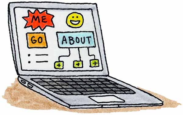
Product package illustration The best products are easy and enjoyable to use, they make us feel successful. Similarly, the best job applications make it easy for someone to hire you. In a moment I can tell you read the job posting carefully, you included all the relevant information, you’ve done your homework (you know something about the company and its products), you actually want the job (do not play hard-to-get!), and you’re nice.
There is a real person on the other end of your job application responsible for making a decision. They’re worried about making a bad choice; one that could embarrass them in front of their boss and coworkers; one that could cost them money, their job, or even their company! They want to feel good about hiring you and they want it to be easy.

Think of your job application as the user interface for you, the product, as you consider these suggestions:

Good software does work for you

Laptop UI illustration Many job application emails are simply an invitation to visit the candidate’s website to “learn all about me”. I have no doubt that those sites contain everything I need to know including links to Github repos and fulfill all the requirements laid out in the job post but don’t leave it to the hiring manager to sift out the good stuff. Why trust that they’ll pull out the best bits anyway? Surface your highlight reel right in the email. If all you had was a thirty second elevator conversation in which to tell someone why they should consider you for the job, what would you say? Write that.
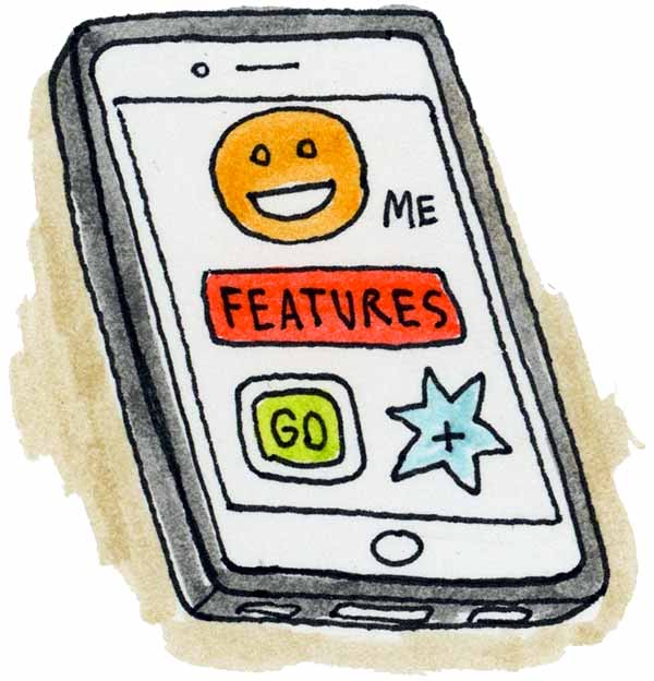
Avoid feature bloat

You may have 20 years of experience, know 30 programming languages, have shipped 40 apps, and pushed 1000 commits to OSS projects but as the user of your job application I only need a few of these “features”. No one gets hired for being comprehensive. If you have so much experience and can do all of these different things—great!—you can apply to many different jobs, but for each one, trim down to the skills and experience that matter most. Be a curator.

Of course, if you’re applying for a job at a Fortune 500 company where you know your résumé is going to be sucked into a database only to be retrieved by some keyword matching algorithm, then by all means detail every job, every language, every piece of software—pack it full of keywords. Just don’t use that same application when applying to the founder with a team of five.

Get the message right

Mobile UI illustration You wouldn’t wear a suit to interview with a Silicon Valley start-up (unless it was totally ironic, right?) so why would you send them a dry, boring resume and cover letter from a template you Googled? If you’re applying for a job that requires you to be creative and inventive, why not be creative and inventive? Take an approach they’ve never seen before. Imagine everyone who applies for the same job is completely qualified—what makes you the right person for the job? Chances are it’s something that isn’t even on your résumé. It’s your personality or your effort. Sometimes it’s as simple as being clear that you’re not not seeking a job but this job.
Nobody likes spam

If your job application consists of a one-line email with a résumé attached you’d better send out a ton of them because you can probably count on the same return rate as the Cheap Meds guys. If it looks like you spent 15 seconds applying for the job why would you expect the person hiring to spend any more time reading your application? What if you were delivering your résumé in person? What would you say? Again, write that.

Wait! You’re just being lazy!

You might be tempted to refute these observations by simply calling me lazy (it might even be fair). The point here isn’t to demand, “these are the things you must do to get hired” but to make clear that some people are already doing them. They’re the ones who make hiring them a no-brainer.

That’s who you’re up against.

Imagining Basecamp on Apple Watch

Jason Z.
Jason Z. wrote this on 11 comments

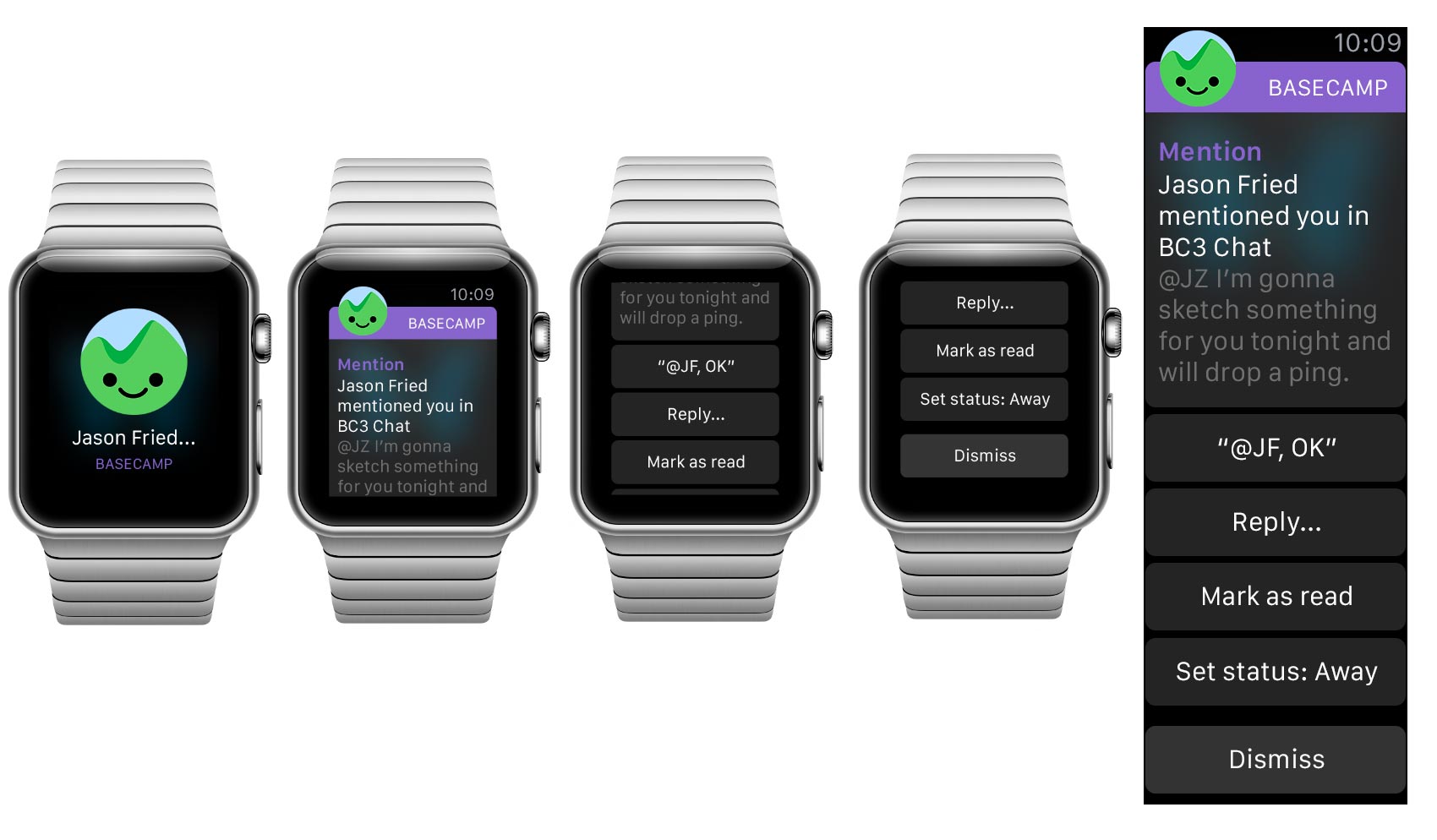
Over the last day or so I spent some time learning about the different Apple Watch components (notifications, glances, WatchKit app) and imagined how Basecamp might work on the upcoming device. Here’s what I came up with.

Notifications are a given for Apple Watch. The ability to see what’s new in your projects simply by raising your wrist sounds fantastic.

Apple Watch mentions flow

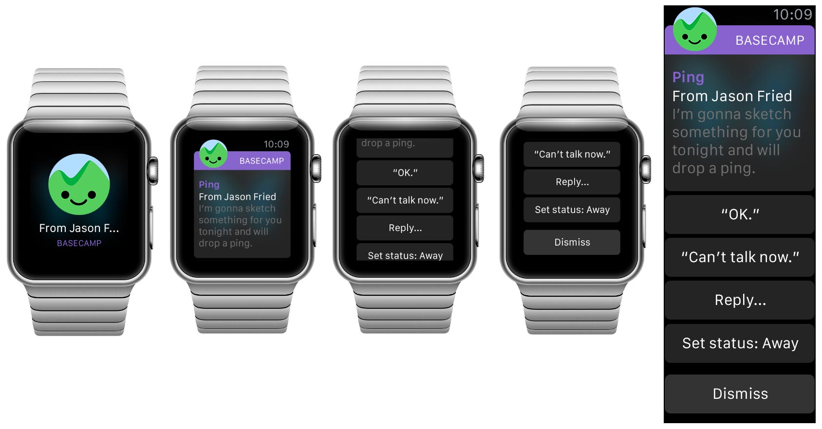
Canned, quick-reply options could be great. I also like the idea of setting your status as an option when notifications start piling up.

Apple Watch pings flow

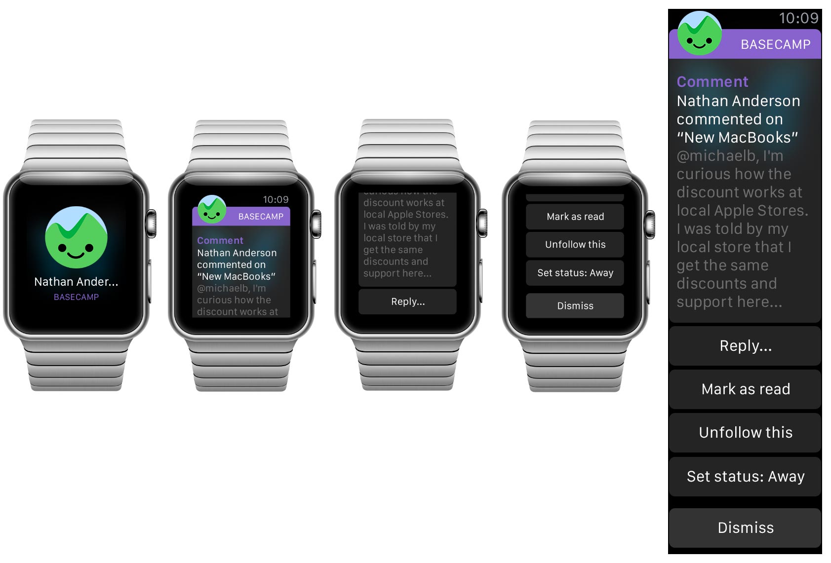
It’s interesting how the actions can change depending on what kind of communication it is—there are a ton of possibilities. Comments, for example, could offer “Stop following” or “Bookmark” (not shown).

Apple Watch comments flow

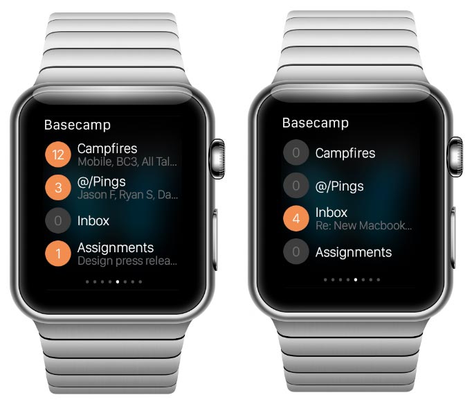
Glances are for quick information display, a great place for state-of-the-world type content. This glance answers the question, “Is anything new in Basecamp?” by showing what’s new for you by bucket and how many items are in each.

Apple Watch glances


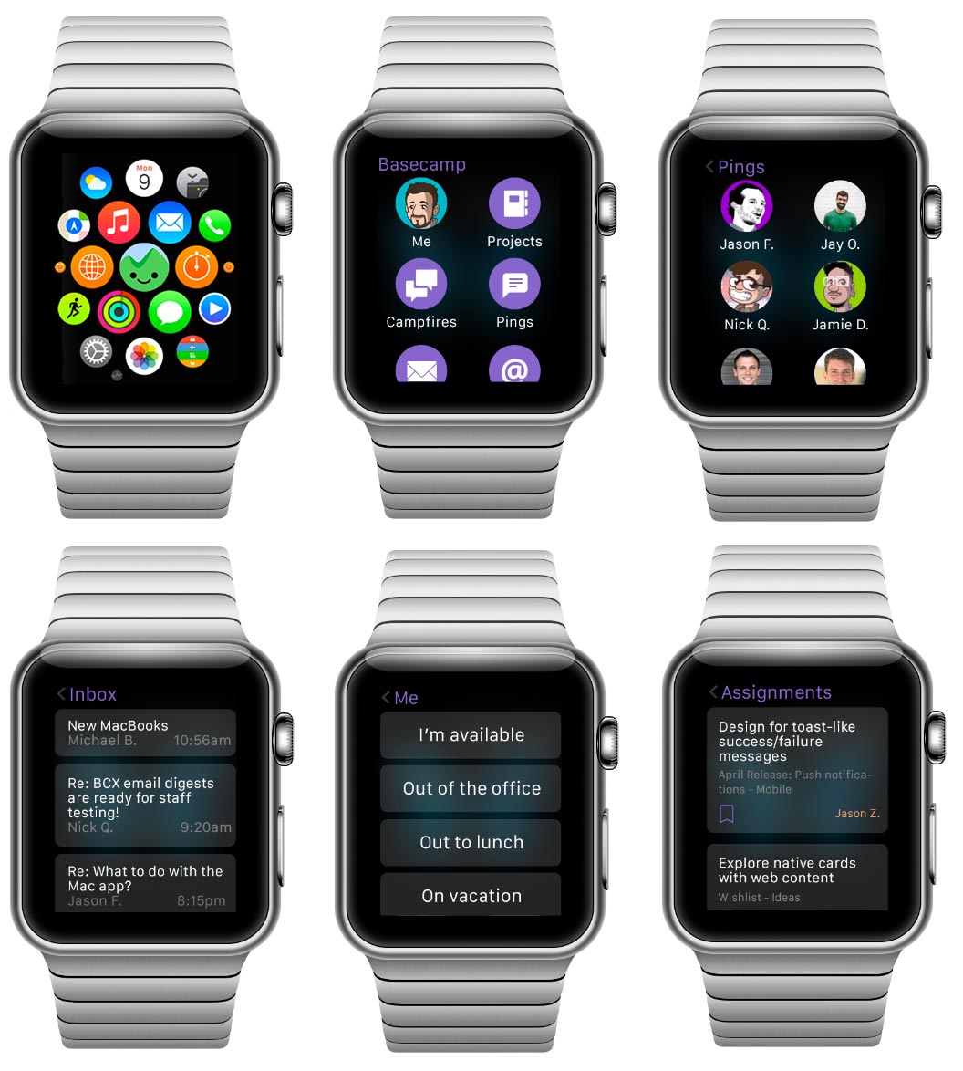
Notifications and Glances are outside the WatchKit app, itself. Here are some additional sketches showing how full a WatchKit app could look:

Apple Watch screens

I went into this skeptical but came out convinced there is a lot in Basecamp that could be useful on a watch. Notifications seem natural, in particular, but any kind of communication has potential. These simple designs use mostly stock UI widgets until we have a better idea what can or should be customized further. We’re certain to have new ideas once we have the device on our wrists.

Taking off the developer goggles

Jason Z.
Jason Z. wrote this on 6 comments

One of the very best things about working at Basecamp is “Everyone on support (EOS)”. That’s our policy where everyone on the team—no matter what their normal job is—spends one day per month as a customer support agent.

Each time my turn comes around I marvel at the truly excellent service our team provides every single day in what is a very tough job. Our team’s ratings and response time are insanely good even with dead weight like me pulling down their averages one day a month. I have no idea how they all remain so positive in a role where it feels like all day you’re saying “no”. Let’s face it, many customers know the answer to the question they’re asking. They’ve looked everywhere and tried everything so they’re frustrated, defeated, and sometimes grumpy by the time they reach out to a support agent— one who is understanding, empathetic, but often powerless to fix the problem. They have work to do and all this tech stuff just gets it the way.

While I’m glad to gain in appreciation for my coworkers what’s even more important about those stints on support is that I always learn something.

I know a lot about Basecamp already. I’ve been working on the current version of Basecamp almost exclusively since before the first commit back in 2011, from the first napkin sketches to its launch on iPad. What that means is I have internalized a very intricate mental model of Basecamp. I know every feature inside-out—and not just that, but code, domain models and all the decisions and debates and history that lead to why things are the way they are, why they aren’t another way and what compromises fit in-between. That’s not to brag, many of us who make products can say the same thing. These apps are built from our passions, they’re our babies. We can feel them. We notice when an interaction takes a beat too long, when a button is a few pixels out of alignment.

All of this blinds us. We’re wearing developer goggles.

Continued…

Welcome Jay Ohms, programmer

Jason Z.
Jason Z. wrote this on 1 comment

Today we’re excited to announce the latest addition to the Basecamp team: Jay Ohms joins us as our lucky 13th programmer. He’ll be working with our mobile team on Basecamp for Android.

Android enthusiasts will know Jay as the one part of the duo behind Press, the popular Android RSS reader. Press arrived at a time when great design was hard to find on the platform. Jay’s focus on quality and eye for detail made Press a favorite and caught our attention, too.

After spending a week working with our Chicago-based Android team on a trial project we knew Jay, who also happens to live in Chicago (did someone bribe an alderman?), was a great fit. Jay makes us better on Android and we’re excited to show you what we’ve got in store for 2015.

Everyone, Jay; Jay, everyone.

Hybrid : How we took Basecamp multi-platform with a tiny team

Jason Z.
Jason Z. wrote this on 9 comments

Yesterday we announced the official Basecamp app for iPad. Just like our other apps for iPhone, Android, and Kindle it’s a hybrid—a native wrapper around a mobile web core. We’ve written about this setup before but today I wanted to really get into the details to show how it all works and how we’ve been able to launch four distinct apps with a handful of developers, just 5 people in all.

How it works

Basecamp has variants for desktop, phone and tablet. Desktop is the default browser experience we launched in 2012. When it detects a mobile device or a native app declares itself, Basecamp renders the phone variant. The phone variant has its own set of templates and its own images, CSS, and Javascript assets. Nearly every screen in Basecamp has both a desktop and a phone template. Here’s how it looks:

Variant flows for desktop and phone

While developing Basecamp for iPad we introduced a third variant: tablet. Basecamp’s phone.css already includes responsive styles which allow it to adapt to portrait and landscape layouts as well as larger phones, tablets and everything in-between. The tablet variant uses these phone styles as a baseline and then layers on additional CSS for specific tablet designs (like those for the iPad app). Responsive design has plenty of drawbacks if you’re trying to take a complex app designed for the desktop all the way to phones but it’s fantastic when you need a nip and tuck from phones to tablets. Furthermore, the tablet variant can have its own templates when a nip and tuck isn’t enough. Making a new variant template means new cache fragments so we generally tried to go as far we could with responsive designs before making that trade-off.

Continued…
bcx-android-teaser.jpg

We’ve got something cooking and we could really use your help. Grab your recent Android device, Basecamp (not Classic) account, and join the beta.

Jason Z. on Jan 27 2014 9 comments