Flows are just as important to good interfaces as individual screens are. Customers don’t land on screens from out of nowhere. Specific sequences of actions lead customers through your app as they try to accomplish their tasks.
But as important as they are, flows are hard to communicate during the design process. Drawing out every state of a flow is too time-consuming. And drawings become instantly outdated as screens change. On the other extreme, flows written down into stories or paragraphs are hard to reference and they don’t easily decompose into checklists for design and review.
Working on 37signals Accounts has recently raised this issue of communicating flows for me. We have whole sets of flows that need to be properly designed, implemented, tested and retested. So I’ve scratched the itch with a simple shorthand.

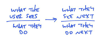
Flows are made out of individual interactions. A screen offers some possibilities and the user chooses one. Then something happens, and the screen changes. It’s an ongoing conversation. Each moment in a flow is like a coin with two sides. The screen is showing something on one side, and the user is reacting on the other side. My flow diagrams illustrate this two-sided nature with a bar. Above the bar is what the user sees. Below the bar is what they do. An arrow connects the user’s action to a new screen with yet another action.
Here’s a simple and concrete example. To add a to-do item in Basecamp, first you go to a list. Then you click to “Add an item.” The form appears. You fill in the item content and submit the form, and if your submission is valid, the item appears and flashes yellow. Here’s a shorthand version of this flow:

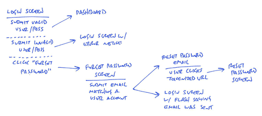
The format is really fast to sketch, and it communicates the essentials of what needs to happen as I’m imagining it. For such simple examples, you don’t really need a shorthand. But for more complicated flows, especially of entirely undesigned sections of an app, the shorthand can illustrate a lot of behavior. Here’s a more complicated example for a log-in flow:

This log-in flow includes a few more notations. The dotted line separates alternate actions. There’s only one login screen, but there are multiple possible actions on that screen. The dotted appears above each additional action. Think of it as “or”. When there are multiple actions, the arrows point from an action to a new screen. Screens where the possible actions are uninteresting or out of scope simply have no bar below them. Like “Dashboard” in the diagram above.
You’ll also notice there are two arrows pointing out from “Submit email matching a user account” under the “Forgot password screen.” That’s because two different screens result from that action! You can think of the multiple arrows from an action as “and.” The updated login screen with “your email was sent” message is a result of that action, and the “forgot password email” is another result. Emails are screens because they participate in interface flows.
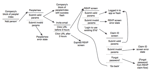
Here’s another complex flow. This one’s for sending and claiming invitations to create a user account:

Now don’t forget: all diagrams are destined for the garbage. The meaningful work is work that directly affects our customers in the form of screens they can see or code that functions. But we still need to communicate and manage our work along the way. This shorthand has met a bare minimum for me to get a flow out of my brain in order to move on to other things. I hope it’s useful for you too.

Heiko Behrens
on 17 Sep 09Simple but effective. I like the distinction “see” and “do” while looking at them as a unit.
Again, a nice piece you guys share. Thanks.
Matt Gillooly
on 17 Sep 09Nice! Looks like this could flow smoothly into Cucumber stories.
Michael Gaigg
on 17 Sep 09Like how you attached the actions to the page they live on. I’m traditionally used to flowcharts etc. with conditional branches. Your approach allows a page element (possible user action) to exist, the user sees it and does something (or not).
PS.: thanks for removing the boxes around the items!
BJ Neilsen
on 18 Sep 09I’m super excited to use this flow for new projects, very cool stuff.
Daniel Smith
on 18 Sep 09Very nice. I definitely see the benefits from a programming perspective but I’m also trying to absorb it from a writer’s perspective. Books are predominantly linear media that “flow” too. It’s very interesting…
Ben
on 18 Sep 09Perfect! That’s how I’ll be doing my flows from now on.
thanks Ryan
Scott Semple
on 18 Sep 09Careful now… That’s starting to look like a design and development plan. Which 37s doesn’t do, right? ;)
David Locke
on 18 Sep 09I’ve done the same flows in MS project long before the web. Ultimately, they roll up to a task. Call the task a use case. Populate it with real data, and you have a scenario.
I did it to do a take off of the flows to obtain a count of the elements in my own work breakdown structure.
You can take the flows further by connecting the flow elements to a conceptual model and a controlled vocabulary. Users build their own conceptual model from their use of the features. The user conceptual model from the flows, and the data populating the features in those flows.
You can also translate the flow path to end-user benefit, and economic buyer value. Is it a point of difference/contention/similarity relative to your competitors?
Your flows would delineate minimal marketable functions (MMFs) in a feature-driven design approach. Agilists could see the flow map at a higher granularity as a product roadmap. A single MMF would take a series of iterations and result in a single release.
Another thing that your flow maps would show you is what elements are hubs, rather than nodes. You can count the links between flow components. Long paths converge. Hubs resist change while the components distant from hubs change easily.
As long as you don’t have any cycles, mindmapping software will work.
JAWEL_
on 18 Sep 09Nice integration of screen designs with activities. I used to work with UML activity model seperate from screendesigns, but this works way better. Thanx.
Anonymous Coward
on 18 Sep 09@David Locke – I think the point of this ‘short hand’ is to just get the basic work flows out. It isn’t meant to be over analyzed…
Camilo Telles
on 18 Sep 09A bit more complex but with the same basic idea. What you have draw are states (what the user sees)/transitions(what they do). There is a classic representation for this in computer science. It´s a state diagram. You have put it in a 37 signals way. simple and elegant :)
http://en.wikipedia.org/wiki/State_diagram
Ben Kittrell
on 18 Sep 09I have a question for you guys. You seem to like to draw a lot, which is great. But I’m wondering, with a geographically dispersed team, how do you share these? Do you scan them? Seems like a lot of trouble, just wondering if you had some slick setup that help you share this analog information.
Russ
on 18 Sep 09Love the concept. I wish i could just get the decision makers to understand that changing their mind halfway through makes me have to go back and redo a lot of crap that is “destined for the garbage”
Ryan
on 18 Sep 09I like it. Thanks for the tip.
Ben
on 18 Sep 09shhh. Don’t tell anyone, 37signals does software modeling. Next thing you know, they won’t throw out the designs, and will share them between team members to disseminate useful information.
Ivan
on 18 Sep 09I normally use flow charts for this, but you just made me realize how awkward it is to try to cram alternate actions in one of those diagrams.
Your method is simpler, more readable, and very 37signal-y, thanks for sharing!
Rod
on 19 Sep 09Looks very simple and easy to use. In fact – it reminds me a lot of UML state machine diagrams, where states and actions in that state are represented together. So in essence, this “See / Actions” rather than “State / Actions”.
Juvenn Woo
on 19 Sep 09Thank you, Ryan, for making my life easier. I’m not an professional designer, though I try to make my app looks good, and I could not make any progress on my project for a week or even a month, just because my inability to design. I’m always wondering how do your professional designers to make a design, what’s your work-flow. Hope to see more these little beautiful tip in the future.
bonder
on 21 Sep 09@Ben Kittrell, when I work with distributed teams I find it’s easiest to take a digital snap of the flow/wireframe/whatever and email it or post it wherever it needs to go.
The pictures may have a lifespan of the user story, or longer – I keep some for nostalgia/future inspiration reasons – but I find it easier to grab my phone than to scan.
HTH
RS
on 21 Sep 09We rarely share drawings. Drawings for us are more of a support for the work we’re doing individually. My drawing of a flow is something I refer to myself when conceiving a feature, writing out the to-dos, or reviewing. In the rare case where we do share a sketch, we’ll do whatever’s easiest to digitize it (scan, phone camera, whatever) and toss it up in Campfire or a Basecamp project.
Jake Behrens
on 21 Sep 09Thanks for sharing this quick method for getting started! I typically have the issue you spoke of with changing screens and having to re-route flows with wireframes early on and this is a good way to help alleviate that problem.
Gary
on 21 Sep 09Great concept if there are simple choices on each screen. I tried it on a more complex UI I am working on right now. When you have a more complex scenario (like multiple edit controls on a single screen) it gets messy fast. At that point I wonder if it’s very helpful.
RS
on 21 Sep 09If you have so many controls on one screen, chances are they don’t all belong to the same flow. They probably belong to different actions, where a few actions are related but many others are separate.
Sketching a flow isn’t about meticulously documenting everything that’s possible on a given screen. It’s about taking a single goal and asking how does the user get started, what happens when they execute the action, what are the main forks in the road, and what happens when they are finished. If you scope the flow by a specific goal instead of by screens, then there should be fewer complexities.
Think “adding a to-do” instead of “flows for the to-do screen.” The first is tractable, while the second is massive and unfocused.
Ben Edwards
on 21 Sep 09I like this a lot. Very simple and direct and doesn’t result in something people feel the need to print and save. I will start to include this shorthand into my workflow immediately.
Design Manchester
on 22 Sep 09This is a great article, particularly as a designer something this simple will allow me to work through the flow of a site and make sure I have all the different scenarios covered.
This is something I have not done before but I will be including it in my workflow immediately!
Wytze
on 22 Sep 09So what I’d like to know next is: once you’ve drawn out a flow like this, when do you decide that you’re making things too complex for users? Very often, adding an extra checkbox in one of the early screens allows you to cut out one of the later screens because you’re letting the user think ahead. That way there are more decisions to make upfront, but fewer screens to plough through. Where’s the tipping point that says “Too many screens, add more form fields” or “Too many form fields, cut up decisions into more screens”?
JF
on 22 Sep 09Where’s the tipping point that says “Too many screens, add more form fields” or “Too many form fields, cut up decisions into more screens”?
You make your best guess, design it, and use it. Then you’ll know. Before that it’s just too abstract. You’ve gotta see it and use it in order to know for sure.
Tobin Harris
on 22 Sep 09I just tried doing these online using http://yUML.me. It works pretty good. You can chose PDF or PNG too for instant sharing :)
PNG: http://bit.ly/s17jm PDF: http://bit.ly/GGQUp
Drawing this diagram took about 2 mins – although I’m used to yUML syntax.
I’d suggest using the experimental page for easier direction and size control http://yuml.me/diagram/scruffy/class/draw2.
Tobin Harris
on 22 Sep 09For those interested in using yUML for this. The first diagram in this post can be recreated with the following DSL on the yUML draw page:
[What the user sees|What they do]->[What they see next|What they do next]Which produces this image:
http://bit.ly/3Jx7aD
Anonymous Coward
on 23 Sep 09I have to disagree. I looked at this several times and found it hard to “read”; I also don’t really see the need to improve; I find traditional flow charting both simple and effective and easy to “read”. But if it works for you and the members of your team who need to be able to “read” your flows to implement them, then all the power to you.
This discussion is closed.