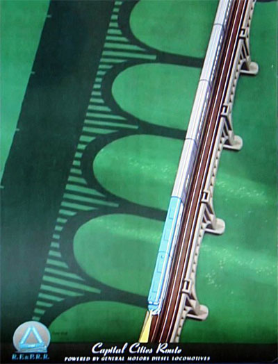
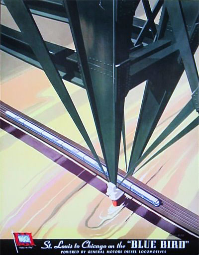
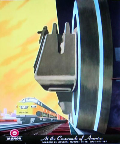
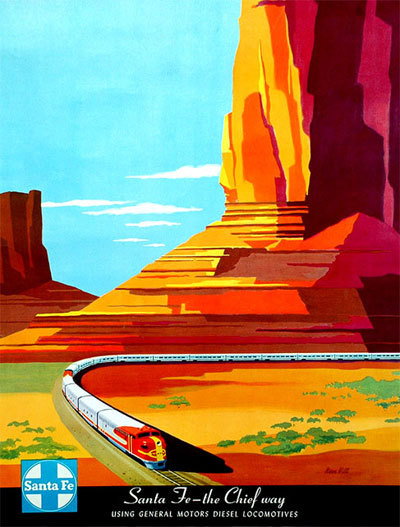
Some beautiful 1950s railroad posters from the cover of Railway Age Magazine. Illustrations by Bern Hill. You can check out the collection on Antiques Roadshow.
You’re reading Signal v. Noise, a publication about the web by Basecamp since 1999. Happy !
Some beautiful 1950s railroad posters from the cover of Railway Age Magazine. Illustrations by Bern Hill. You can check out the collection on Antiques Roadshow.


Brad
on 10 Nov 09Wow. These are really a-track-tive. That designer must have had a lot of training.
Jim Gay
on 10 Nov 09+1 Brad
David Mermelstein
on 10 Nov 09Railroads need to make a comeback.
Bob
on 10 Nov 09Love the perspective on #2 and #3.
Alex Young
on 10 Nov 09These really remind me of Ayn Rand – Atlas Shrugged.
Kevin Holesh
on 10 Nov 09I love the perspective on the first one.
@Alex, Taggart Transcontinental!
Girish
on 10 Nov 09Santa Fe poster is fantastic, ofcourse so are the others.
Blue Sail Creative
on 10 Nov 09These definitely have that “Atlas Shrugged” type of look. If you look up the book cover, it has the same look.
Elsa Solender
on 10 Nov 09I really wish someone would put together a book of Bern Hill’s posters. I can’t afford to buy one, but I would pay to have a collection of them in book form.
Arash Zafarnia
on 10 Nov 09Coincidentally, Kanye West posted this video on his blog, of a 1958 Disneyland TV prediction on the highway of the future. Simple in its color and appearance, still lofty in its predictions :)
http://bit.ly/29bzjM
Daniel
on 10 Nov 09Reminds me of some 1950s Danish railway posters too (but I suppose every country had railway posters in that general modernist style at that time). Some examples:
A reminder to unload your cargo quickly to save money – motif very much like the 3rd poster above
Bridges seem like a popular motif, too
Illsutrator/graphic designer Aage Rasmussen also did a poster of the same bridge, but he also created what is likely the most famous of the Danish railway posters: An ad for the the new high-speed trains (120kph!) (couldn’t find larger res, sorry)
By the way, this site is a good place to see more stuff like this: International Poster Gallery
David
on 11 Nov 09Saw this episode of ARS. Surprised to hear the guy say that the original artwork was less valuable than the posters.
David S
on 12 Nov 09What strikes me is just how powerful these posters feel...they have a nearly physical impact, and convey very strong emotion that goes deeper than just a cerebral appreciation.
And totally without words or typography. Just the colors, shapes and division of the space (which has remarkable balance).
Hard to imagine being able to improve upon them.
This discussion is closed.