Greg Borenstein writes in about the Quicksilver Radial Menu:
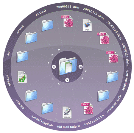
Seeing your screen capture from the Quicksilver preference pane recently reminded me of one of my all-time favorite outside-the-box interface elements: the Quicksilver Radial Menu. I can never quite decide if it’s ingenious or just utterly daft, but it’s a whole alternate interface style available for Quicksilver that opens up a transparent circle around the current item you have selected.
If you invoke it on a folder, for example, the radial menu shows you the contents of the folder arrayed in a circle around that folder’s icon [see below].

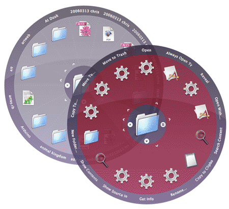
Then, if you hold the mouse down on any of the spokes, it shows you the actions available for that item [below].

Also, you can hit the arrow below the central icon at any point to flip the whole works over for more options (for example, to toggle between action and navigation modes). Like everything in Quicksilver, these options are all ingeniously and infuriatingly context-aware, constantly changing based on what kind of item you’ve got and what actions are available.
The whole experience is a little bit like someone smashed open the contents of your hard drive and the capabilities of all of your apps and just laid them open for you on a flat surface.

justin
on 19 Jan 07Link to article? How does one find this nifty looking radial menu?
Matt
on 19 Jan 07Justin—go here: http://quicksilver.blacktree.com/
Josh
on 19 Jan 07Open up the QuickSilver Prefs, go to Plug-Ins, then “All Plugins” in the side-menu. You should see a plugin marked “Constellation Menu” with a beta symbol next to it. Click the checkbox to install.
To use you just start using Quicksilver like you normally would, bring up an object, tab, then start typing “Radial”. Hit enter on “Show Radial Action Menu” and you are good to go.
MH
on 19 Jan 07Quicksilver is an amazing app. I’ve had it on my home and work Macs for over two years now, and couldn’t live without it. Once you try it, you will never want to dig through folders to launch a document or application again.
I tried out the radial menus, intrigued with the idea. The basic concept is that it’s an equally short reach to get to every option on the wheel, as opposed to a standard dropdown where you have to reach further for each subsequent item in the menu.
But I uninstalled the extension shortly thereafter. The radial menus are not keyboard-accessible as is the rest of Quicksilver; thats’ the big advantage for me. The less time you spend switching between the mouse and keyboard the better.
Ross Patterson
on 19 Jan 07This is cool stuff. There are lots of other implementations running around – check out the Wikipedia article on “Pie Menus”, which is the generic term Don Hopkins coined for this kind of thing: http://en.wikipedia.org/wiki/Pie_menu
Ross
Daniel
on 19 Jan 07You might want to change that link to quicksilver.blacktree.com. Quicksilver.com has nothing to do with it.
Mark Larson
on 19 Jan 07Pretty cool. Anyone else remember the radial menus from the Super NES game Secret of Mana? I like the layering in that Quicksilver interface, so you can keep your context/ location in the pies a bit more easily. Too bad it’s not keyboard friendly.
Dean Jackson
on 19 Jan 07Wrong URL for Quicksilver.
http://www.blacktree.com/quicksilver
Javan
on 20 Jan 07Greg is cool.
Chris
on 20 Jan 07Autodesk Sketchbook Pro (used to be Alias Sketchbook) has a very similar interface. It’s very natural, almost like an artists pallete, especially when using a Wacom tablet.
Peter
on 20 Jan 07I’m with MH. The best feature of QS for me is not having to move my hands from the keyboard. Looks cool, though.
Lance Shields
on 20 Jan 07Well, I know what the keyboard pundits are on about. But anything that innovative is worth a try. Reading Designing Interactions recently made me realize that the interfaces like the desktop, windows, and pulldowns – while they have been tried and true, it’s also possible that fairly arbitrary choices were made. What if this radial menu had been in the original mac os?
icelander
on 20 Jan 07But I uninstalled the extension shortly thereafter. The radial menus are not keyboard-accessible as is the rest of Quicksilver; thats’ the big advantage for me. The less time you spend switching between the mouse and keyboard the better.
The reach to each item would be the same, but the reach to the mouse through meatspace would eat up any advantages that you’d find.
If you’re on you mouse a lot, I can see how it would speed things up. I’ve been considering a Dock hack that would put it in the bottom corner of the screen and display it radially, probably with magnification. That would improve the interface because you’ve got to mouse the dock anyways.
MT Heart
on 20 Jan 07I think I first saw this kind of thing in DENIM
Roope Rainisto
on 20 Jan 07Radial menus make sense if the user can learn them by heart.
Alias Sketchbook is a good example of how to do them right: The user learns that the gesture “up” on top of a certain button always selects the same function. So when selecting it the user doesn’t even need to wait for the menu to open and to select the correct function. (It kind of goes past Fitts’ law in this sense.)
Then again, if there are that many commands, or if those are context-sensitive, it doesn’t really make so much sense.
Mb.
on 22 Jan 07Looks cool, and the interface idea is definitely cool, but I have one not-so-small problem with it. The revolution in Quicksilver is, for me, that I can get anywhere and do almost anything on my machine with a few keystrokes. One hand on the keyboard + muscle memory = I’m there in, at most, 2 seconds. If I have to make the switch from muscle memory to searching around a circle, then aiming and clicking with the mouse, no matter how cool it looks it’s just slowing me down, i.e. removing the one huge advantage Quicksilver has over all other sorts of launchers out there.
Of course I haven’t tried it out yet – maybe it works just as well with keystrokes. But then it’s just pretty but completely unnecessary window-dressing, isn’t it?
Yehudah Goldstein
on 22 Jan 07I’ve tried this kind of stuff with the Pie menu add-on in Firefox some times ago.
Uzi Ben-Levy
on 22 Jan 07The problem is the number of options. Too much options, usability decreases.
Zvi Cohen
on 22 Jan 07Constantly changing, context-aware menus are double-edged swords.
Jeff L
on 22 Jan 07Reminds me slightly of EasyGestures, the Firefox extension which provides mouse gestures for navigation and other things.
Ryan
on 23 Jan 07Twilight Macintosh anyone?
This discussion is closed.