I’d like to share the design process that went on behind the scenes for the recent Basecamp email redesign. In this case we started at one point and wound up with a very different design in the end.
All of the conversations happened with me, Jason Fried, and Ryan Singer in our Campfire chat room. I would upload a design to the room and Jason and Ryan would give feedback. This process lasted for 1 day — start to finish.
I created many different iterations during this process. Here I’m showing the main shifts, so you’ll see “Version 2” followed by “Version 6”. You’re not missing anything.
Original plain text
We still send this out if you don’t want to get HTML.

Version 1
Here I tried to emulate the actual to-do page in Basecamp.
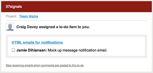
Version 2
Jason thought the checkbox in the email was confusing. If you finished the to-do would you click this checkbox? The checkbox wasn’t actually functioning too. It was fake. Let’s get rid of it.
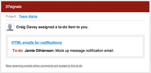
Version 6
Jason said there was too much junk around the actual to-do. The to-do wasn’t the focus of the email. He suggested to try making the to-do the hero. Ryan thought I could try and icon of some sort to spotlight the to-do.
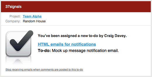
Version 8
The checkbox icon was too much. Too big, too blingy. Also, since it was checked already did that mean it was done? Kind of confusing. I tried just creating a graphic that said “To-do”.
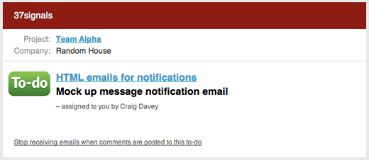
Version 11
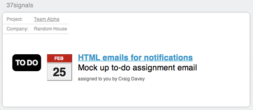
The to-do graphic was a little too glittery. It was detracting attention away from the actual to-do. Jason was still bothered by all the “chrome” in the email. The company name, 37signals, was more important than the to-do. So I tried stripping everything away.
Version 12
Here’s where we finally ended up. We stripped away all the “chrome” and made the focus the actual to-do. I also flipped the link so the to-do item that was assigned to you is blue. You can still also click on the to-do list title — in this case “HTML emails for notifications”.

Here’s a little something
Thanks for taking the time to read about this design iteration. I didn’t want that fancy checkbox icon in Version 6 to go to waste. You can click the link below to download the fancy checkbox icon. Hopefully you can find a use for it in your app, on your site, or for your next project!

Kimberley Crofts
on 24 Mar 10Thanks for posting all the iterations. It’s something that is hardly ever done in the graphic design world (where I come from) and I think it’s much more helpful for people to be able to see the development. More please!
Michael S
on 24 Mar 10It’s great to see the thinking and iterations. Thanks!
Paul
on 24 Mar 10Really interesting! Is the calender just an icon? Or does it change with the actual due date? I visually like the lighter blue more, but that’s personal.
Attila Juhász
on 24 Mar 10It is interesting to see, that less color makes more inpact. It is again “less is more”.
I love your “Behind the scenes” stories! Please keep them going!
Chris Your
on 24 Mar 10Interesting progression. I’d push it one step further and blend Version #2 with Version #12 to pull back in some (but not all) of the Basecamp brand into the feel of the email.
Sean
on 24 Mar 10Like everyone else said, great to see your iterations and commentary. Were there any reservations about stripping away even a hint of 37signals branding in the emails?
Alexandr
on 24 Mar 10It was fun to learn you also go through the odd-looking stages. :D
JD
on 24 Mar 10Paul, the calendar is actually a DIV. I am not sure why the notification emails are coming in as encrypted. I wish you could view source. Maybe because the email is coming from BC. Anyway, it is a DIV so yeah the date and stuff changes. The calendar image is made from borders and background colors.
Sean, Basecamp is used by companies working with clients. We definitely don’t put 37signals branding anywhere on these emails. I think the design is a bit misleading since there is a “37signals” there. That is actually the Company name. So if these emails were from Coca-Cola, it would say “Coca-Cola” where it says “37signals”
One thing to note is the colors in that Company bar would pick up the colors from your Basecamp account. That was the original idea.
Jim Gay
on 24 Mar 10This is great, but I’m really surprised it took 12 iterations to realize that you don’t need the company name at the top.
Walter Davis
on 24 Mar 10Hey, you hint in this message that you still send the plain-text version. How do I switch back to that? As much effort as you put into this, I still don’t like HTML mail, and have it as switched off as I can get it. Unfortunately, that still means that I see empty image placeholders and semi-styled text. I’m using Apple Mail in Leopard if that matters.
JD
on 24 Mar 10Walter, it seems the only way to do this on Apple Mail is this way: http://www.ehow.com/how_4517218_force-all-mail-mac-os.html
Isaac Priestley
on 24 Mar 10How long would you say this process took, from Version 1 to Version 12?
Alex King
on 24 Mar 10This is one of the coolest updates to basecamp in a long time – todo notifications are so much more fun now that they look awesome and are easy to understand.
JD
on 24 Mar 10Isaac, the process took 1 day. A lot of rapid fire back and forth. I was actually working from HTML (not Photoshop). When the design was ready to go we just needed to add some Rails stuff to make it dynamic. Basically it was plug and play.
Alex, thanks for the kind words!
Josh Dance
on 24 Mar 10Thanks for showing the design process. Iteration iteration. :)
Daniel Tenner
on 24 Mar 10Hi Jamie, thanks for sharing this. Very interesting. These “behind the scenes” stories are definitely some of the most interesting posts on this blog.
How do you work email client compatibility in your development process? Outlook, Gmail, Thunderbird, Hotmail, Yahoo mail, Outlook express… all those will display the main with subtle differences (some of which might ruin the design)
Do you test it as you’re iterating or at the end? What do you use for that testing?
JF
on 24 Mar 10Daniel: We use CampaignMonitor’s HTML email testing tools to check designs across multiple email clients. There are definitely variations – some we can’t get rid of – but that’s OK as long as the emails look as good as is reasonably possible across the majority of the most popular email clients.
JD
on 24 Mar 10Daniel, we used CampaignMonitor’s testing feature It is really easy and slick. I believe it costs just $5 to test each email.
KMB
on 24 Mar 10First: Love this! Would’ve taken design 11 and transferred the “to do”-sign above the task, but that’s just my cup of tea.
Second: I am wondering what the date should tell me? Is it the date until I would have time to finish the task?
Third: I also wonder if there is a nice list of “next steps” included in the mail.
E.g.: - read further information about this task - mark the task as finished - postpone the task - contact the “taskmaster” - e-mail the “taskmaster”
Each item linked to its obvious behavior.
pwb
on 25 Mar 10For testing email: http://www.litmusapp.com
DL
on 25 Mar 10I’m a developer trying to become a decent designer, and as such it’s extremely gratifying to see a good designers’ design process in action. I may be on the right track since that’s the same iterative process that I use when working up a new HTML design. I like how each design on it’s own would work, but the refinement process turns it into something that is more characteristic of 37signals and not just something that will work.
This discussion is closed.