We just launched a redesign of the 37signals Job Board. From start to finish we spent 10 days on the project. Jamie Dihiansan designed it and Josh Peek programmed it. We love how it turned out.
We had a few goals for the redesign:
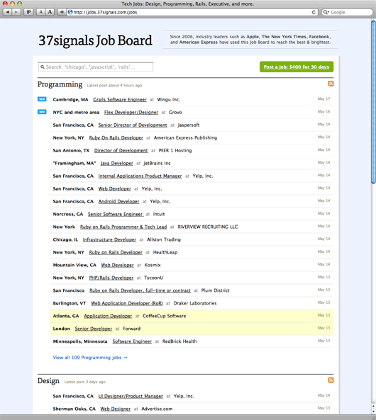
- A fresh coat of paint. We didn’t want to add or remove any key functionality, but we wanted to redesign the look and feel to freshen it up. Modernized, cleaner, and clearer. We also experimented with Typekit for the first time.
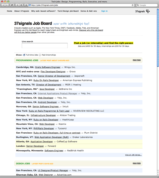
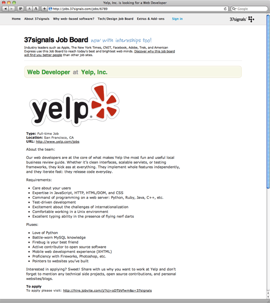
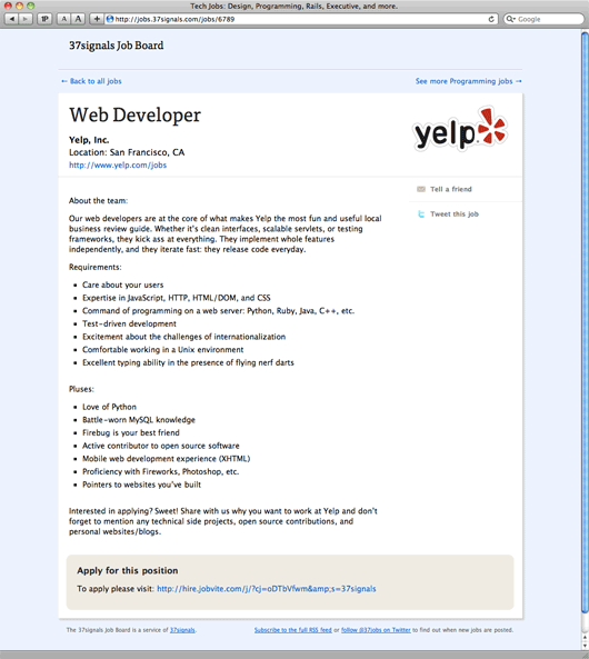
- Remove distractions and make our Job Board customers the stars. With our product logos, a big black footer, and our standard header, the old design was too much about us and not enough about the companies listing their jobs on the Job Board.
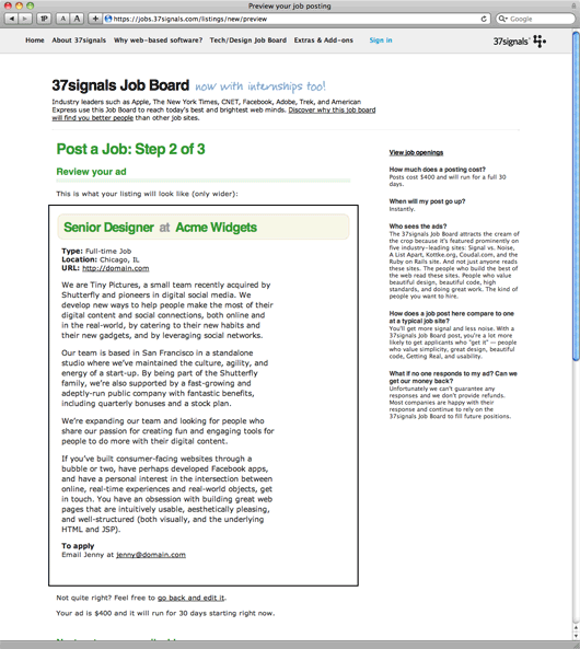
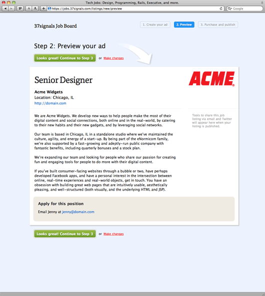
- A better purchasing process. We wanted to make the purchasing flow friendlier and easier to use – especially the preview step.
- WYSIWYG. We wanted to add WYSIWYG editing to the job description field. This gives people the tools to make their ads — especially ads with bullet lists — look nicer.
- A proper thank you. The old Job Board dropped people back on the home page after they posted their job. The thank you only came in the form of an email. The new design thanks them properly and gives them some helpful information and tools to promote their position.
Job listings BEFORE the redesign:
Job listings AFTER the redesign:
A job ad BEFORE the redesign:
A job ad AFTER the redesign:
Previewing an ad you’re placing BEFORE the redesign:
Previewing an ad you’re placing AFTER the redesign:
We hope you like it
You can check out the full redesign live at http://jobs.37signals.com. We hope you find the redesign improves the experience for browsing and placing jobs.

Judson
on 17 May 10Might just be my phone, but the typekit text doesn’t seem to be loading on my iPhone.
JF
on 17 May 10Judson: Typekit doesn’t currently work on Mobile Safari. More info on Typekit and browsers.
Luis
on 17 May 10Looks great guys!
Josh Owens
on 17 May 10Jason,
It was an interesting choice to move from san-serif to serif in the header. Junction, right?
Why the departure from your typical 37signals font branding? Just really wanting to use a font-face? The new font seems bigger and more invasive more now than before (on the front page at least).
Vojto
on 17 May 10Where have internships gone? :o)
DHH
on 17 May 10Vojto, internships were very lightly used and the few posts that were there mostly courted full-timers anyway. Snip, cut.
Adam
on 17 May 10Have you thought about adding the posting date to the job description itself? When I was job shopping, I had a lot of tabs open, each one showing a description of an opportunity. Part of my prioritization process was to consider how “fresh” the opportunity was. See Krop or Authentic Jobs for examples.
JF
on 17 May 10Josh: Just experimenting with a different look. We sorta wanted the Job Board to stand alone with it’s own look/feel/type.
Adam: Good idea. We’ll get that in there.
Pavel Maček
on 17 May 10I think It is definitely big step foward. Great work. But as Vojto, I miss the internship checkbox (eventhough I understand you explanation). Also I vote for the date to job detail.
EH
on 17 May 10job listings needs facets or a section-bookmark sidebar if it’s gonna be a long page of categories like that.
Matt
on 17 May 10Curious about the process using Typekit – when choosing the Typekit font, did you browse Typekit first or did you design with serif headers then go to Typekit and search for a font that was similar?
Anonymous Coward
on 17 May 10@37signals
Wow, when do you raise the price to $400?
JF
on 17 May 10Wow, when do you raise the price to $400?
A few weeks ago.
Michael Rakowski
on 18 May 10Nice redesign. Looks really good. I’ve been checking it lately as I’ve been applying to jobs. TypeKit is really neat too. I tried it out yesterday and was surprised at how easy it was to use. I was prepared to invest much more time.
One constructive criticism is that the “new” badge is a bit garbled in Safari 4.0.5. Looks great if I zoom in though.
John
on 18 May 10While I like the redesign, I have a couple of comments/questions:
- I noticed that the 37signals logo is no longer on the page. What was the thinking behind this? Are you phasing-out the logo? - Was it a deliberate decision to remove the zebra stripes?
I really admire how clean the new job board looks, but it is so clean that it almost looks generic—especially without the 37signals logo.
Zak
on 18 May 10Your old job listings looks much nicer than the new one. Everything else looks great.
mk
on 18 May 10JF: TypeKit does have MobileSafari support, but it’s still beta I think. It’s been working great for us.
http://blog.typekit.com/2010/05/06/typekit-now-supports-fonts-on-the-iphone/
Eric J. Gruber
on 24 May 10This design reminds me of a default template from Word 2007. I suppose I liked the old design better.
This discussion is closed.