A few weeks ago we decided to take a stab at redesigning the Basecamp home page. We liked the current design, but we wanted to see if we could do better. Specifically we were interested in more visuals, less text, and a generally simpler and less dense presentation.
Started with a sketch
As we usually do, we start with a very low-fi sketch of the big idea behind the design. No details, no words. Just a very rough idea. In this case the idea was a series of scenarios all pointing back at the Basecamp logo. The original sketch, done in Draft and shared in Campfire:
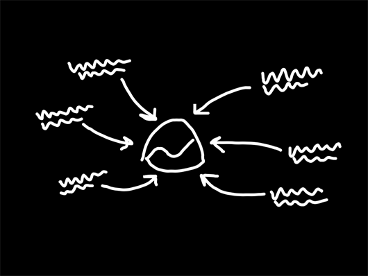
From this sketch we ended up with something that looked like this:
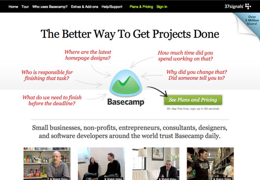
We messed around with the words, subheads, and other copy. We tweaked a few small things, but while we loved the general concept we still felt like it wasn’t communicating clearly enough at first glance.
So we decided to replace the phrases with icons representing the major features/benefits of Basecamp.
After a few rounds of tweaks, we ended up with this:
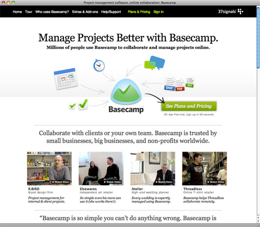
After we were pretty happy with the top, we moved down the page and redesigned the rest. We can talk about those decisions in a future post.
A/B test
Once the page was ready, we decided to run an A/B test against the current (now the old) design. The test wasn’t sophisticated – we just wanted to test clickthroughs to the sign-up page. That’s where most people land on their second hop, so we wanted to see if the new design took more people to that page. We didn’t test actual signup numbers – just clicks to the signup page. We know how the signup page converts (and continues to convert) and we didn’t change anything there.
The new design sent 14% more people to the signup page. We were thrilled with that performance. We recognize it’s not absolutely definitive (signups are more important than clicks to the sign up page), but it was enough evidence for us to put the new design into production.
Back to back
For reference, here was the old design:
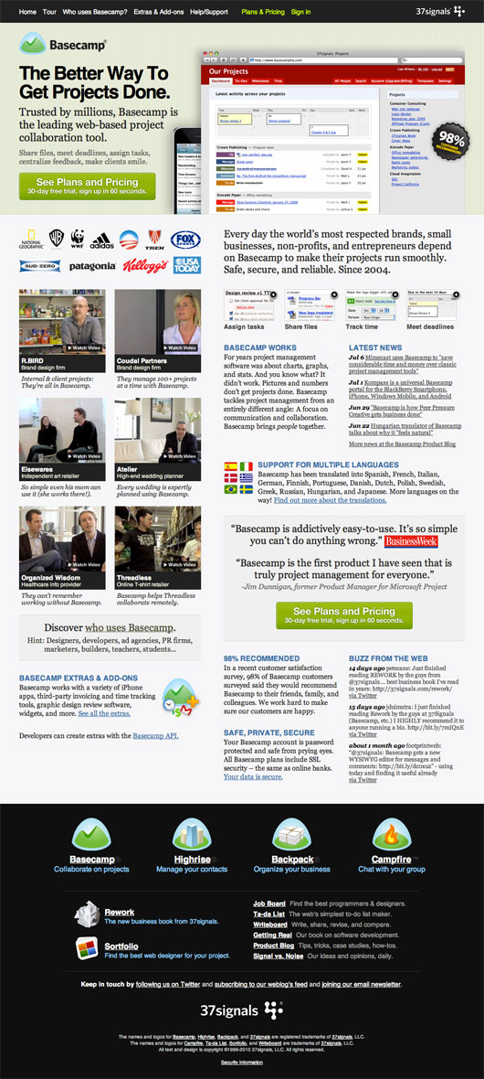
And here’s the new design:
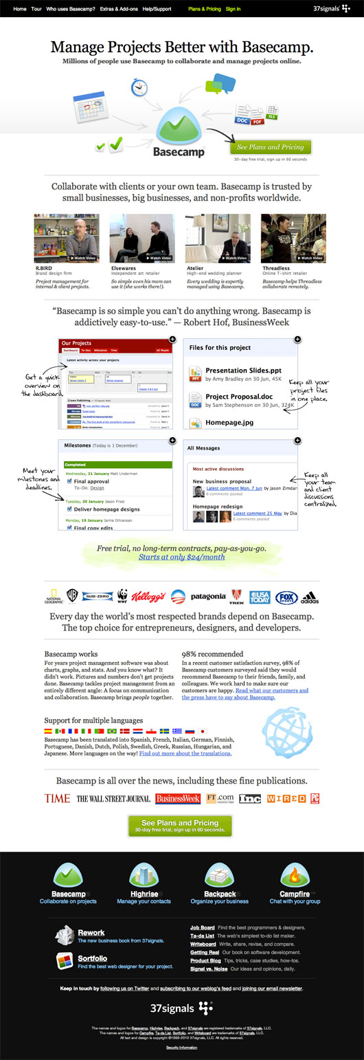
Here’s the new home page as it is today. Over the next few weeks we’ll be trying out some additional tweaks to the new design. There are a few things missing that we’d like to incorporate, and a few things we’d like to move around, but so far so good.

Jeff
on 06 Jul 10It’s not often someone can pull off The Arrow and still make it look good. Nice work!
Zac Clark
on 06 Jul 10Are you at all worried that your A/B test results could have been influenced by users seeing the new page and visiting the signup page not because they wanted to buy the product, but because they noticed a redesign and wanted to see if the signup page had been redesigned as well?
It seems like every design decision made by 37signals is immediately studied by tons of other web designers, and I could see this curiosity offsetting valid conversions from the new page.
Jamie, Baymard Institute
on 06 Jul 10I really like how all the arrows point to Basecamp, and an arrow from Basecamp then points to the sign-up button. Something about that screen just makes me (and apparently other people) want to click that “See Plans and Pricing” button.
Very interesting to see how this little text can seemingly work so well.
Personally, I have to say that I dislike the style of the icons (but that’s just a matter of taste, which is rather irrelevant in this case).
Tiffany
on 06 Jul 10Was your A/B test informal or observed in-house? Or do you have a service or tool that you recommend?
JD
on 06 Jul 10Tiffany, we set up the A/B test with Google’s Web Optimizer. It was a public test based on actual traffic to basecamphq.com over a period of about 2 days. The tool is pretty easy to use. I’d recommend signing up and trying it out.
Mike Stokes
on 06 Jul 10Awesome! We’ve been through the process recently and found very convincingly (20% improvement) that having the title along the top with a sub-title – similar to your re-design has a much better conversion rate than the exact same wording on the left-hand-side of the screenshot image.
Not exactly scientific, just our experience.
Justin
on 06 Jul 10Jason,
The post’s 6th sentence doesn’t make sense to me: “In this case the idea a series of ideas all pointing back at the Basecamp logo.”
Brett Houle
on 06 Jul 10I find it really interesting that you actually removed the typical screen shot of the product from above the fold. You bucked a trend (seen everywhere – including with us :^), it appears to have not hurt anything, and you saw an uptick. Take this the right way: the new design is less sexy, but probably more focused and effective. Nice job.
EricTimmer
on 06 Jul 10Wow, it looks much better! No need to do anymore A/B testing I give it my seal of approval.
JF
on 06 Jul 10Justin: Fixed the sentence.
Justin Reese
on 06 Jul 10Saw this last week, love it. I wasn’t a fan of the “old” design. (In quotes because it feels like last month it was introduced.) Felt cluttered. This one is very clean, makes excellent use of whitespace without feeling islandy on a big screen.
Great job!
Eivind Uggedal
on 06 Jul 10Regarding the rest of the redesign:
You should probably keep the thumbnail and modal full screen version of the “Get a quick overview on the dashboard” screenshot more consistent. The thumbnail has a red header background while the full screen version has a blue background. At first I though I’d clicked the wrong thumbnail.
Simple Social Manager
on 06 Jul 10- I love the change from words to pictures in the main image. Less cluttered. - All the doodles in the screenshot is proven to increase the response in printed direct marketing
I love the new design, very refreshing.
Ian Conrad
on 06 Jul 10Love the concept and the final product! I actually kinda liked the words, mainly the “who’s responsible…” bit, because that’s a huge reason why we use Basecamp. Considering new visitors though images probably make more sense, though i’d be interested in testing ;)
Justin Russell
on 06 Jul 10Love it. Zac Clark raises a good point about A/B testing on 37signals products; return visitors to the site are probably curious to see if the signup page has changed, too. I think a longer-term study might be in order to see if the increase holds. (I think it will.)
The old Basecamp homepage always struck me as too corporate (for lack of a better term) for a 37signals product. This seems a lot more friendly and less intimidating for people who have never used the product. Personally I’d be much more likely to click through with the new home page than the old one.
The only hesitation I have about the new design is the lack of text in the top image. I’m not sure new customers will understand at first glance that Basecamp provides special functionality for some of the content types shown, and they may be confused about what some of them mean (do the speech bubbles mean I can use AIM or Google Talk with Basecamp?). I’d be interested to see how an image with short labels (“Group chat with Campfire™”, “Milestones and to-dos”) for each arrow would perform in comparison to the graphic-only version.
Overall, it’s a huge improvement. Great job.
Greg Macoy
on 06 Jul 10Without wishing to seem too critical…
I don’t think the use of white space is as good as it could be. It still feels a little claustrophobic, especially the area linking to the videos. This video area doesn’t seem like it has had as much consideration as the other parts of the page.
I think the line height and the lack of significant margins around the body text and headlines has the effect of making it seem more wordy than it actually is.
Eduardo Sasso
on 06 Jul 10And what about the blog redesign?
Tim
on 07 Jul 10@37signals
The increase in the signup plan is misleading.
Take me as an example. I only click the “sign up” link to simply see if you redesigned the signup page.
When I saw you only redesigned the frontpage and no other pages, I left the site.
JF
on 07 Jul 10Tim (and others): That’s not what the (bounce/return/unique/new) stats are showing. Plus, we’ve conducted other tests where we’ve totally changed a home page design and not seen this sort of response.
Clarification: The test ran for nearly a week with Google picking a winner on the second day. The results continued to add up in favor of the new design.
Lance Jones
on 07 Jul 10I oversee the Web site optimization program for Intuit’s Global Division and it’s always interesting (for me) to see how others go about testing new designs.
I do agree with the posters who commented on the fact that -in this case - clickthrough may not be your best success metric. And not necessarily because of the potential for ‘lookey-loos’ on the new design… but because changes to one page - especially a home page - can have downstream effects beyond the next page in a flow. I’ve been surprised many time how influential a home page can be on outcomes such as sales conversion, and I would encourage you to go that extra step.
However, I know that GWO is not particularly well designed for measuring multiple test goals, but there are some well-documented Javascript hacks out there if you’re interested (I’m sure you’re aware). And integrating Google Analytics with GWO gives you a ton more useful data on which to base your design decisions.
Lastly, I recommend letting an A/B test such as this run for at least 1 week… in case you have any weekday/weekend ‘effects’. Letting a winning design run longer against your control page doesn’t hurt anything (i.e., your average clickthrough rate has increased) and you can be even more confident with the results based on a larger sample.
I know you didn’t ask… :-)
Lance
Mark
on 07 Jul 10If the web design crowd following your every change isn’t the reason, my guess is that the text version gave people enough information to decide that this wasn’t the droid they were looking for.
The graphical version is intriguing but less informative, so your click-through rate will be influenced by the “huh? what’s this?” visitors.
I think you absolutely need to track sign-up rate over a significant period of time before you can draw conclusions on a change’s effectiveness.
Keep up the posts, though – lots of inspiration here!
Phil
on 07 Jul 10I agree with Zac Clark’s comment (second from the top). Might be best to compare the click through rates in a few months?
Ricky Irvine
on 07 Jul 10The new design is really good, better communicating at a glance. Unfortunately the markup completely wipes out the text in the first composition. For a screen reader user, the page makes a lot less sense “at a glance”. It doesn’t have to be that way.
Helgi Þór
on 07 Jul 10I really like the re-design, the old one was too cluttered, too much noise.
The new page feels more welcoming, for some reason :)
One thing tough, I know you’ve got links at the bottom to both of your blogs, but why not include “Blog” in the black banner at the the top as well? I find that whenever I’m looking at new websites now, I look at their blog to get a feel for their voice, as part of evaluating their product.
Ironically, I belive it was you guys that started that for me, so I suggest you give SnN a more obvious link for the newcomer.
Richard
on 07 Jul 10Why is there a horizontal line right above the “see plans and pricing” button? I thought maybe that was a paper fold background pattern but it’s nowhere else on the page. It looks awkward to me.
Ambrose
on 07 Jul 10I think you guys need to put up a replacement testimonial video in place of Elsewares.com one since that company is closing down soon… But maybe most people new to your site won’t even bother watching those videos….
@Lance Jones
on 07 Jul 10It would be great if you switched positions to oversee Intuit’s QuickBooks registration “optimization program”. Then you could, perhaps, improve the process which requires me to call to get a “generated” key to activate the program. Apparently Intuit’s computers are so slow it takes 5-10 minutes to generate a key, just enough time for the rep to try and upsell me a bunch of stuff.
Vojto Rinik
on 07 Jul 10What’s up with that ‘happy clients’ videos? Nobody watches that shit anyway. It’s positioned above ‘features preview’ part.
I, visitor, potential customer, don’t care about what some unknown people have to say. That’s a waste of my time listening to some happy people.
Maybe that’s because I’m used to this. I’m expecting those people to say nothing but praise. So I expect bunch of lies. Those ‘happy customers’ videos are full of bullshit in most cases.
I care about what you really have to offer. Screenshots. Maybe some kind of live preview, feature tour, anything. Everything but bunch of folks talking about how happy they are.
And no, I haven’t watched those videos. And I won’t.
Mandy
on 07 Jul 10I prefer the original. It has much more pop to it. The new design is a bit too much white. I also think the arrows look a bit messy and too childlike for a professional program, but that’s me.
Richard
on 07 Jul 10I’d have to agree on the videos. I’m not interested in what they say either – but I can predict what they’d say. It looks like a lot of work went into them, but I don’t feel comfortable trying to believe them. I would be more comfortable seeing a photo of that person with a quote below them – so long as it obviously wasn’t stock photos of grinning models.
And on the subject of quotes – way too many, guys. One click over and my screen filled with praise. It seems overdone. They are quotes coming from someone I don’t know and being delivered (filtered) by you. I don’t put quotes on my site, but believe me if I wanted to I’d have tons to choose from. They just seem fabricated when I see them elsewhere.
JF
on 07 Jul 10What’s up with that ‘happy clients’ videos? Nobody watches that shit anyway.
That’s not what our conversion statistics say.
Michael
on 08 Jul 10Uh, coudal and threadless are pretty good endorsements. They’re not exactly nobodies to watch…
Ricky Irvine
on 08 Jul 10I’d like to know about the quiet markup, why you guys choose to write it for the reader to depend solely on seeing the graphics.
leena paul
on 08 Jul 10Kitchen cabinets are something you use every day, yet you probably never take the time to appreciate them. They seem simple enough, but there is actually more than plenty involved behind the scenes. There are many things to consider regarding Discount Cabinets refacing, cabinets materials, finishes, door designs, and even information on hardware.
Cristiano Rastelli
on 08 Jul 10Simply a GREAT re-design!
Brandon Eley
on 08 Jul 10Don’t criticize something you don’t know anything about. Making blanket statements like “nobody watches that…” is a little presumptuous to say the least. Even IF you could show market research showing that Internet users don’t like video (it’s actually the opposite), each website and company has a different audience/customer. What works for one may not work for another.
Thanks to Jason and 37Signals for showing us a glimpse behind the redesign of the Basecamp site. Reading a little about the “whys” always inspires me. I love the redesign, and am glad it’s working well!
Brandon Eley
on 08 Jul 10Also, for what it’s worth I always thought the old design was a bit busy and crowded. The new design is more airy and open. As such, (to me anyways), it feels much simpler and is just as effective at conveying the same information.
John Hyde
on 08 Jul 10Love it.
Project Management and its tools are very abstract ideas. A ‘no-words’ diagram is a fantastic way to get the site visitor on-board with these concepts and how Basecamp will help each one.
I wonder if you’ve tried tilting the screenshots or other techniques to show they are screenshots and not part of the boilerplate? (The ‘hand-written’ comments are one example of such a technique)
Stephan Wehner
on 08 Jul 10Hey, the new design looks nice; at the same time, a trained artist would easily improve it. Those arrows are a bit much to me.
Stephan
Darren Negraeff
on 08 Jul 10Love the redesign. Good discussion on here and interesting points raised by Zac, Justin et al. Of course, the stats might say otherwise, but I would also add that just because this result has not been noted via other tests prior to this instance does not, by itself, validate this instance of return visitors not increasing the conversion to see if the signup page has in fact changed. The two are not necessarily connected because through time more people become aware of the great work that 37signals does and so the effect might be amplified as we’re all very interested to know if the signup page has changed.
Despite saying all that, I think the results are probably accurate and, again, love the redesign.
Dave
on 08 Jul 10Hmm could be more accessible.
Drew Franklin
on 09 Jul 10I agree with Brandon it definitely breaths more yet still shows the same information.
Quick question how did you get those full page screen shots?
Dan Whitmore
on 09 Jul 10Love the new design, really refreshing.
Congrats on the results too.
Dan
Adam Hermsdorfer
on 11 Jul 10Thanks for sharing and I’m glad you ended the post with the performance lifts in click through rates. I’m not surprised that the new design was the winner. Less always seems to be more!
Richard Freeman
on 12 Jul 10Great post here guys, really interesting to hear about the data side of things. Been blogging about the changes in homepage design to be more user-focussed – do you reckon just good old numbers are enough or are there other ways to get good user input in homepage design?
http://bigorangesoftware.wordpress.com/2010/07/09/how-to-get-your-homepage-re-design-right/
Paul M.
on 12 Jul 10@JF Which sign-up button was more successful and what was the click ratio?
This discussion is closed.