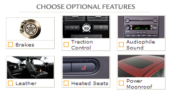
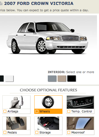
FordDirect.com has some interesting ideas about which features on a car are optional…

Optional brakes? That certainly is a Bold Move.
And if cash is really tight, you can also have ‘em leave off the wheels and pedals…

[tx RA]
Related: ‘06 Ford loss: $12.7 billion

The Colonel
on 02 Feb 07I’m also glad to see that airbags are optional, but I have to say, the lack of optional windshield and engine are a little disappointing.
Nick
on 02 Feb 07This is great, considering the automotive industry’s biggest expo starts tomorrow.
Steve
on 02 Feb 07Amazing what leaving off a little word like “upgrade” can do for something like this. If I don’t want to but pedals, how do I drive?
Josh
on 02 Feb 07I’m sure they mean a certain type brakes and wheels (i.e., hub caps vs. alloys). But… chalk that one up to shoddy copy writing. ;)
Eamon
on 02 Feb 07I’d like my Econoline without the storage, pls.
brad
on 02 Feb 07I would say someone was asleep at the wheel, but then again, wheels are optional.
ranndino
on 02 Feb 07Looking at it all in terms of the big picture a Ford in itself is optional. It’s the kind of option I will never choose.
justin
on 02 Feb 07No pedals in mine please, they make my feet tired.
Henry
on 02 Feb 07That is totally out of context. Go to that site and run through the configurator. Where in the site is there an option for brakes. I could find it as any option.
FredS
on 02 Feb 07talk about low hanging fruit.
condor
on 02 Feb 07My guess is that Matt doesn’t actually believe Ford is trying to sell cars without any brakes or wheels; I think he’s pointing out some usability issues with the forddirect.com website (detailing obviously nonoptional features as optional)
dave
on 02 Feb 07If all customers were as hyperliteral as Matt seems to be, or if the car had just been invented, then this might be a problem. Fortunately, people have been buying cars with brakes, pedals and wheels for over 100 years, and they might be a little smarter than matt gives them credit for.
FWIW—if you click on any of the “features” listed, the site tells you in detail what you’re selecting.
Anonymous Coward
on 02 Feb 07Dave, it’s sort of a joke.
ranndino
on 02 Feb 07Dave, if you’ve ever sat on any web usability tests you’d surprised just how hyper literal many users are. In this case, while it was sort of a joke, the word “upgrade” would have been quite useful.
Michal
on 03 Feb 07Dear 37signals, please stop Matt from writing to this blog. All he posts is banal, childish, adolescent at best. And he fruitlessly tries to mimic the style of the better contributors.
Also, please forgive my bluntness. I was nearly posting this note several times during recent weeks. Today I gave up.
Mark
on 03 Feb 07What I’d like to know is how does 37svn / Matt balance what is an obvious comment on the importance of copy with the recent jackhammer post by Jason—
In context…anyone over the age of what…7 maybe?...can figure out that these things are for features, upgrades and styles.
So…
Wouldnt Ford be solving the wrong problems in spelling out the obvious? Wouldnt that also using more words than necessary to get the idea across?
dave
on 03 Feb 07There is something quite funny about this post, but I’m not sure it’s what the author intended.
Much of the study of artificial intelligence in the last 10 years has been about endowing computers with “common sense”—the ability to use context and history to “know” that, for example, Ford doesn’t deliver new cars without at least the ability to go, stop and turn.
So Matt is helpfully pointing out that, if you read the page like a computer ordinarily would - in other words, without using any of your common sense - you might find it confusing.
Or maybe it is indeed a joke. Hyperliteral readings of instructions often are; when I was 7, I remember thinking that the instructions on the back of a tube of Crest - “Flatten tube as you go up” - was extremely funny. I’m still waiting to go up…
carlivar
on 03 Feb 07All kidding aside, please don’t be like ranndino. Please consider buying a Ford. It would be a shame to lose a company with such history (and economic impact). Obviously you can’t buy for that reason alone, but American cars are reviewing well against imports these days. All things being close to equal why not step outside of the Honda Civic/Accord-Toyota Camry bubble…
Josh
on 03 Feb 07Mark: The obvious change would be to use the word “upgrades” in place of “features”. People would be less likely to literally interpret the options that way.
Further, Jason said “when four will do” ... apparently in this case, less words won’t do, so more are necessary. Maybe changing “brakes” to “premium brakes”. Or “wheels” to “alloys”, “pedals” to “sport pedals”, etc. These changes are hardly taxing in terms of brevity, but infinitely clear up the copy for literal readers.
manuel martensen
on 03 Feb 07i think this topic is about how lousy the copywriter advertises the big mama wheels/brakes:
A) maybe matt tries to point that if you want to sell a upgrade to special superfat wheels you should not write just wheels (because that IS the standard) but special wheels (2” wider than standard).
B) maybe matt tries to point that if you want to sell a upgrade to special ceramic porsche-style brakes you should not write just brakes (because that IS the standard) but super sticky porsche brakes (cooler than standard).
Mark
on 03 Feb 07Let’s also keep in mind the product being sold in this case - a white Ford Crown Vic - favorite of old, retired couples, corporate leasing programs and car rental stores within a 5 mile radius of any major airport. Oh, and police departments too—but they already have the “special” superfat wheels with super sticky porsche brakes.
I mean, don’t you think their marketing department has enough data from countless years of selling crown vics, what options need to be hyped and which dont?
For comparison, look at the SO sheet on the Ford GT. Different market, different detail.
Leo Klein
on 03 Feb 07That’s pretty funny. I ‘spose breaks are optional only if you think stopping is optional.
Ben Darlow
on 03 Feb 07Good god, that’s an ugly looking car. Do people really buy those?
Eric
on 04 Feb 07For five years I’ve been waiting for the other car companies to rise to the Mini Cooper’s quality, detail and clarity in their web-based configurator. It seems like such a win for the companies but to this day it’s rare to come across anything more than a choose-the-color image of the car with three pages of checkboxes and a place to type your zip code.
FredS
on 04 Feb 07When was the last time you bought a new car from a website?
Moondoggie
on 05 Feb 07I only found out about this by reading an article in the NYT’s today about food bloggers in NYC and following a few links to one of the job board listings. If Ford’s site was a work of perfect genius I wouldn’t have known that, either. On the other hand Cadillac’s site presents some pathetic copy writing plus embarrassing mis-informational faux pas but I still love it.
Martin
on 05 Feb 07Damn, American cars really are ugly.
Isaac Weinhausen
on 05 Feb 07From the temperature of these comments, I have the feeling that Matt has caught the attention of some-sort-of large corporate entity—I mean honest heart-felt bloggers…
sarcasm intended
murali
on 06 Feb 07Somebody is seriously trying to understanding about ‘Less is More’. Cars are so elegant without brakes (:-))
Yehudah Goldstein
on 08 Feb 07I hope Ford dies soon.
This discussion is closed.