Five days to go until we begin working in the new office. It won’t be completely done for another 10 days or so, but it’s workable so we’re going to work it.
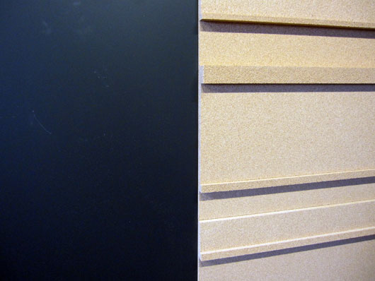
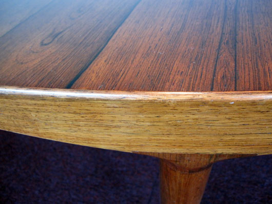
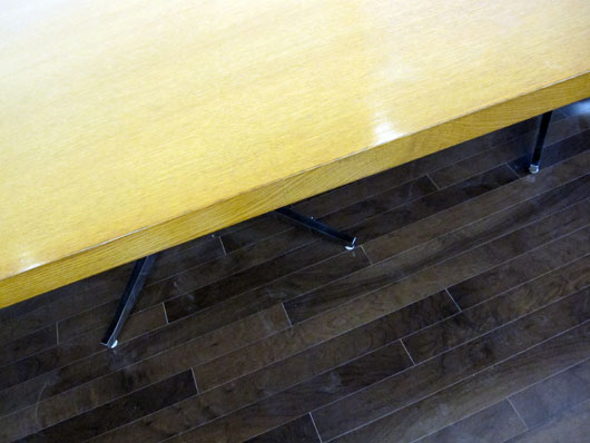
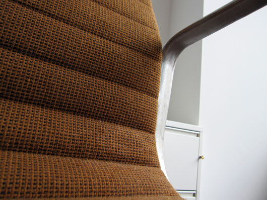
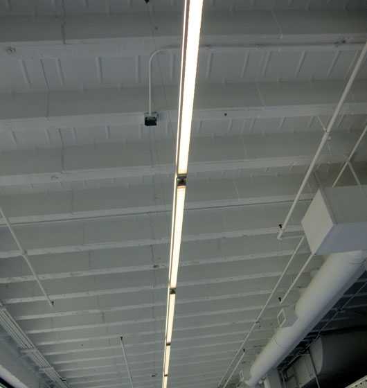
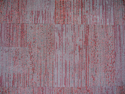
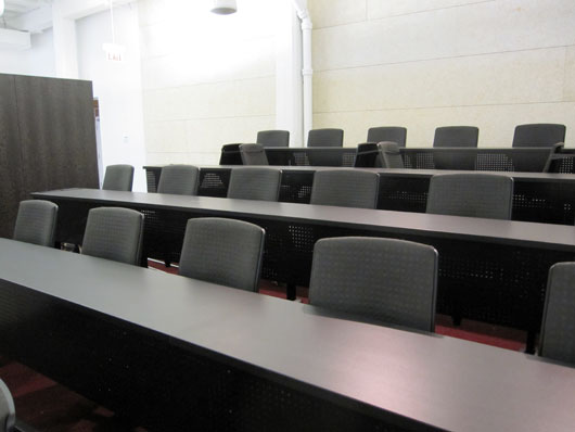
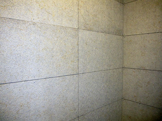
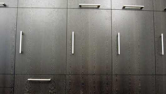
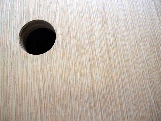
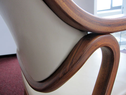
Here are some details of some of the materials in the space.

You’re reading Signal v. Noise, a publication about the web by Basecamp since 1999. Happy !
Five days to go until we begin working in the new office. It won’t be completely done for another 10 days or so, but it’s workable so we’re going to work it.
Here are some details of some of the materials in the space.


Frankie Laguna
on 14 Jul 10Looks amazing, I can’t wait fro 37Signals University to open up. I’ll be first in line!
Frankie Laguna
on 14 Jul 10I apologize for my misspelling of the word for.
marilyn
on 14 Jul 10Gorgeous. I’m most curious about the first one (mixed metallic?) and the worn wood table.
Don Schenck
on 14 Jul 10Should I put my house on the market now??
Tanner
on 14 Jul 10Looking beautiful. Color me jealous!
Dustin Frampton
on 14 Jul 10Very Nice! I look forward to the workshops you guys will be offering.
Jay Owen
on 14 Jul 10Looking forward to a video tour and maybe checking it out in person at one of your talks. We have always operated in a completely virtual setup, but am starting to consider an office for my company.
EricTimmer
on 14 Jul 10This is going to make all your “Telecommuters” want to work in the office. I know I would!! Throw that efficiency out the window ;-)
Jeff
on 14 Jul 10@Frankie The first one looks to be ebonized, quarter sawn oak – or maybe a plastic laminate version of it. It also looks a little like lacewood from Australia. But I could be completely wrong.
Nice photos guys. Thanks!
JF
on 14 Jul 10I’m most curious about the first one (mixed metallic?)
Jeff called it – it’s lacewood.
John
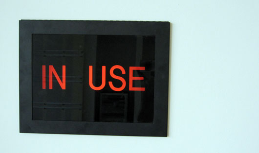
on 14 Jul 10I wonder how many design sessions were spent on the wording of the “IN USE” sign.
“At first, we had ‘BUSY’. It was ok but it didn’t feel quite right. What if David is in there slacking off, for example? It’s no ‘busy’. So, I went to use Draft [link] and posted the following on Campfire [link]: ‘OCCUPIED’ It was the right meaning this time, but it sounded shitty, like it was an airport bathroom. In the end, Ryan suggested ‘IN USE’. It just clicked: simple, the right meaning, short and to the point. Perfect.”
Luis
on 14 Jul 10Jason who is the interior designer? Looks great!
JF
on 14 Jul 10John: Luckily we don’t sweat stuff like that. IN USE was a standard option. We went with it.
Érik
on 15 Jul 10@John: HAHAHAHAHAHAHAHAHAHAHAHAHAHAHAHAHAHA The best joke ever!
iconolater
on 15 Jul 10show them how it’s done…
Michael
on 15 Jul 10Hahaha @ John. Classic.
Tiago
on 15 Jul 10J., that one made me laugh.
Best comment around for a while.
Scott
on 15 Jul 10@John: LOL. Well done.
JF
on 15 Jul 10Jason who is the interior designer? Looks great!
Thanks. I worked with the architects to select the furniture and materials (we were lucky to find some beautiful vintage pieces which we had restored here in Chicago). The architects presented the color palette and fabrics based on our direction of “warm and rich with lots of texture.” The architects designed the flow/layout based on our requirements (we went through about 5 rounds of revisions – a few major, a few minor). They also came up with the stacked cork/felt concept which is great for acoustics and a unique look/feel. Primary materials include different woods, cork, felt, stainless steel, magnetic chalkboard, and a variety of other materials used in appropriate places. We’re really happy with how it all turned out. Can’t wait to start working there!
Anonymous Coward
on 15 Jul 10Love the class style seating the most. Wish you guys opened an office in LA!
Anonymous Coward
on 15 Jul 10WTF! if i dont enter a name, it comes up as “Anonymous Coward”? why would you make that the default setting? not everyone needs to give or make up a name just to make a quick post…
not my real name but at least i'm not anonymous nor a coward
on 15 Jul 10AC, you mean like this?
Luis
on 15 Jul 10JF, thanks I am envious!!! Enjoy the new place!
Darren
on 15 Jul 10I haven’t read much about the interior lighting. Bad lighting bugs the shit out of me. Obviously, you have tons of natural light, but what about deeper into the space and in more private areas?
JF
on 15 Jul 10Darren: We paid very close attention to lighting. It’s lit different ways in different places. Some lighting is bright and exposed, some is dim and cozy. Some is incandescent, some is florescent. Some lighting is direct, some bounces and reflects. Some goes up, some goes down. I’m really happy with the architect’s lighting plan.
Nathan
on 15 Jul 10Looks great. What is the material used in the 10th photograph?
JF
on 15 Jul 10Nathan: Those are Tectum acoustical wall tiles.
X
on 15 Jul 10An office with it’s own glory hole… you guys thought of everything!
Austin B
on 16 Jul 10@X: really?
@JF: Are those fluorescents? Are they not headache inducing?
Steve R.
on 16 Jul 10Dibs on first Rails class you host.
Jeff Southard
on 16 Jul 10How about some pictures on the wall! Consider my CollageWall service. (FYI: I’m a huge fan and a Rails-based startup you may have read about in yesterday’s NY Times article.)
Hugo Baraúna
on 17 Jul 10Damn, this seems awesome! Congrats guys!
This discussion is closed.