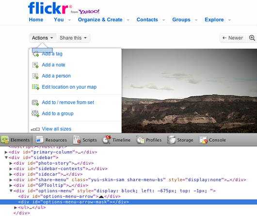
1) Interesting use of unicode characters for the UI on Flickr:

That triangle up top is actually two triangle characters side-by-side. Sucks that we still have to resort to such hacks for such a common UI shape — but this is a smart solution.
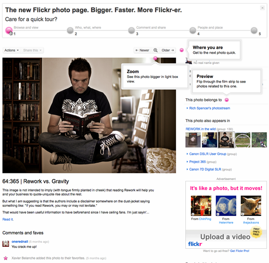
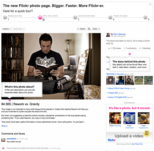
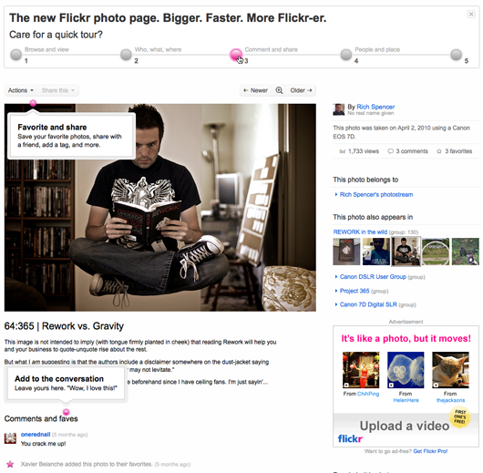
2) Also interesting is this inline tour of the new photo pages. Rollover a number and bubbles pop up to show you what’s fresh for that section.


David
on 02 Sep 10Are you sure that the triangle is such a smart solution? For me it shows up differently and buggy in every other browser: Broken Arrow
justin
on 02 Sep 10I think the method of using CSS borders to create arrows works slightly better. It doesn’t require you to insert unnecessary characters into the page. However, it still does necessitate extra elements, but at least they’re empty. Tricky to do shadows, too.
Colin Nederkoorn
on 02 Sep 10We’re doing something similar with some modals, but my engineers are telling me we use borders, not unicode to achieve it.
http://flic.kr/p/8xyNwL
Marco Palinar
on 02 Sep 10@justin
You can always use :after :before and the the content: “▲” to generate the character via CSS (hence keeping the markup clean)
Javan Makhmali
on 02 Sep 10Inspired by Flickr’s menus and their use of unicode characters within, I created a jQuery plugin to make somewhat similar menus:
http://github.com/javan/jbar
Henrique
on 03 Sep 10A little too clever maybe. Too hacky.
Alex
on 03 Sep 10The “▲” character is too tall and narrow. Looks not so good. I found it’s better to use the top part of a diamond character “◆” to make isosceles triangle. This should work in all browsers.
ashchan
on 03 Sep 10@David, I saw buggy arrow here too.
Harlan Lewis
on 03 Sep 10Alex’s solution is solid.
Alternately, one could wrap each half-triangle and control spacing/position explicitly, rather than leaving it up the browser.
rob
on 03 Sep 10I have never found the Flickr UI intuitive or good. This new UI is even more confusing than the original. It is not a place, for instance, that I can send my father to without instruction.
The fact that it needs all these bubbles tells you something…the UI is confusing.
Tim
on 03 Sep 10I’m a huge fan of the inline tour / help. I have them littered throughout my application and it’s all driven by a simple backend.
Seems that more apps should answers questions at the point in which the question becomes evident.
wibo
on 05 Sep 10i lile the bubble. It’s clear and useful.
Rajiv
on 06 Sep 10Thanks for the interesting find!
Greg Macoy
on 06 Sep 10I agree with Rob, I regular get frustrated with the UI on Flickr.
Book Publishers
on 06 Sep 10Great stuff, love this use for flickr…
html
on 08 Sep 10pretty obvious, but really nice
This discussion is closed.