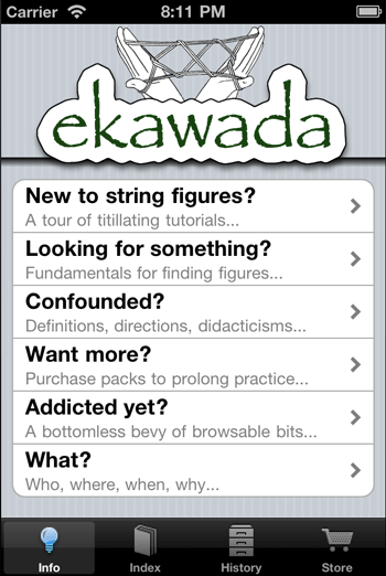
It’s interesting how much flavor and personality shows up in our side projects compared to our “professional” work. Jamis posted this screenshot into Campfire today to show an iPhone app he’s been developing on the side.

Check out the playful alliteration in those subtitles. I love the personality there. It’s interesting to think about how when a project is a hobby, it frees our mind up somehow to show more personality—to be more playful. Then when it’s time for “professional” work everything gets buttoned up and greyed out. (Unless you’re Wufoo or MailChimp.)
Next time I’m working on something, I want to ask myself: “How would I design this if it were just for fun?”

Deltaplan
on 22 Sep 10Does this comply with Apple’s HIG ?
John Beckett
on 22 Sep 10Is there some unwritten rule that professional projects should be bland and personality-less?
Danijel Šivinjski
on 22 Sep 10Happy you put professional under the quotation marks :P
Corey O
on 22 Sep 10I find that it’s a symptom of large organizations. Stamp out the unique. You aren’t usually called out for being too much like everyone else, but you are if its too different.
Brandon Ferguson
on 22 Sep 10Most of the time I’m having a hard time designing something I just go sarcastic and silly. Writing joke copy, making silly visual effects, just screwing around.
Oddly enough a lot of the so called “jokes” end up being better than anything else I’ve done so far and make it into the final design.
Papyrus?
on 22 Sep 10What the hell?
This^
on 22 Sep 10Yipes
JZ
on 22 Sep 10Why the hate? This is one of the few cases where Papyrus is used judiciously.
String figures have been created by some of the world’s oldest civilizations—the kind of places where text hand-written on papyrus would be right at home.
Joe
on 22 Sep 10Good observation.
Perhaps its because when there is personality in a project, its more likely to have it clash with a user’s personality. You wouldn’t want this in a professional environment, so you stay mostly conservative there. (Which really is just another kind of personality.)
I wouldn’t mind seeing more personality in products though. Like art, if people don’t like it, there will be plenty of other things out there with similar functionality for them to enjoy and connect with.
Justin Reese
on 22 Sep 10I’ve found it’s best to start with a balls-out personality fest, but then walk away for a while and assess it as a new user and see if the personality gets in the way of usability. Sometimes it they can coexist, other times you have to admit it gets in the way and polish it off.
E.g., “Whoops, that sucked, cancel it!” has mounds more personality than “Cancel”, but after the hundredth time hunting for it, the user will become frustrated.
This isn’t an argument against creative interface writing, just a point of consideration.
Justin Reese
on 22 Sep 10Case in point: MailChimp has very entertaining interface writing, but I find myself having to decipher it much of the time.
If you have to have a toggler for disabling your “personality mode”, you might be wasting your time.
Dan
on 24 Sep 10Yeah mail chimp seems cool at first but when people actually need to use it all the “personality” is overdone and gets in the way.
They should split test the amount of people that become paying users on the free trial when all the monkeys are removed.
This discussion is closed.