Cognition
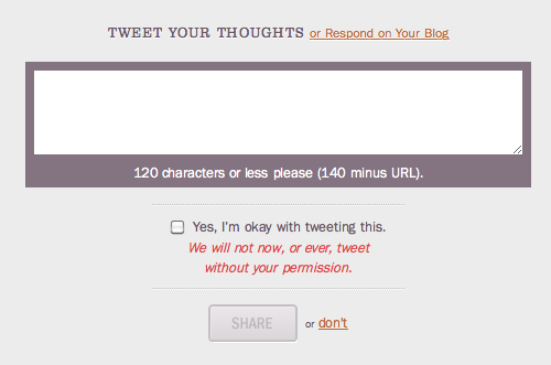
 Cognition (Happy Cog’s blog) lets you use Twitter to leave comments.

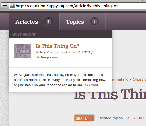
And the dropdowns there are nicely designed too.
Erskine Design

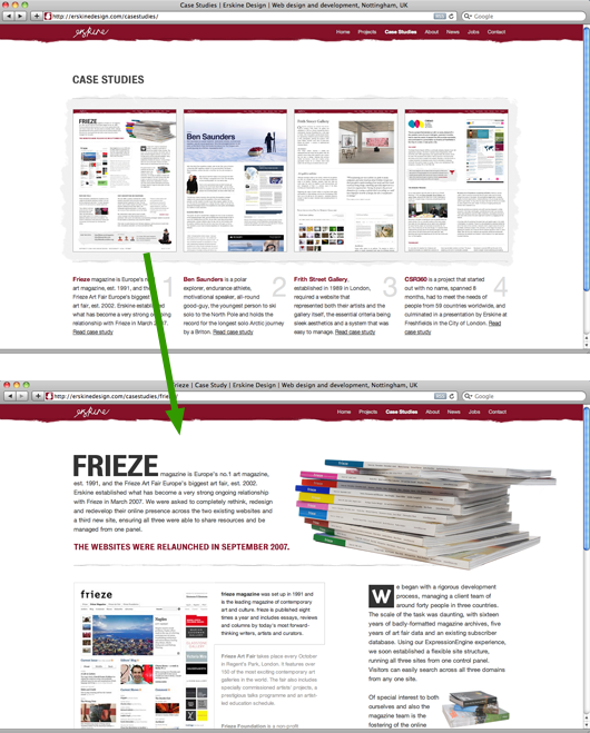
Erskine Design’s case studies page has thumbnails of each case study page on its own website. Those thumbnails aren’t website designs, they are the actual case study pages shrunken down. It’s like you can see all their pages from far away and then you click on one to see it up close.
Monoprice

SvN reader Jonathan Sato wrote in about this alert message on the Monoprice home page.
I thought this was a nice way of owning up to a problem. A description of the site error is displayed at the top of the homepage to all visitors.
Although I wasn’t affected by the error, in a strange way it actually gives me more confidence in buying from this company online.
Typographic Map

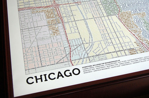
Typographic Map of Chicago.
These unique maps accurately depict the streets and highways, parks, neighborhoods, coastlines, and physical features of the city using nothing but type. Only by manually weaving together thousands upon thousands of carefully placed words does the full picture of the city emerge. Every single piece of type was manually placed, a process that took hundreds of hours to complete for each map.
We just ordered one for the office.

click here for more info
on 19 Oct 10That’s indeed a very good work to have dealt with. I think that it would be a very good thing to have this implemented in a proper format as this will assure to be of a good use to the many others and the design also looks quite elegant and professional too at the same time.
This discussion is closed.