From our Campfire chat room:
| Ryan S. |
i love how Ministry Of Type keeps gently evolving his design
|
|
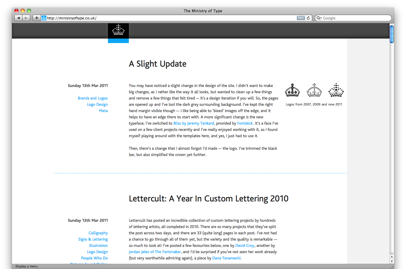
even the logo evolves in a steady path:
|
|
|
|
|
|
(2007, 2009, 2011)
|
|
|
i really like how the new layout is centered,
|
|
|
but with white to the browser edges on the left and grey on the right
|
|
|
he kept the grey margin on the right to give his images an edge to bleed off of
|
|
|
very sophisticated
|
|
|
it kinda feels left-aligned and bookish even though the layout is actually center aligned
|
|
Radex
on 15 Apr 11In 2013 he’ll have just a black dot, huh?
Awesome layout. Love the idea.
Shahib
on 15 Apr 11Btw just to share, I evolve this idea and layout inspired by Ministry of type to make it a responsive layout design (iPhone and iPad).
Check out: http://syukran.com/blog and let me know what do you think?
P/s: Btw I’ve contacted Aegir Hallmundur and credit his layout for my blog.
Thanx for the share Ryan love your idea and designs.
- Shahib Amin (37signals Fan)
Jim Cipriani
on 18 Apr 11I know there’s not supposed to be a “perfect” in design, but Ministry Of Type seems real close. Can’t pinpoint what it is. The proportions, typography, vertical rhythm, the print-style bleeds all get under my skin. Makes me itch. It’s simple, but never gets boring.
This discussion is closed.