During the NBA playoffs, OKC resident Jason Zimdars pointed out design professor Jim Watson’s post on The Oklahoma City Thunder’s logo and why it’s a poor identity (no relation to thunder/Oklahoma, poor typography, etc.). Here he explains why that’s so frustrating for the city:
The logo was unveiled and we realized the opportunity to convey excellence was blown. The stereotyped image of Oklahoma might remain a little longer.
Unfortunately, the more bad design the public sees (Thunder, Walmart, La Quinta, Holiday Inn, to name a few), the more numb the public gets to bad design. The average person doesn’t understand nor discriminate enough without the guidance of corporations, cities, and the design community. If the corporate and design communities accept work such as the Thunder logo, then, heck, anyone can become a designer. One doesn’t even need much training or a design sense.
When questioned, almost all Oklahoma designers agreed that its an awful logo but were unwilling to do anything about it. Mantras in Oklahoma include If it ain’t broke, don’t fix it, Let sleeping dogs lie, Don’t rock the boat, Don’t make waves, Its good enough. All of these attitudes result in low standards of design. Maybe we got exactly what we deserved.
Watson’s site is filled with other interesting, strongly worded observations on design. Improvements to signs at rest areas points out how existing signs are poorly designed…

...suggests an improved version…

...and then compares the two.

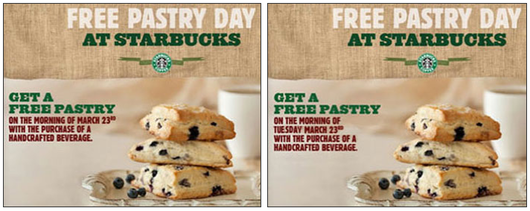
Please print the day of the week along with the date also offers a nice A/B comparison.

Lots of other interesting nooks and crannies — design and otherwise — at Watson’s site. (And yes, his site could probably use a UI overhaul itself. Cobbler’s shoes and all that. Nonetheless, worth a visit if you’re into this kind of stuff.)

Ben
on 15 Jun 11I was in 100% agreement with him until he said this:
Walmart?
Have you seen their new logo.
It’s great in comparison to their all of their past logo. It’s much friendlier and more personable.
Ravi T
on 15 Jun 11The content on the site is great, but I noticed something… Highlight the list under “Pro sports teams named after their state or region” for a surprise.
Spoiler alert: He’s using font tags to create white n’s and m’s for indenting the list! I’m scared to view source.
Jake
on 15 Jun 11@Ben
The new Walmart logo looks like a puckered sphincter….
Keith S.
on 15 Jun 11The Starbucks ad might be intentional. I’d imagine a typical consumer might think ‘Oh isn’t that nice of Starbucks’ and that sentiment sticks with them longer than the desire to look up the day of the week. End result? Good impression with consumers, less free product given out.
Kevin Haggerty
on 15 Jun 11This is great stuff, thanks for sharing it. Lots of good reading on his site. Especially loved his “Great Ideas” section.
I found no issue with the UI of his site – cleanly organized, focused on content, easy to read, even easier to scan for things relevant to my interests.
Kevin Haggerty
on 15 Jun 11@Keith S
Would that they were that clever! The point of giveaways is to increase store traffic – a free pastry + paid for coffee + something else today? = more revenue for that store. Omitting the day of the week seems like pure laziness on that original designer’s part. Going yet further – the red block type is extremely hard to read, and the headline should be “Free Pastry Day – Tuesday March 23rd” that way all the important information is at the top and gives a stronger first impression.
OnLooker
on 15 Jun 11I agree with Jake… the new Walmart logo is terrible. Seriously, a 5th grader could have come up with that.
Rachel McClung
on 17 Jun 11Love the direct commentary. After browsing Jim’s blog, I get the vibe that he calls shots just like he sees them, without any filter. I appreciate his guerrilla approach to fixing environmental design issues in everyday life (see A Blocked Sidewalk, Vandalism on an Airplane).
One of his points about the Thunder logo gave me pause: “When questioned, almost all Oklahoma designers agreed that its an awful logo but were unwilling to do anything about it.”
I’d be curious to know what exactly designers in Oklahoma could do? Offer to creative speculative design for a client that clearly doesn’t respect the process? Create initiative to educate business community on what makes an effective identity? Not sure there’s a quick, ethical answer. But maybe Jim can put his mind to the task…
D. Morris
on 17 Jun 11While I agree that bad design looks…well, bad, it can be brandable. It can sometimes stand out better than good design, like Walmart’s logo. It may not be the nicest logo in the world, but it’s hard to forget…and that’s more the point.
However, the typography on the Oklahoma City Thunder logo does need some serious work.
joejoejoe
on 17 Jun 11The Oklahoma City Thunder play to 99.7% capacity, their basketball games are setting ratings records for TV events in market, and they are 7th in merchandising despite being one of the smallest markets in the league. They have one of the best players in the world, were one of the best teams in professional basketball last year, and have one of the lowest payrolls in the NBA. Where are the design problems again?
Michael
on 17 Jun 11Can someone explain what’s wrong with the logo? It looks fine to me.
Hamid
on 20 Jun 11Design lessons, I don’t like wallmart logo also. Design improvement is one of my goals in website application designing.
This discussion is closed.