Sometimes when I’m giving feedback on a UI, and I’m pointing out a spacing detail, I upload a little screenshot to Basecamp or Campfire to help make sure the feedback is clear.
I wanted to share a little tweak to the feedback which I think is ultimately more useful. In this example I’m pointing out that the space above and below an element is not equal (and I think it should be).
I used to do it like this:
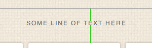
Two lines. One line above the element (text, in this case) extending to the next element above it, and one line below the element extending to the next element below it. The length of the lines shows the different spacing. That works, but the difference – especially when we’re talking about small units of pixels – isn’t as clear as it could be.
Then I switched to doing it like this:
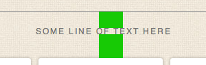
Blocks like this are easier to see than thin one pixels lines. This is an improvement. But it’s still not as clear as it could be because it’s not as easy to judge the comparative volume of a rectangle as it is a square. So…
This is how I do it now:
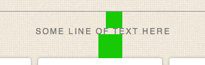
The same vertical distance is covered, but now, since both blocks are perfect squares, we have related horizontal distance which helps you see how much bigger the difference is.
Why not just say 24px vs 35px? Because I want to point out the physical difference, not the exact number of pixels. If we’re just talking numbers then it’s easy to assume 24px or 35px is right. But maybe the final size is 27px or 31px. I don’t want to get stuck on numbers when I provide feedback like this. The final number isn’t important as long as it’s the same (and it looks right).
I hope this was helpful.
Don Schenck
on 04 Nov 11VERY good point, Jason. Reminds me of the kinds of things Tuft points out.
Anoop Ranganath
on 04 Nov 11By doing this, you’ve made the relative difference in area of the squares disproportionate to the relative difference in size of the spacing.
In the example you provided, 24px is roughly 68.8% of 35px.
However, with the squares, you are now comparing 576sq px with 1225sq px, so the smaller square is 47.0% of the larger one.
If the intent was to exaggerate the difference to make it more apparent, it succeeds. If it’s to accurately reflect the difference in spacing, I don’t think it’s ideal.
Anonymous Coward
on 04 Nov 11Anoop, it’s not about numbers. It’s about seeing the difference better.
Mad Hemingway
on 04 Nov 11Feel free to pass your feedback along to the Google Reader team. Heh!
Tyler
on 04 Nov 11Enjoyed the post, it’s always fun to see how people work. But 100% with Anoop on this one about the distortion. I actually thought your 2nd method was the clearest.
Fen
on 04 Nov 11Would colours not work better here? I skimmed the images before reading the article and had difficulty interpreting what the difference in marker widths meant – presuming it was something to do with kerning.
Perhaps red for the top marker and green for the bottom would be a nice touch? For the non colour-blind, that is…
JF
on 04 Nov 11Fen: These aren’t shared in isolation. They are shared with a simple explanation. The graphic just helps round out the explanation.
Anonymous Coward
on 04 Nov 11JF: Sure; I just think it’s nice to be able to grasp something quickly with illustrations and not necessarily need an explanation. Yours is a great idea anyway, I’m always trying to communicate verbally and it usually requires repetition. Visual aids are a great tool, often underused in small teams when communication is done by turning your head to the right and speaking :)
Darcy Fitzpatrick
on 04 Nov 11It’s a small detail, but I’d centre the top square with the bottom square. I know you’re using these squares to be more clear about your feedback, but right now the indentation is making me feel like that’s part of the issue. Either that or stick with keeping them the same width. You might have a point that judging squares is easier, but seeing them in this context seems to muddy things rather than make them more clear.
Pete
on 04 Nov 11Darcy:
The squares are aligned left for the same reason they are squares. Because they are squares, we know that the height of each is equal to the width of each. Because they are left aligned. we can compare widths very easily to understand that the heights are different, and by roughly how much. Centering the squares would force you to mentally add the difference on either side.
Don is correct, Tufte is the first thought that came to mind. well done.
Rebecca
on 05 Nov 11Interesting. Visually, people like extra space at the bottom though. That’s why museums and picture frame places will always make the bottom mat of a piece of art or photograph bigger than the top. Maybe this isn’t the same online though…
Brett Atkin
on 05 Nov 11Aren’t you glad you shared this Jason? As a developer, if my design partner sent me this image and the words “please center heading vertically”, I’d look at the image about 3 seconds to get the idea and then just fix it. Jason, I like the idea of showing relative differences, and that is all it is. I think the second example works equally well though for the intended purpose. I think some of the commenters may have over analyzed this just a bit.
Jorge
on 05 Nov 11Great timing with this tip. Lately I’ve been struggling with how to provide this kind of feedback within my team. Not everybody sees the differences without using visual aids.
Aishwar
on 05 Nov 11Thats a nice way of showing the difference. I think the second way is the most intuitive. The third way is clever and makes the difference more obvious, but at first sight – its hard to understand what it is illustrating. But once you realize the idea behind the squares, it is good.
jason
on 06 Nov 11Great idea for sure. The last image made it all so clear.
Saeed Neamati
on 08 Nov 11I read it carefully, twice. But honestly, I didn’t got what you meant. Maybe you should write more clearer, or maybe my English is leaking.
Tim
on 08 Nov 11I think the squares work perfectly. The first example – hard to tell but it looks a little off The second example – bit clearer, there’s obviously more space below than above The third example – woah, that’s miles off
The first two examples wouldn’t work well if it was only 1px or 2px.
It doesn’t matter if you don’t get it at first, but like many learned behaviors it’s so obvious once it’s learned.
Joker
on 10 Nov 11@Saeed LOL
Francesco Bertelli
on 11 Nov 11This is freaking smart. QA made simple.
This discussion is closed.