One of the joys of building the new Basecamp was using the new Basecamp to quickly iterate on a design problem. Because I’m in Colorado and the rest of the team lives elsewhere, we rely on a combination of tools to share files and work through ideas. And while we might have used Campfire in the past, we now use Basecamp messages to quickly work through ideas and keep the conversation focused.
During one design session, I worked with Jason and Ryan on a particularly thorny problem on the calendar: notifying people about a new event.
Reusing Patterns
When we build large features like the Basecamp calendar, we like to get a prototype up and running as soon as possible. This allows us to use the feature early and often, helping us identify problems and fix them. Sometimes, building a working prototype means standing up pieces that are “good enough” and moving on.
For event notifications, we grabbed an existing design pattern (for calendar permissions) and roughed it in. With other parts of the calendar still up in the air, we added a “good enough” stamp of approval and focused our attention elsewhere. As time went on, though, we started to feel the pain. This solution wasn’t going to cut it.
The Wrong Metaphor
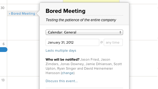
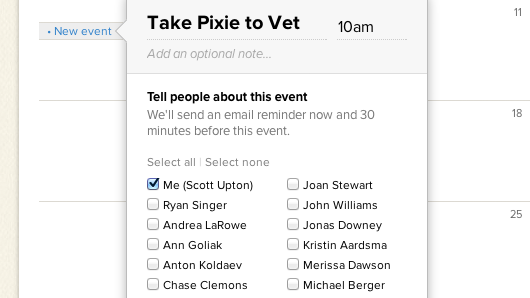
There were two main problems with this design: 1) The text fields made it seem like you could tell anyone about an event, even if they couldn’t see the particular calendar and 2) We were forcing people to type names for every event, which felt like work.
Sure, by using an existing design pattern, we were able to build something quickly. But the cost was that we weren’t really thinking through the problem. As it turns out, it was the wrong metaphor altogether. We weren’t granting permission here, we were notifying people about an event and setting a follow-up reminder. Time to sleep on it.
Clarifying
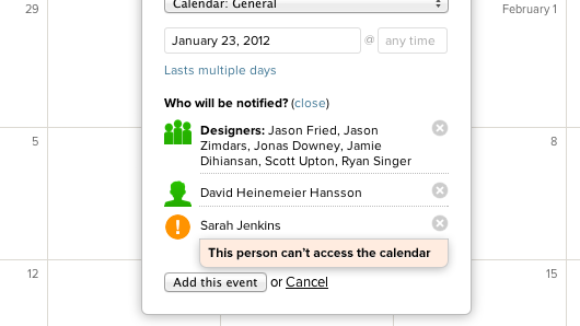
The next morning, a solution became more clear. We needed to offer a few quick notification options (me, everyone) and a way to choose specific people:
Those shortcuts made it easier to notify yourself or everyone on the calendar about an event, but what if you wanted to tell just a few people? It felt like a lot of interface to include more text fields on a dialog with loads of radio buttons, date fields, and buttons. Maybe we could tab the dialog? Could we toggle it in some way? What if we slid the contents sideways? I quickly mocked up an idea and dropped it into our Basecamp thread:
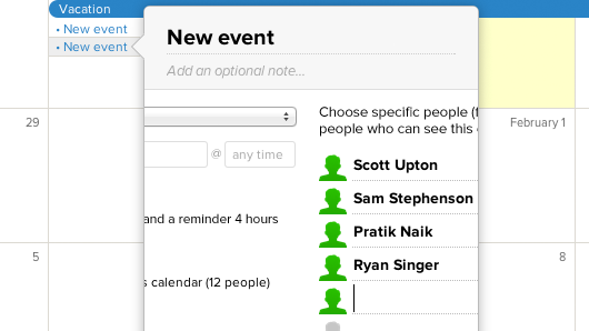
We were onto something, but it didn’t feel quite right. The freeform text fields still required that you remember who can see the calendar in the first place. We soon realized we were avoiding a better solution because the dialog was so small. By sliding the UI over, though, we’d freed up space to use checkboxes for everyone on the calendar:
That felt better. You could quickly send notifications to people with minimal effort. Plus, if you didn’t need that functionality, the complexity was tucked out of the way until you do.
We continued to iterate from there, but we hashed through the core thinking in about 24 hours of back and forth in a single Basecamp thread. These sessions are fast, interactive, and fun. Everyone can see the designs as they are dropped into the conversation, leave a comment, and offer suggestions. When the idea feels like it has legs, we build it and start the feedback cycle all over again.
For a more detailed look at the new Basecamp calendar, check out this video or start your own free trial today.
Michael
on 29 Mar 12Thanks for thinking this through. I like that when I add someone to a project, I know they can just start using it to communicate. I don’t have to hold their hand.
Also, this is a different kind of calendar notification, but I really like the post-it note that announces upcoming dates on the main page of the project. It’s exactly where it should be.
Tim
on 29 Mar 12Very cool iteration process. Who manages all the comments in the Basecamp stream?
BTW not to sound like a stalker.. But I swear I saw you at Ozo coffee one time.
Mike Waite
on 29 Mar 12My favorite part of this:
“We continued to iterate from there, but we hashed through the core thinking in about 24 hours of back and forth in a single Basecamp thread.”
It’s amazing how big of a hurdle this is for most people.
Andrew Banks
on 29 Mar 12I love this post. It’s so refreshing to see a real company take design so seriously.
It’s also good to see someone who thinks software should make your life easier, not harder. If it’s hard, it’s just as likely the software is to blame as the user (e.g., “We were forcing people to type names for every event, which felt like work.”
radex
on 29 Mar 12Links are broken :(
BM
on 29 Mar 12I noticed throughout BCX most input fields only have a bottom border, no inner shadow or background color (a la Event Title). A super clean design in my eyes, but has there been any pushback/confusion/etc from users?
Simon
on 29 Mar 12Superb work team… just started using basecamp at the studio and we all instantly love it – its touches like this that does it for us :) High fives!
The one thing we felt was missing from this is being able to trigger ical alerts when you are subscribed to the calendar?
Mike
on 30 Mar 12“And while we might have used Campfire in the past, we now use Basecamp messages …”
Is this the reason why there is no progress with Campfire? Will you continue to actively develop the tool?
David Kraljic
on 30 Mar 12Slightly off topic but related to calendars.
Tasks and their due dates are core elements of project delivery. As such, I wish tasks could be seen on the calendar. Planning a project on the calendar by dragging and dropping tasks to different dates would be ridiculously helpful. Doing this on a calendar as opposed to the todo list puts the planning in context of all the other events happening on a project. It just makes sense.. at least to me.
I know all those tasks would clutter the calendar. So you’d probably need to be able to toggle them on and off. There doesn’t seem to be an app out there that puts tasks on a calendar. Maybe for good reason, or maybe not. I think not.
Hope you’ll consider it.
David Kraljic
on 30 Mar 12Oh yea – quick follow up to my comment about todos on calendars.
You got rid of Milestones and that attachment of todos lists to milestones. OK because that setup didn’t fulfill they need. The need – to see what has to get done and when in the context of the most common format when discussing dates – a calendar. Milestones were too abstract. God knows, I’m not looking for gant (not even sure how to spell gant, gannt?) chart because again, not on a calendar.
Here are my assumptions to back up this “Todos on Calendars” workflow. When humans think of dates, they think calendar. Todos have due dates. Todos are the building blocks of project delivery. Completing a project is in large part completion of a collection of todos. Therefore, planning a project is planning a sequence of todos and plotting them to do dates. If the calendar is the most commonly thought of view for dates, then planning todos on a calendar makes sense. You’d be planning in the same context that you think of when thinking about dates. Plus with Basecamps awesome new ability to add other calendars, you’d have even more context when planning. Like, Jason is out, or at a conference the last week of April. Better not put all those todos on his plate that week.
JF
on 30 Mar 12Tasks and their due dates are core elements of project delivery. As such, I wish tasks could be seen on the calendar.
We’re working on that right now.
Chris Cuilla
on 30 Mar 12Great post! It’s great to see the thought process…and just the general thoughtfulness that goes into these things. A seemingly rare thing indeed these days.
David Kraljic
on 30 Mar 12JF:
We’re working on that right now.
Thank you.
GeeIWonder
on 02 Apr 12Hah BORED MEETING!!!
This discussion is closed.