
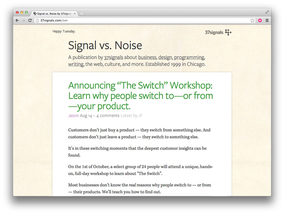
Last month we launched the redesign of our blog. During the process, we wanted to make it feel distinctly ours with a visual nod to its very name—signals and noise.
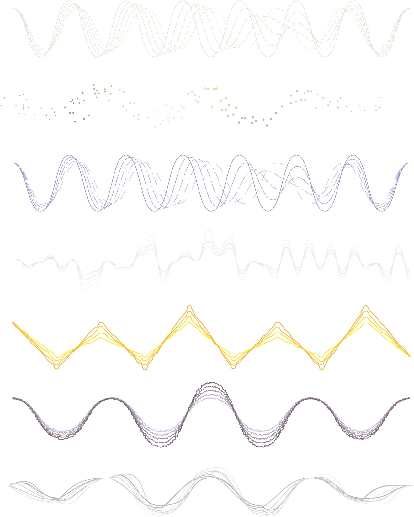
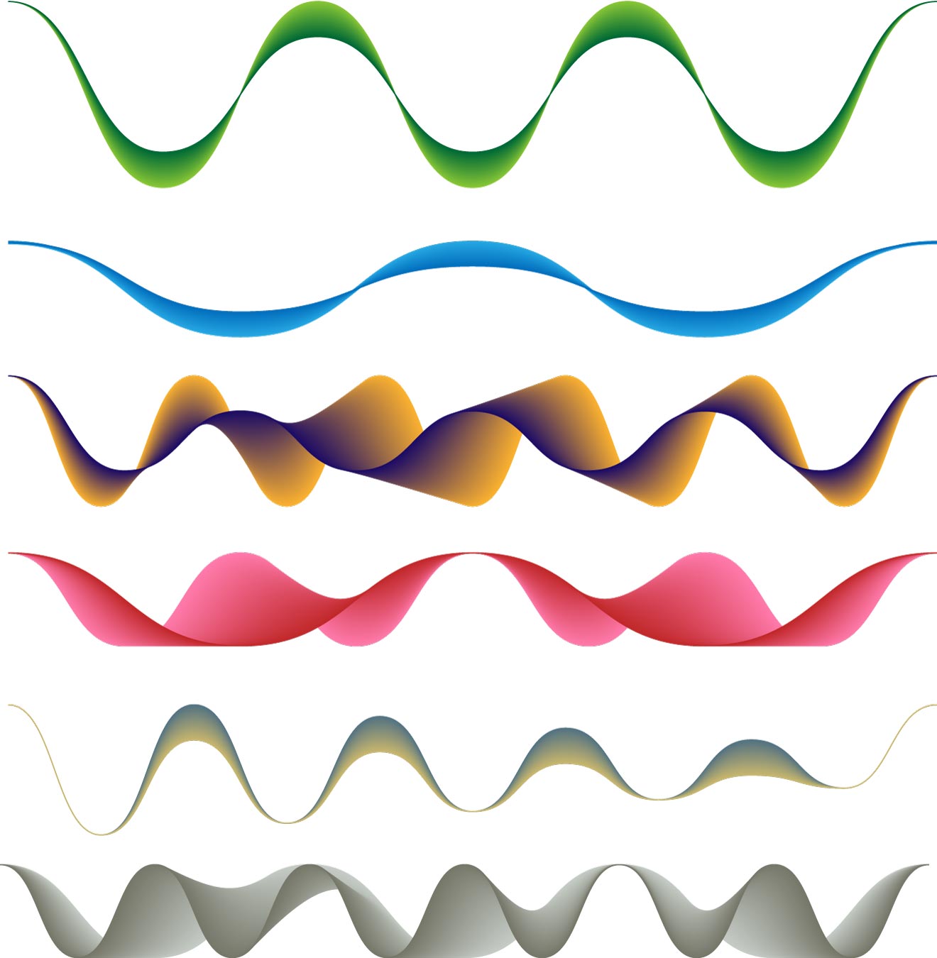
I wanted our blog to feel special, aesthetically unique, but not gaudy. I took a quick survey of our blog structure and found a great area for opportunity to explore style: our post categories. From design, programming, business, support, writing, to sysadmin, anyone from our team can categorize a post they write.
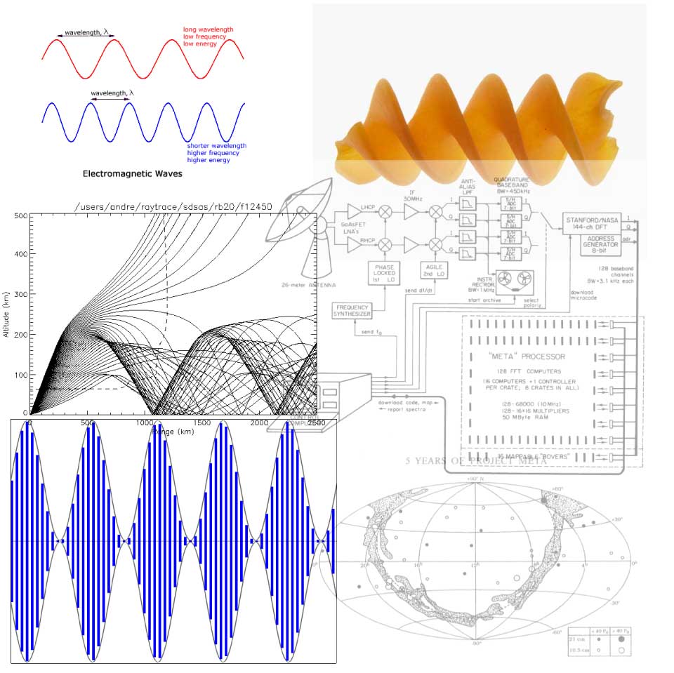
To give each post an identity, I riffed on these category themes. From there, the obvious presented itself: try illustrating waveforms to harken back to “signals and noise.” Although I had a focus on illustrating, I still started with words, and more specifically, questions to myself.
What does “writing” look like?
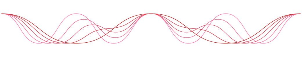
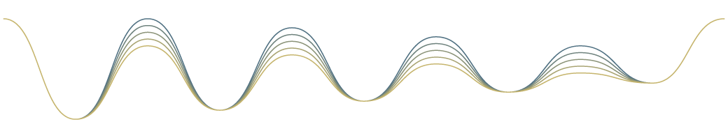
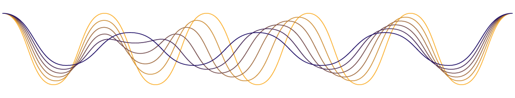
So, with Illustrator fired up, I started generating waveforms that would wear the identity of “design,” “programming” and so on. It quickly became an exercise in shape, color, and line densities. The process was fun, and the results were full of surprises.


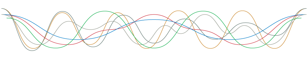
Illustrating noise
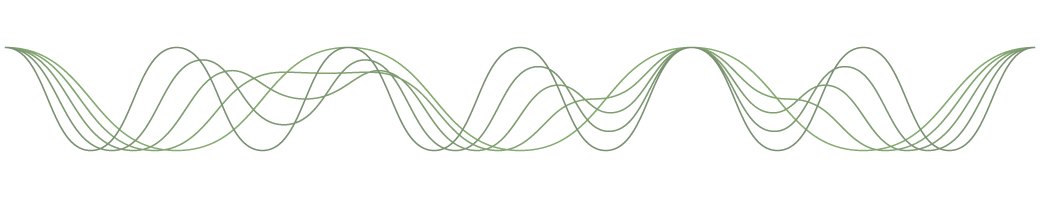
What about noise? (Or in our case, an un-categorized post?) What does noise look like? I had a slew of variations that all seemed, well, noisy.
But noise isn’t necessarily a bad thing. A “noise” post could be part design, part programming—or none at all. Instead, I stole a strand from each existing waveform and fused them into one, far more beautiful, noise form.
Keeping it light
The first versions of these waveforms were actually opaque. I loved the look, but as graphic elements, they were too heavy. They over powered the articles themselves, so I opted for the single-stranded look instead.
Revelation: tightly-boxed content feels temporary
Beyond illustrating waveforms, I tried out a few other art direction concepts. I was married to the idea of putting our posts within a white “sheet,” much like we do for Basecamp. It took me a while to realize, though, that wrapping content inside of a box also feels like putting an expiration date on it. Having content in a box makes it feel temporary, short-lived, even. It’s in the same vein that posts on the Tumblr dashboard feel like one-off posts with no future in sight.
Allowing articles to own the entire page in the browser, free of contained boxes, gives them a sense of worth. Nothing revolutionary, of course. Frank and the nice folks at Medium are aware of it.
Inspiration board and cutting room floor
You can start to see a lot of inspiration that sparked my waveforms came from SETI diagrams, and visualizations of radio waves, signals, and various frequency noises. I happen to find the thin, plotted, and intricate lines from data quite beautiful.
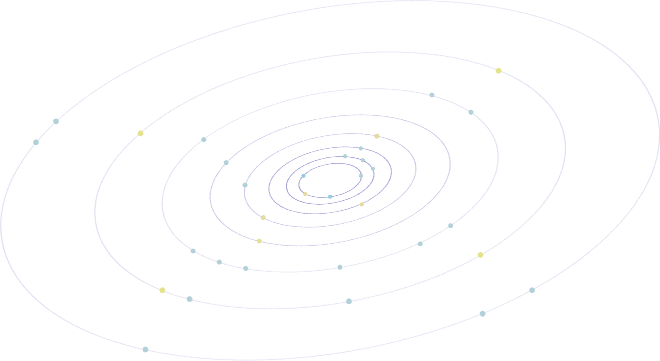
As a background element, I explored mapping every hire at 37signals on a ring within space. It starts with JF and DHH in the center, and each year of growth represents all the signals hired that year. It was a fun idea to explore, but in the end, a bit too distracting.
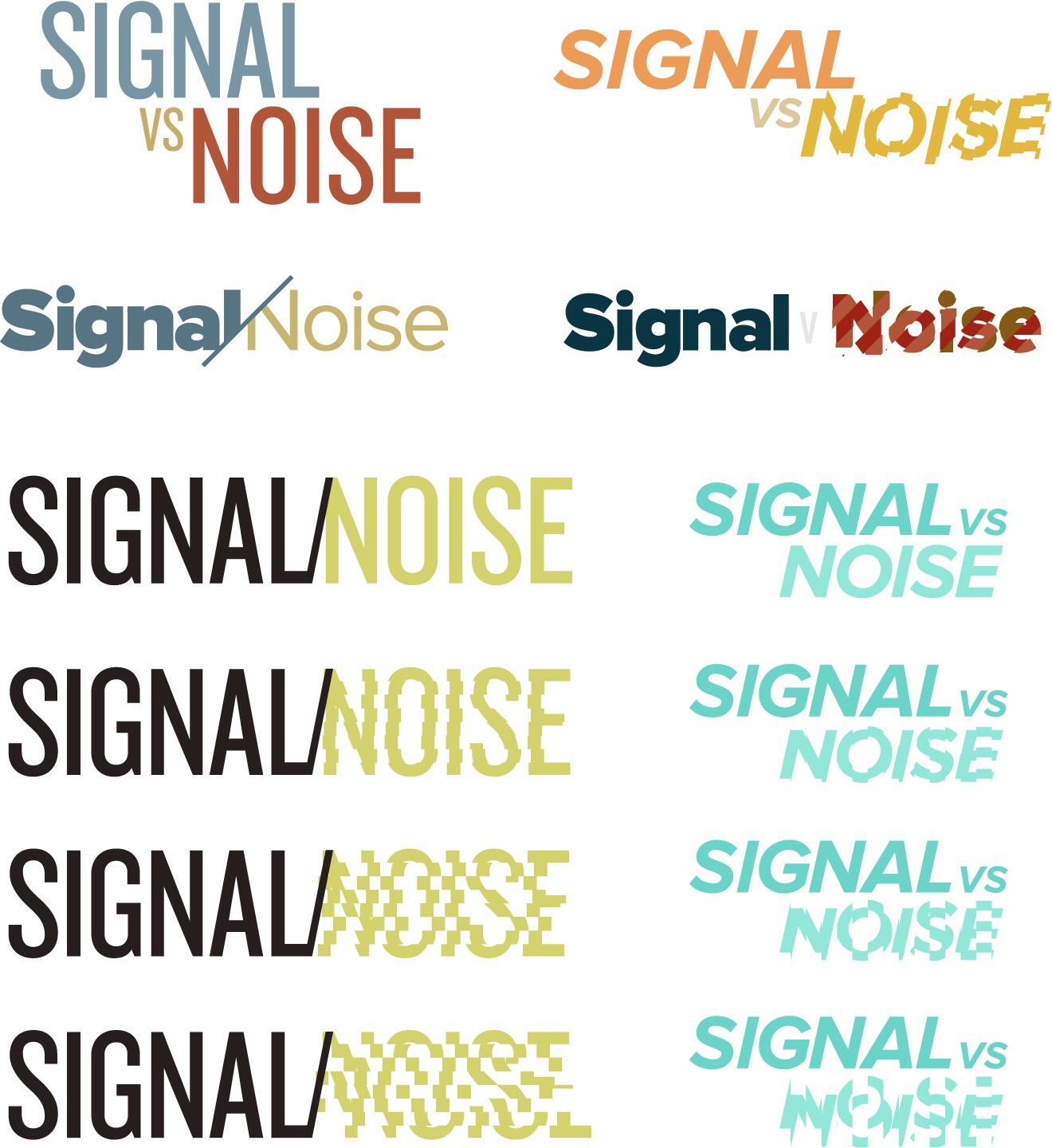
For most of the process, I was exploring a modular logotype. Each page request would show a different level of “noise” applied to the logo. Much like the 37signals rings, it was more of a visual distraction from our posts themselves.
People often ask, “how do you know when to settle on a design?” It’s through these rounds of explorations—seeing the good, the bad, and the ugly—that the right directions start to surface.
Dan Mall
on 09 Nov 12I can’t love this any more. Thanks so much for sharing your thoughts on the redesign!
GeeIWonder
on 09 Nov 12I liked it better when I thought the signal graphics were just random.
This is far too contrived for my taste.
Timothy
on 09 Nov 12+1 for GeeIWonder comment
Michael
on 09 Nov 12I really like that you made the waveforms symbolic in an age when so many designers opt for impression/dynamic equivalence over something more meaningful. Thanks so much for sharing.
Dan Bowen
on 09 Nov 12I hate to sound apathetic, but it’s a blog, not anger management therapy. Black text on a white background, very clean and Apple-like, although its no mystery you guys are Apple fans I don’t come here to be calmed by the pretty meaningful waveform, I come here for information. But what the hell, if it works as a conversation starter in the bar then by all means, blog about it!
Scott
on 09 Nov 12Like it!
Jeff Rodgers
on 10 Nov 12I would respectfully say for you folks that don’t get this post, and why this matters, you’ll never get it. There are two types folks that will read this post:
One that says “Why does this matter?That’s a waste of time.” Two that says “Oh yeah, that’s how I design.”
This article speaks to who 37 Signals is as a company. An alternate name for the company could be “Design Matters”.
GeeIWonder
on 10 Nov 12@Jeff:
Nah, it’s far worse than a waste of time. You’re either going to do something right, something quick, or something that is neither. This is the latter.
It’s taking something that has real SIGNAL and removing all meaning and significance, supplanting them with artifice. Design and Writing are the same wave with different amplitude/wavelengths with completely different rationalizations.
And then you post a picture of an article at the end as if this somehow provides justification for the whole exercise. You want to have a halloween signal or a christmas signal or whatever else, go ahead—Google does it. They don’t usually drown you in pseudo-scientific justification to do so.
The post immediately previous to this one talks about Big Data issues—why not get graphical signal vs. noise elements out of that rather than plotting sin and cos curves.
steffen
on 10 Nov 12After one “CMD -” it looks not bad. But default text size is too big.
Brian Saunders
on 10 Nov 12I don’t understand the hatred expressed in the comments here. The design decisions are rational and are firmly rooted in a process.
Travis
on 10 Nov 12Unbelievable how self righteous 37signals feels in spending a waste of time on something to useless.
I’ve resisted saying this for the past year but will say it now … 37signals has jumped the shark
Michael
on 10 Nov 12Jeff, I like Mig’s post but I don’t agree readers have two choices. I do not design the way Mig does, but I don’t think his approach is a waste of time.
Anonymous Coward
on 10 Nov 12Part of the backlash that’s been on this blog for a while now is coming from the fact that 37signals has always been respected and admired for being a business that cuts through all the useless crap and nonsense to focus on what matters and lately it seems like they’ve been awfully proud of focusing on exactly what doesn’t matter.
Frank
on 11 Nov 12+ million to Anonymous Coward
Matt
on 11 Nov 12I don’t remember where a read (Possibly: “Getting Real”) where there is something like, when you are trying to explain a feature more than once, it means that feature was not easy or well implemented. This is the second post about the new design, besides all respect about their choices, for me it not looks good and it seems that they tried to hide the comments from the readers.
ploogman
on 11 Nov 12+1 to GeeIWonder, Anonymous Coward, and Frank
Yes, very contrived as to waveforms being used in this way and they are not so distinctive to each other when you only see one giant waveform before scrolling a lot to see another one. Sounds like a lot of time spent on this and the end result is not that great in my opinion. I think the premise of using a horizontal waveform, cutting across the center text river, is a bad design premise to begin with. “Signal vs. Noise” has meaning to readers without pseudo-scientific waveform designs to illustrate it.
There is rationale and reason behind all design, good and bad. Designers should not be fooled by their own rationale or lulled into a state of certainty over a design based on their process. Design, no matter what its muse or inspiration, has to stand on its own at the end of the day and no detailed explanation of the design automatically makes it good better or good.
This hidden scroll bar comment box is difficult to work with. I just checked twice, once in each direction, to make sure my remarks were not cut off at the beginning and the end.
Not saying the old design was winning any prizes but this new design needs to be more function and less form, or in this case..waveform.
Sam Solomon
on 11 Nov 12Great post Mig. The new blog design is gorgeous, and easy to read. I’m a fan.
Randall
on 12 Nov 12I dig it. Are those functions all sums of sine waves, or ‘drawn’ with a spline tool or the like?
I also approve of leaving out the logotype—when the blog is spare otherwise, even a pretty reserved graphic design on top of the page is going to look loud by comparison. The green hover on the ‘Post’ button even surprises me. I also like the narrow lines, wide spacing, and choice of font; I think we’ve collectively gotten Stockholm syndrome and have started to think hard-to-read layouts on the Web are good (or inevitable, or standard). Zooming images on click/tap is nice.
The choice of where to use serif versus sans is tricky. Some of the text in Proxima Nova seems like it’s really content (titles of other posts, category names) that should be Kepler if content-versus-UI is the dividing line. Other hand, you could argue that this is really about parts of the page (core versus header/footer) rather than types of text (content vs. meta) and, anyway, picking which text to set in what is such an inherently fussy subjective task that people will disagree about any choices.
I still wonder about the lack of a box or any of focus on the comment textarea. A box makes it much quicker to recognize that this is, in fact, an editable field. At another level, if boxes suggest ‘temporary’, then it makes perfect sense to box my as-yet-unsaved comment and only take it out of the box once I post. (The narrower line-spacing already suggests the in-progress comment is a different creature from all the rest of the content; why not go all the way?) You could indicate the box is ‘special’ but still give it a quiet and unconventional look by using, say, a light grey background rather than a border (either all the time or just until the textarea’s focused).
Russell Middleton
on 12 Nov 12Have you tested whether, given a list of concepts and waveforms, new users can identify the correct pairings? I’d be interested in the results. My guess is they won’t do much better than a random walk – if so, is this still worthwhile?
Devan
on 12 Nov 12To me, this is a classic case of design ‘forgetting’ about the root nature of what is being designed. Waveforms such as you have illustrated are the visual representation of (usually) audio sounds.
Mig, you seem focussed on the visual representations of your waveform illustrations. If you were to plug these waveforms into a synth or other modulating device that can translate them into sound, you would quickly notice that most of them will simply end up being ‘noise’. In fact, some of your ‘noise’ ones may actually end up being more clear and articulate to the human ear.
Perhaps a better starting point would have been to start with the audio signals first – tune your synth LFO, MOD and Waveforms to get a sound that represented Clarity, Balance, Structure etc. and then looked at the resulting waveforms and use those as a starting point for the design process.
Maybe not just audio waveforms – why not study the patterns made my bumblebees going to/from the hive for the ‘Exchange’ waveform? The path the beating wingtip of a swallow traces across the sky for ‘Elegance’.
I think you need to channel Richard MacDuff (from Douglas Adams’ first ‘Dirk Gently’ novel) a little more… ;-)
ploogman
on 12 Nov 12@ Devon – I agree with your first sentence but maybe not in the way you mean it – in the sense that it seems like it was forgotten that a blog was being redesigned as opposed to something else as the result is frighteningly hard to work with and look at – and is supposed to represent the best of the data visual architects online? And in terms of clarity which I am all for, blankness does not equal clarity.
As to the rest of the comment about synth waveforms and other seemingly gross deviations from redesigning a popular blog, this whole exercise seems so contrived.
T
on 12 Nov 12This is a classic example of a company designing for itself rather than for its readers. This is very, very strange to see coming from 37signals, who have always brilliantly put the user first.
The result for the readers is an image…and one that in my opinion doesn’t work all that well as a blog post separator. The meaning of the image is company internal and self-congratulatory. But this whole new blog is quite egotistically focused, rather than making things easy for the reader.
I don’t get what happened here with this redesign, but it feels built for the boss, not for us. I hate that, because I hold 37signals in such high regard—but I’d never send anyone to this blog anymore – I think it would detract from the image.
I’ve been searching for a word for this design, and I think I’ve found it: pretentious. Look up the meaning on Google: “Attempting to impress by affecting greater importance, talent, culture, etc., than is actually possessed.” That sums up this post as well. Sorry Mig! Being honest, I think you can do better.
JeffreyR
on 12 Nov 12I have also fought to enjoy this new design. But one BIG plus is that Readability can now parse and render it. I’m not sure if it ever could with the old design, but I tried it a couple of years ago and it failed.
For those that have not discovered it yet, I highly recommend Readability. Then no matter how you feel about the current SvN design you can have the text look the way you want it to.
MIG: Please test for Readability compatibility on any new designs…
MR
on 12 Nov 12“This is a classic example of a company designing for itself rather than for its readers.”
@T — You nailed it. I designed our blog—our company blog—for us.
Thanks everyone, for the comments. The positive, the negative. It’s always fun sharing your process. Worth noting: I quite adore companies that take the time to craft and finesse every opportunity of their own communications—be it their own company blogs, email newsletters, or otherwise.
A hat tip to the great folks that invest time polishing the place where they share their own thoughts: Vidget, iA, Intercom, among plenty of others.
JM
on 12 Nov 12Mig, FYI: https://www.google.com/search?q=pretentious
ploogman
on 13 Nov 12Well I think Jason loves iA and finds nirvana with a really clean slate on an 11” MacBook Air. That is a refreshing way to write – but not great for a blog redesign theme. I agree with other poster above about sending people here – I would hesitate to because the look and feel of this blog totally overshadows the content now. I think you will see a readership dip, but maybe you don’t care and even want to “prune” SVN. Don’t forget Mig – we criticize and critique because we care and not to give you grief. We all like the content posted here and have frequently sought and received inspiration and encouragement. This new blog redesign discourages a lot of us from coming frequently.
Pete Petrash
on 13 Nov 12The new look is gorgeous. Absolutely love the waveforms you came up with and the meaning behind them . You killed it with the ‘noise’ waveform. Thanks for sharing your process.
GeeIWonder
on 13 Nov 12designing for itself
Cop out.
I have nothing but respect for what you people do and good for you for putting yourself out there Mig—I take no issue with you, just this particular design/narrative but…
Cop out.
T
on 13 Nov 12Thanks for the honesty Mig, and interesting to see some of the design inspirations. I personally don’t like any of the other sites you mentioned for all the same reasons, but clearly there is a specific opinion about the purpose of those blogs, driving the design which SVN now shares.
So that suggests to me that 37signals is moving SVN away from the concept of a place to present an idea to an audience – and moving towards an SVN that is a place for employees of the company to share ideas with each other and boost morale.
That’s too bad. I enjoyed the previous design that felt like 37signals gave the same import to the words of its customers and evangelists as it did to its own. Now, instead, we have an extranet of sorts, which perhaps was the direction the company gave you. If so, you’ve done your job.
To 37signals at large: it was made clear that this new design was less blog, and more archive. I think you’re readership will suffer (I visit far less frequently already) but as someone else mentioned, perhaps you’re intentionally pruning us away. After all, money-producing customers and evangelists like me just write long, annoying comments anyway.
Freddy
on 14 Nov 12Thanks for explaining the design process behind the blog. I really like your blog design.
As a regular reader of your blog I found that I was (unconsciously) highlighting the text (with my mouse) every time I was reading a block of text. The text color #333333 was making the readability little difficult.
I changed the text color to black (using firebug) and I didn’t face any difficulty in reading.
Any thoughts on why the content was not given black color?
Anonymous Coward
on 14 Nov 12Wow is this the future of blog design or just an in-fad between designers who want to impress each other. The profile images here are pretty much copied straight from Vidget, the general layout and spacing is copied from iA, and Intercom is such a hot mess I cant tell what was borrowed from there. Reminds me of the wave of self promotional portfolio sites from about ten years ago where so called artists tried to show off their uber design skills and came up with all sorts of extremely unusable and crappy sites that only impressed other so called artists.
And that green hover on the post button. What color is that. Maybe its the highlight from the basecamp logo. No, not quite that even. Randomly chosen I guess since it has nothing to do with the anything else on the page. Maybe it looks different on a tablet or phone. Looks awful on a mac. I feel like Im on punked and I am just waiting to be let in on the joke.
ploogman
on 14 Nov 12@ anonymous coward
I have decided that this blog redesign may in deed be a practical joke and I feel silly for falling for it. I’ll stop back in a couple weeks and see the real redesign hopefully at that time. By then, my eyes should have stopped buzzing from the extreme whitespace and unnatural line spacing and other affronts to usability.
In the unlikely event this is not a joke, not sure even where to start but is really derivative and example of form riding roughshod over function to a fault. Love how I have to actually press “post this comment” twice for it to work.
Jeff Rodgers
on 14 Nov 12@Michael – I don’t think I was clear in my earlier reply. I’m not defending Mig in HOW he designed it. I was giving my opinion as to WHY they changed the blog (because design matters, and they wanted to give it meaning). I was not trying to say that if you do not design like Mig, then you don’t get it. But I am saying if you don’t understand why design matters, it can’t be explained. All of that said, I was surprised at Mig stating they changed it just for themselves. That I don’t get. LOL.
MR
on 14 Nov 12Jeff, it’s not that we changed SvN for “just for” ourselves. It’s our personal blog, not anyone else’s. Since no one is required to read it—or has to pay for it—we have the autonomy to experiment and try new things.
Some of these will be a success, some will probably fail. We’ll piss people off, and delight a few others.
At the end of the day, we put some new thoughts and efforts in freshening up our blog which hadn’t been touched since 2005. There’s plenty of room for improvement, and that’s the exciting thing about design. It’s a process, not a final outcome.
We’ll tinker here and there. And it’s because we can.
I heard a man once say, “But this is my personal site. There are many like it, but this one is mine. And on this one, I get to try designs that are idea-driven and make statements.”
This discussion is closed.