Notice how the little, er, laser-beam-thing (?) above the navigation suggests moving from left to right, i.e. first you “meet zune” and in the end you, inexorably, require “support”... Well, at least it’s sorta honest.
PHP Developers’ Network

Megan Jack writes:
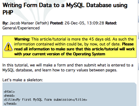
Check out the yellow box that alerts you that this article may be out of date. I’ve come across a lot of content on the web that is not dated. Is this article from 2005 or 1998? Who knows. The PHPMac method could be applied to any site – I think a lot of misinformation occurs when people don’t realize that content they are reading is out of date, either because there is no date or because they don’t notice that the article or website is several years old. About.com is particularly bad for this (no dates on articles).
Planet Argon

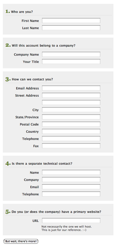
Nice “create an account” form at Planet Argon.
American Express

We have to be ThirtySevenSignals for AmEx.
Got an interesting link, story, or screenshot for Signal vs. Noise? Contact svn [at] 37signals [dot] com.


James H
on 28 Mar 07I have a beef with the Planet Argon form: colour should not be the only thing used to signify something’s importance (per WAI-1, http://www.w3.org/TR/WAI-WEBCONTENT/#gl-color).
some guy
on 28 Mar 07Form validation constraints can be far more asinine. I read one example of an insurance company where their system had parents fill in information about their children for family life insurance plans or something like that. The system wouldn’t allow any of the listed people to have the same birthdays. Problem: what about twins?
RS
on 28 Mar 07The fields are actually all white. I think the yellow might be from a browser auto-fill function. We thought the form itself is nice: the text, the layout, etc.
ML
on 28 Mar 07I think the yellow might be from a browser auto-fill function.
Replaced with the normal all white version.
brad
on 28 Mar 07The “no dates on articles” thing is one of my pet peeves. It’s so maddening to read content and have no idea when it was posted! Community MX is a good example of this: none of their posts are dated so there’s no point of reference…you see articles that say “next week, we’re coming out with a new Jump Start!” and you can’t tell what week, month, or even year they’re referring to.
Worse still are sites from bands and artists who don’t put complete dates on their announcements and calendars. So you’ll see “Upcoming gigs” that refer to upcoming dates in April or May but in fact they might have been for gigs that occurred in April or May of 2006. Grrrrr.
Justin Reese
on 28 Mar 07Yeah, AmEx’s site kills me. Their online account access registration (for credit cards, at least) limits passwords to “6-8 alphanumeric characters”. Yes… an upper limit of 8 characters. Numbers or letters only. How terribly secure.
Of course, they do offer the added security of an interface so arcane and muddled, hackers couldn’t figure out how to do anything once they broke in. So that’s nice.
Adam Sanderson
on 28 Mar 07The absolute first thing I do when reading articles that aren’t on my RSS feeds is to search out the date if there is any question of age. It doesn’t even need to be exact, at least let me know which year this is.
Sometimes I will even resort to checking the meta tags, or trying to divine it out of the url. You surely don’t want vastly outdated css advice, or examples of ruby code from back when the language focussed much more on those crazy perly magic variables $!. At the very least I want to be aware that something is possibly outdated.
Jeff Mackey
on 28 Mar 07re:AmEx site, the Capital One website has the same issues with company names including numbers. Totally annoying, as I cannot apply for a business credit card online because their form flags “SIX15”.
John S.
on 28 Mar 07My beef with the Planet Argon form is that it is asking Yes/No questions but leaving the user to guess what to do if the answer is ‘No.’ Maybe their users are smarter than mine. If I had something like that on my sign up form I’d be bombarded with questions or (worse) fake company info because nothing designates those input boxes as being optional.
Using questions there to break up sections uses unnecessary words and doesn’t clearly state what they’re asking for. Less is more. I think I read that somewhere.
Another problem with that form: free form State/Country entry. When was the last time you typed that in yourself? Is their system parsing all of that on entry? What’s the point? It takes more time for the user and it’s error prone.
Lastly, “But wait, there’s more!” is a joke right?
Grant Hutchins
on 28 Mar 07In Jakob Nielsen’s latest article, “Does User Annoyance Matter?”, he points out that most users are slower with drop-down boxes for “state” and “country” and that much input error comes from this type of control. He suggests free-form entry, like Amazon.com uses. This is especially true for the elderly and less-experienced users. So be careful that you don’t confuse yourself as designer with the user.
With proper form validation, they could accept many different formats for “state” entry and even suggest what they think you mean if you misspell one. I’m not sure what they do on Planet Argon.
Steve
on 28 Mar 07The funny thing about that Zune laser pointer thingie is, it looks more like dynamite fuse, ala Mission: Impossible. So therefore, it’s going in the wrong direction. :)
Gal Josefsberg
on 28 Mar 07No, the worst is when you do Google searches and the results are not dated. You get all excited at finding something that matches exactly what you need and then you realize it’s a four year old page and the information is no longer accurate. It doesn’t matter for most searches, but when it does matter, it can get quite frustrating.
I wish there was a way for Google to display a “last updated” date next to each link on their search results.
Derek Scruggs
on 28 Mar 07That last one makes me wonder how they would cope with Jennifer 8. Lee
Darrel
on 28 Mar 07“My beef with the Planet Argon form is that it is asking Yes/No questions but leaving the user to guess what to do if the answer is ‘No.’”
I agree.
“With proper form validation, they could accept many different formats for “state” entry and even suggest what they think you mean if you misspell one.”
Maybe it doesn’t work internationally, but at least in north america, ZIP/Postal code = state, county and city. Why can’t they just ask for your street address + zip?
But, yea, it’s quite annoying to be speeding along filling out a form…type…tab…type…tab…type…tab…only to realize that there was one drop-down list in the middle of it all that you missed.
Allison
on 28 Mar 07Hi! I designed the Planet Argon new hosting account form about a year and a half ago, and looking back on it now, there sure are a lot of things I would change. Some mentioned here, and some not. We are in the process of a site redesign (yay!), so a new and improved form is on its way. :-)
One thing we will be keeping is the text fields for state and country. Select boxes are frustrating for people (Grant posted a good link), and the information we collect here is not critical (nor required). If it were, I might use auto-complete with some hinting.
John, good point about the yes/no questions. To be honest, I hadn’t really thought about it that way. I am still working out the best way to show required and not required fields, when there are only a few required fields (in this case, 4 out of 18). Actually, if anyone has any good examples of how this has been done, I’d love some links!
Dave P
on 28 Mar 07@Darrel:
The “Zip” field is one of my biggest annoyances as a Canadian. We don’t have Zip Codes, we have Postal Codes.
I can’t tell you the number of times I have been left out of an otherwise available service because I have to use a “zip code” consisting of all numbers.
In fact, unless you are going to mail me something, I’m not sure why you would require that information at all. The Planet Argon form states “How Can we contact you?” which I would take to mean that the fields are optional.
This is very confusing to me, and I don’t think this form is an example of good user experience at all actually. Admittedly, this is being viewed out of context, so there could be something more that I’m missing.
Peter Cooper
on 28 Mar 07Country drop downs are actually very simple if you know how to use the keyboard. All I do is tab down to it, type “Un” press up and down a few times to find the United Kingdom, and I’m ready to keep tabbing. Sadly most users aren’t au-fait with tabbing and will scroll through tons of options ;-)
Consistency is key, I think. Some companies do stupid things like list “Great Britain” instead of “United Kingdom” or, worse, “England”. Perhaps this is just making the argument for freeform boxes though ;-)
NetManiac
on 28 Mar 07PHP Develpers Network is doing right with dates and disclaimers, however it looks a little funny… I guess basic things like way to write some data to MySQL does not change every month ;))
smackfu
on 28 Mar 07I was just going to point out the same thing. I bet more than 50% of the pages show that warning, which makes it so common that it’s useless. You don’t know whether it is out of date or not.
Typical technical solution, when it would be far better to go in and mark deprecated things as deprecated.
Paul Schreiber
on 28 Mar 07AmEx can’t sort, either.
Jake Walker
on 28 Mar 07The AmEx no numbers requirement reminds me of my friend, Ty, who for a long time couldn’t easily book a ticket with a few major airlines, as they required any first name to be 3 letters long.
l@m3r
on 28 Mar 07MiCr0$haft iS s0 l@me – keeeeeeeeeeeeewl!
Addi
on 28 Mar 07I think I do. From the looks of the article metadata right above the yellow box it says Posted: 26-Dec 05.
I am guessing it’s from 2005. Do I win anything ?
nathan
on 28 Mar 07he wasn’t referring to that specific article, addi
Baeck
on 28 Mar 07Re: AmEx:
That must be why Matchbox20 became Matchboxtwenty – they all wanted to get AmEx cards. It all makes sense now!
Martin Bialasinski
on 29 Mar 07In the current form, there is no indication which the four required fields are at all. Instead, the users is turned off by a looong sign-up form.
Your goal is to make sign up as easy and fast as possible. How about you show just the four fields. Then, after the “Thanks for signing up”-message, you present the optional fields. With a clear notice why it is in the users best interest to fill them out. To allow for faster contact in case of problems or questions regarding the service, or whatever the actual reason is you asking the users these additional questions.
Martin Bialasinski
on 29 Mar 07Oh, and about drop-down menus: Large ones are a pain in the ass. Switching to the mouse and selecting Germany in Highrise takes awfully long. It could at least memorise the country I selected and offer it as default on the next contact I add.
A auto-complete text field would be better, maybe even one that gives once selected options a greater weight, so you can complete the entry even faster.
Michael Blanchard
on 29 Mar 07I’m with Peter – what’s a mouse? I’m all about using the keyboard to fill in forms – including drop lists. That’s the main reason I use Camino instead of Safari – Safari won’t let me tab into drop lists. C’mon Apple!
Tamlyn Rhodes
on 29 Mar 07I too much prefer free-text inputs for address details. In the UK most sites that require an address ask for your post code then offer you a drop-down list of the addresses in that postcode (usually around 10-20). The trouble is our flat number isn’t in the database! Some sites give you an ‘Other’ option but if they don’t then that’s me blocked out.
Martin Bialasinski
on 29 Mar 07Because a sweet and crisp form is always better. When you open the page and you see a field with that many fields and you see that the form has even more fields when you scroll down, you get the “oh gosh, filing out for tax returns again, do I have to fill that all out” feeling before even searching through the field for any indication what is required. And visually, the big form (and the bad pre-disposition) is still there, even if the user realises that most fields are optional. Visual clutter. It unnecessarily requires additional mental processing to decide if that field is required or not, when filling the form.
A short form with only required fields screems “Look how easy it is, sign up!” It sends a message about the service / product you sign up for: it is easy and painless to use. Let’s hope it actually delivers on that :-)
And as for the asterisk, that is not such a clear convention at all. Some sites use it to indicate required fields, some to indicate optional fields.
Justin Reese
on 29 Mar 07There’s actually some system preference that enables this. I’ve been using it for years. Go to the Keyboard Shortcuts panel of the Keyboard & Mouse system preferences, and enable “Full keyboard navigation”. Technically, even without it, you can option-tab to the select list, but this allows direct tabbing.
Caveat: it also enables tabbing between interface/input elements in places like dialog boxes, so your “Don’t Save / Cancel / Save” buttons when closing unsaved documents are now tabbable. I love this, but it might take some getting used to.
Justin Reese
on 29 Mar 07Correct: the preference is “Full keyboard access” and you just toggle it from “Text boxes and lists only” to “All controls”. Tried to go on memory there.
Justin Reese
on 29 Mar 07Metacorrection: I meant “Correction”, not “Correct” up there. Sheesh.
Christian Decker
on 29 Mar 07That yellow box is a really good idea, but I think it should be a little more subtle.
Qian Wang
on 29 Mar 07So, AmEx doesn’t do business with 3Com, 3M, Level3, or 7-Eleven? I’m sure the poor programmer wasn’t the one to think up that ridiculous restriction. It was probably a “domain expert” of some kind who’s got a deep understanding of all the “business requirements.” Which is why I shudder at things like Simonyi’s Intentional Programming that aim to give more direct control to these domain experts and let them generate code automatically. Imagine the UI’s you’ll get out of that!
Chris Bernardi
on 30 Mar 07Does anyone know how to create the warning box with PHP?
Justin Reese
on 30 Mar 07Chris- not sure how much of this will come through:
$out_of_date = date('Y-m-d',mktime(0, 0, 0, date('m'),date('d')-45, date('Y'))); $article_date = '2007-01-20'; echo $article_date<$out_of_date?'Old':'New';Obviously you’d replace the shortened conditional echo (line 3) with whatever you wanted to do, probably an include. You’d also dynamically insert the article’s date into $article_date, formatting it in that way.
Anonymous Coward
on 30 Mar 07Trying again:
$out_of_date = date(‘Y-m-d’,mktime(0, 0, 0, date(‘m’),date(‘d’)-45, date(‘Y’)));
$article_date = ‘2007-01-20’;
echo $article_date<$out_of_date?’Old’:’New’;
This discussion is closed.