Click away from the pen tool…
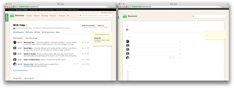
Put down your Pantone book…
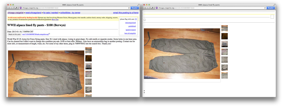
Stop rearranging your layers…
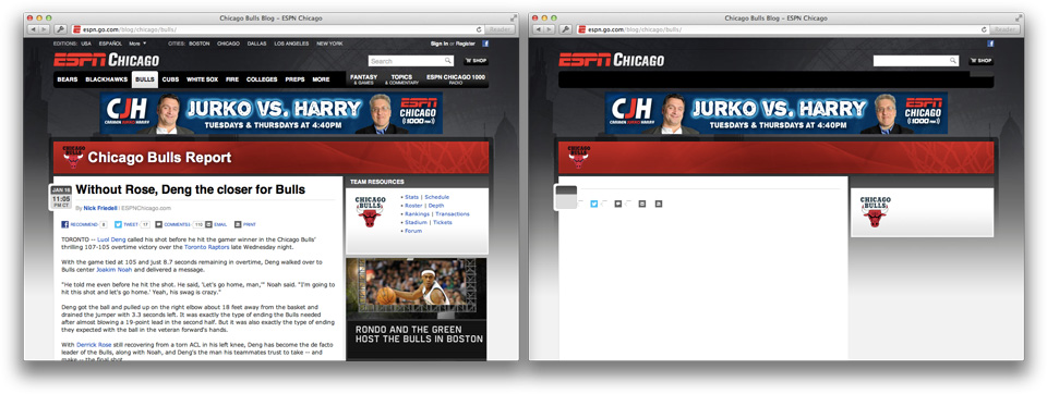
Close your stock texture folder…
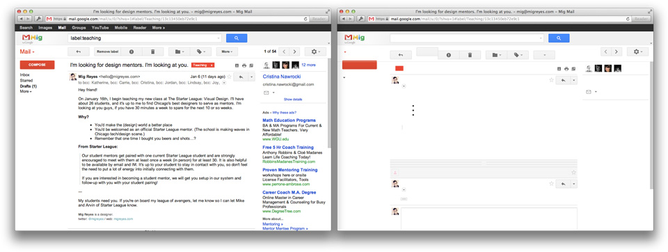
Log out of your Dribbble…
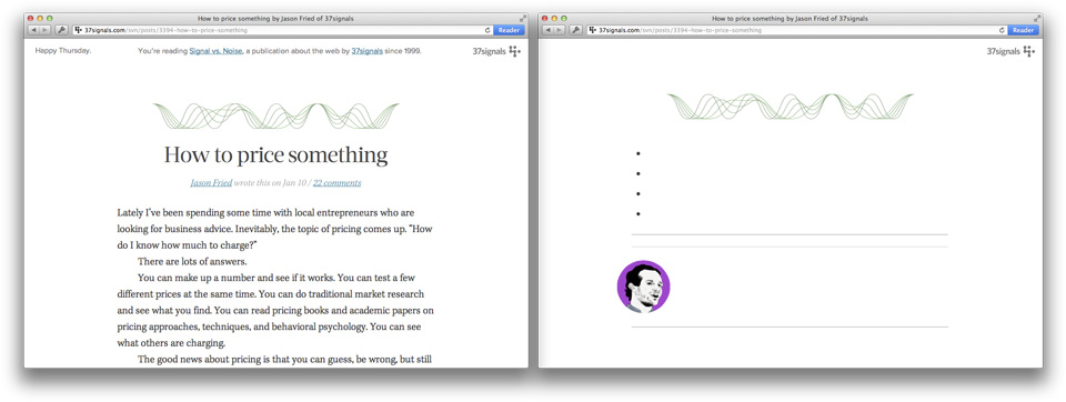
And god dammit, hug your copywriter…
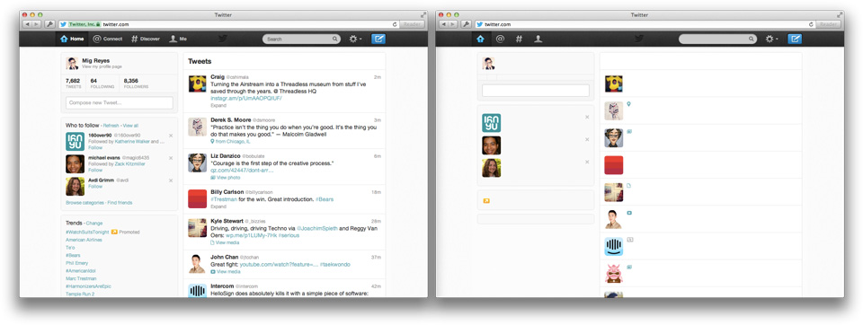
Designing for the web is still about words.
You’re reading Signal v. Noise, a publication about the web by Basecamp since 1999. Happy !
Click away from the pen tool…

Put down your Pantone book…

Stop rearranging your layers…

Close your stock texture folder…

Log out of your Dribbble…

And god dammit, hug your copywriter…

Designing for the web is still about words.
Brian M.
on 17 Jan 13Amen.
francesco
on 17 Jan 13The most underestimated job. Excepted for classic adv industry.
Jens Nikolaus
on 17 Jan 13Yes!
David
on 17 Jan 13Great post! Well said, sir!
Scott
on 17 Jan 13+1!
Des Traynor
on 17 Jan 13This is excellent Mig. Really timely reminder.
I used to give a presentation on a similar topic you might enjoy: The Language of Interfaces.
Sandra
on 17 Jan 13Bravo! Now, if we can send this link to my folks…
Julieta Felix
on 17 Jan 13I was just telling our senior copywriter yesterday how amazed I am at how hard their work and the talent they have. Great post!
Andrew
on 17 Jan 13Words are our world’s UI. Clear and concise copy is the most important thing and hierarchy is second, everything else is usually noise.
Rohit Menon
on 17 Jan 13A nice insight. However, you should also put screenshots of only text without the design, which I guess would be interesting. Will the words still be that interesting? Just a thought.
Alexey
on 17 Jan 13Yep, this is exactly how modern websites looks now when you’re on slow connection waiting that goddamn webfont downloading when layout and pictures already are.
Andrew
on 17 Jan 13So you are the guy that hid the comments in this blog so good that it took me forever to find them? WOW! I’m impressed ;)
Mello
on 17 Jan 13Mig – have to admit last comment is funny. This new design is pretty unfriendly to eyes and flow. Is the joke over yet?
Ricky Salsberry
on 17 Jan 13With comments like the two above, it’s no wonder comments took a back seat.
Yoosuf Muhammad
on 17 Jan 13Agree with you!!!
BS
on 17 Jan 13If you are designing a blog it will not be a good design if it is boring, no matter how good it looks.
John
on 18 Jan 13In the Beginning was the Word …
Dan M
on 18 Jan 13I think one reason it’s hard to find comments from the http://37signals.com/svn/ page is because the link to view them is at the top of the post, whereas it’s conventional to have it at the bottom. Although it’s only that way for the blog posts; video and quote posts have it at the bottom.
shane harris
on 18 Jan 13This is the best thing on the Internet.
Shane Harris
on 18 Jan 13I will never get back the 300ms it took me to find the Comments.
Mr BMC
on 18 Jan 13Curious that a post about the importance of words relies so heavily on graphic examples to illustrate its point. Did you try reading this post without the screenshots?
Be that as it may, the sentiment of this post is sound even if the execution is not. Clear writing is a core principle of good design.
Goran Peuc
on 18 Jan 13Partially correct. Design is about communication. Yes, good part of that communication is made from words, however there are numerous other communication interfaces through which we, humans, gather and comprehend data.
Take for example Google Analytics – made from graphs, pie charts, little bars etc. Yeah some parts are plaintext data, but good deal of analytic knowledge that you “inhale” from that site comes from graphs.
Instagram. You can use Instagram iPhone App purely relying on iconography and photos. Basically no text required. Open iPhoto App on iPhone/iPad. It communicates a lot, yet uses almost no words.
As more and more icons enter mainstream, and from icons turn into unanimously understood symbols (such as Settings icon, and Photo icon, wherever you place it nowdays people will understand what it does) there will be less and less need for words at least as a part of interface. Then you will be able to construct entire site where only the main content is text (or photo if you are building such a site) and bye bye with communication via text.
Reminder: design is still about communication through any form.
Chris Back
on 18 Jan 13So true Mig, I sent an email to our editors/copywriters with this link and a thanks.
Nathan
on 21 Jan 13“Design is all about [name one facet of design]”.
No.
Design is solutions. Those solutions normally involve several visual and contextual aspects. Please, people, stop regurgitating this empty nonsense.
Nathan
on 21 Jan 13Wise words from Goran above^. Not as snappy for a Tweet, but far more useful as design advise.
mello
on 21 Jan 13If design is still about words, then this blog design should be changed from the blinding white snowstorm it is. It is actually quite distracting for digesting any in-depth posts aside from a single pic gallery style post. Just my 2 cents and I’ll put on my fire retardant suit now as I get flamed by all the folks that claim to just love this blog redesign. Don’t know on what device this is supposed to look good on. Across desktop, notebook and phone, no good for me. Surprising from this pedigree to be honest.
Venture
on 22 Jan 13Very great post to learn. Venture of web design
Ahmed
on 22 Jan 13I agree words are important and they could be the whole design, such as Craigslist. My self and friend of mine working on the core/basic design of coming app/web site. I start to think of image could be the solution or big part of it to show users our contents (Pinterest.com). You sometimes 1 image can speak for itself better than 1000 words. He reminded me with the minimal design and how much Craigslist is known and famous for its simplicity.
His words reminded me with an experienced I had lately with classified mobile app. I was trying to sell my phone (that I’m using for listing). I add all info I wanted (name as text, description as text, price as text, currency from drop down menu, category as drop down and share with friends ON and OFF option) in 2 minutes or less. When it comes for me to add a photo, I was “annoyed”, because I don’t have an image of the phone I’m using in my phone library. I asked myself:”Do I have to add picture?”. So I had to search online for an image similar to my product. In order to search, copy, add to library then cost me about 4-5 min, which is double the time of adding text. (i could have added 2 lists in that time).
I think our experience and the minimal thinking, will shift the design to more words focus.
Ahmed
on 22 Jan 13@migreyes Regards the new blog design, its simple, but why Ads area has more space compare to previous design? Attached image shows it has alomst 50% of the whole page. http://t.co/AY7Ljxlf
whoa there troll hunters
on 22 Jan 13that post above from “mello” is a troll post? come on, you guys can’t take anyone’s perspective or anyone’s constructive criticism?
this new blog design is the epitome of me-to web feng shui center-content-river to the extreme. its not really about the content anymore, but I guess you guys are too big now to be worried about that? content is still king and glitz falls away, and you don’t have to be so quick to “troll” a poster like that, why not respond with something in serious response or even in joking response?
the site does look like a snow storm with giant letters flying by. even if you like it, you can at least have a laugh folks. even mello, whomever they may be, is reading your work so that should count for an ounce of respect, you folks provide the public forum after all.
maybe you should give the "troll" button exclusively to Jeff Bezos, he seems to be good with humor and with criticism and with knowing when to press the buttonsam
on 23 Jan 13funny how I couldn’t find the Words to show me the comments. I guess words+pictures are sometimes better then just a wall of text and linked text…
This discussion is closed.