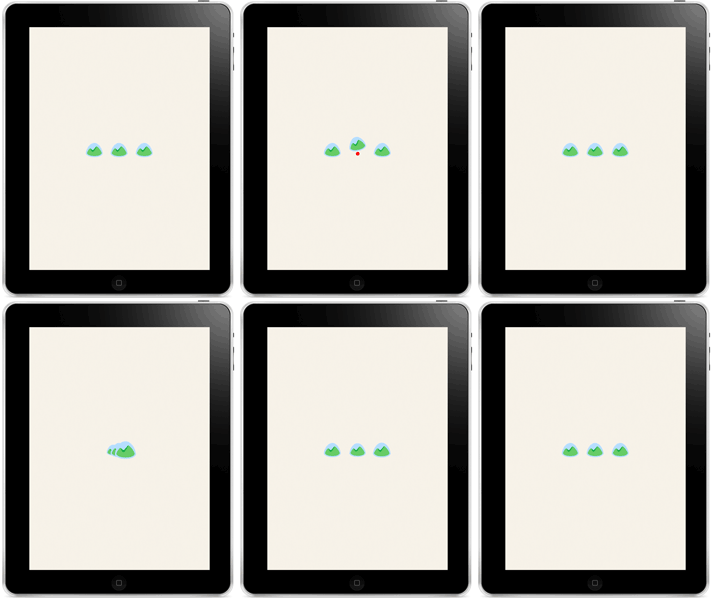
Last March the iPad team asked me to design some custom loading screen spinners for the Basecamp app. None of these have made it into the app yet, but I thought it would be fun to share some of the tests.





You’re reading Signal v. Noise, a publication about the web by Basecamp since 1999. Happy !
Last March the iPad team asked me to design some custom loading screen spinners for the Basecamp app. None of these have made it into the app yet, but I thought it would be fun to share some of the tests.


Justin
on 15 Oct 14I hope you go with the “three card monte” version, that’s pretty awesome.
Joe
on 15 Oct 14+1 Justin’s comment—that shell game animation rules.
Tino
on 15 Oct 14Last one!
Alejandro Moreno
on 15 Oct 14Just had to pipe in. The last one!
Jason Fried
on 15 Oct 14I’m partial to the three card monte version, too. I think it’s awesome.
Jake... from State Farm
on 15 Oct 143rd row from the top middle is fantastic! I think the last 4 are overly distracting… IMHO.
chander
on 15 Oct 14It’s gotta be the last one. No competition there!
Chris
on 15 Oct 14I think all the “spinning” don’t work well.
The line being drawn (without spinning) seems to communicate the message best. So in that case: 1613-BCX-ipad-spinner-08.gif.
That being said, the last one: 1617-BCX-ipad-spinner-12.gif is cute and fun and would be interesting if you used that on special occasions. Using it all the time might not be best since it’s always under the same cup so the novelty may wear quickly. But neat idea none the less.
Glad to see a company looking at the spinners of UI since even Apple uses the standard non retina spinners on their web interfaces.
Justin Van Patten
on 15 Oct 14These are all really nice. However, you may want to consider using the iOS system spinner for better perceived performance.
See http://mercury.io/blog/the-psychology-of-waiting-loading-animations-and-facebook
Michael
on 15 Oct 14Do the shell game and every now and then, load one where the ball appears under a different cup just to mess with people.
Christoph
on 15 Oct 14I love number 8 (https://37assets.37signals.com/svn/1613-BCX-ipad-spinner-08.gif). Number 6 is also great (https://37assets.37signals.com/svn/1611-BCX-ipad-spinner-06.gif) but maybe it gives the application a sence of hecticness. And Basecamp isn’t about that.
(memo to myself: Loading spinners can change your mood inside an application)
felix
on 15 Oct 142nd row down, on the right (draw in, then fade out) IMO. This one has the best feel as a loop, also is interesting enough to hold attention without being too distracting.
J
on 16 Oct 14I would very much like to know what tool you used to create these animation tests.
Marya
on 16 Oct 14The shell game!! Although I think all of the color ones are excellent.
Alex
on 16 Oct 14Love it. I recently had to make one these for my app. I’m really digging number 6: https://37assets.37signals.com/svn/1611-BCX-ipad-spinner-06.gif
Matt McCormick
on 16 Oct 14I think you should make it look like Pacman chomping across the screen. Kind of like the old school Ms. Pacman interlude.
Otherwise, the 3 card monte is pretty fantastic.
Rob Colburn
on 16 Oct 14If this is intended for full-page loads, then the final one is both entertaining and visually appealing. I do echo the sentiment that an elaborate loading animation feels less performant, and that I don’t trust it as much. Similar to how I distrust Apple’s spinning beach ball.
The subtler spinning grey logo feels nicer in a partial page load scenario or one where the full content is refreshing. Though none seem quite right for a pull to refresh scenario.
Devan
on 16 Oct 14The ‘three card monty’ one looks cool, but has the ‘shyster’ connotation of the street game, which I think may subtly make users defensive and cautious when they see it. I like number 1 and 9 – the rotation with a pause. I think we have all been conditioned to see a rotating object as a ‘please wait’ indicator. The pause makes the rotation of the non symmetrical graphic easier to bear without reaching for the sick bag… :)
Andrea Grassi
on 16 Oct 14I agree with Jason, the three card version is fantastic, playful and nice.
BTW: Shaun, did you excluded the possibility to have some text under it for “longer” waits? (it might fade in slowly only when the wait exceeded some time limits).
Might be a good addition to entertain the user while waiting.
Thiago Carvalho
on 16 Oct 14I like the heart beat one (3rd). The animation feels a little aggressive though
Wytze
on 16 Oct 14All your designs take the word “spinner” very literally. Why not just animate the two green mountain bumps inside the glass? E.g. letting them grow and shrink, or changing their colors.
Maybe even animate the grass through four seasons. Green turns brown. Flowers come and go.
Red Feet
on 16 Oct 14GeeIWonder
on 17 Oct 14The best loading spinner is no loading spinner of course.
However, for some applications, you might want the logo to indicate progress. In which case something like the middle, second from bottom row, might be preferable.
The last one is good too if that’s not a concern. I think I might grow to hate it though. It’s almost like bragging about how much time you have.
Ahmed
on 17 Oct 14The “three card monty” is the best :)
Mike
on 17 Oct 1437s iconography feels like snow globes
These can shake…
Sooooo…
JiPé
on 18 Oct 14Hey Shaun, thank you for sharing. I like seeing things in progress. None of them may be the final one, but it shows your process with all the iterations. Many are based on what we would expect form a spinner, to let you know something is running, spinning or animate while you wait. What I like about the last one is that it goes beyond and entertain you. I got caught following the logo that has the ball to see if I got it right! Maybe if you go forward into direction you should event think of programming it and making it random. I very much like it and in some way it represents what the team at Basecamp trive for, to delight the users by doing the extra miles.
Joel Wilson
on 18 Oct 14Thanks for showing us this work in progress!
My favorite is third row down, middle. And the three card monte is really fun!
Could you also consider figuring out how to use iPads as spinners on a lowrider? Because that’s what I was expecting at first. :)
Dmitry
on 20 Oct 14Thank you
Uzo
on 21 Oct 14I feel color transitions are subtle enough without being distracting. If the colors were meaningful and recognizable (simulating season changes in the basecamp “snow globe”, for example) it would likely bring all the joy of the comment section favorite spinner (three card Monte) without looking like it’s too much.
Matt West
on 21 Oct 14The last one is brilliant! Nice work :)
christiano
on 21 Oct 14first one = loading the rest = ? last one = loading
Shawn Chittle
on 22 Oct 14Three card monte without question. Then push an update a few months later and see if anyone notices you’ve moved the ball.
This discussion is closed.