eBay
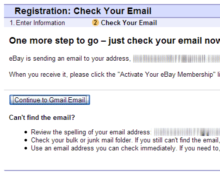
 Shane Pinnell writes: “As with most sites, eBay requires a valid e-mail address, but what eBay does a little differently is that when you reach the page that says ‘Please check your e-mail for verification’ they actually provide a button that opens up your email, assuming that is that you use a web based e-mail client like Gmail, Hotmail, Yahoo, etc…Very nice!”
Berkshire Hathaway
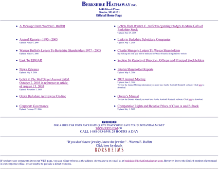
 Scott Meade writes: “A company like Berkshire Hathaway clearly does not have to rely on its website to attract investors and instead spends their energy on tasks providing true ROI. Not fun, exciting, enticing or interesting. Is efficient (e.g. no wasted words, full of content, empty of noise).”
Apple
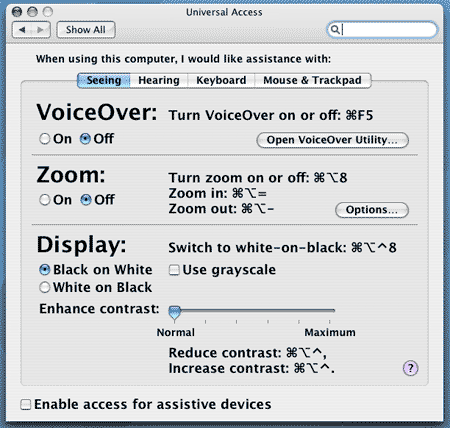
 Angela Welchel writes “Apple’s system preference pane for Universal Access: takes into account the probability that users needing assistance seeing information on the screen would most likely appreciate larger, bolder text on that pref panel. Considerate.”
Got an interesting screenshot for Signal vs. Noise? Send the image and/or URL to svn [at] 37signals [dot] com.

Chad Burt
on 12 Oct 06I’m not seeing the images. When I go to the image url I get a rails 500 error.
Dan Boland
on 12 Oct 06I’ve noticed the Universal preference pane and its nice big type before, but I always wonder… how do the vision-impaired get to that screen in the first place?
jsf
on 12 Oct 06That eBay functionality is nice from a usability perspective but from a security perspective it’s a bit questionable .. you’re now trusting a third party to link you directly to your email providers page, opening you up to some kind of phishing or man-in-the-middle attack.
Next up, they’ll include a link to your internet banking site. Then things can really start to get interesting.
Jason
on 12 Oct 06The Apple screenshot is nice, but +1 on Dan’s comment. Apple should incorporate this look into their install/setup process so it helps low-vision folks drop the machine into this mode by themselves. The way you get to it now, it assumes you’ve got a sighted friend or somebody to help you find that set of features in the first place.
Justin Koh
on 12 Oct 06We’re also assuming you’ve got somebody to help you unpack the Mac and plug in the cables :P Maybe there should be a big button and a voice cue when you first power up a Mac asking if you need the accessibility features.
Narendra
on 12 Oct 06At 30 Boxes, we have been doing the same thing with big web mail addresses for registration confirmation. We also, use them to generate the link behind our mail icon on the 30B Webtop.
SteveF
on 12 Oct 06Love, love, love the ad for Geico on the BH site. That cracks me up. Does BH really need to run ads on their site?
Pure Warren Buffett, never miss a chance to make a buck or two.
Scott
on 12 Oct 06He owns Geico.
Kieran
on 13 Oct 06So is the type smaller on the other tabs then?
Shane
on 13 Oct 06When I began reading this I was surprised to see that SvN was writing about the same thing I did, then it dawned on me that they were covering my entry and linking to my weblog! The sense of validation I have is almost overwhelming! I read this weblog every day and I really appreciate the link.
SvN has opened my eyes to a whole new world of web design and programming, and perhaps even more importanly to Ruby on Rails. I am simply a hobbyist and blog for the fun of it, but being linked to here provides a great deal of satisfaction and motivation.
Thanks!
Ben
on 16 Oct 06What if I forward my gmail mail to my yahoo mailbox?
This discussion is closed.