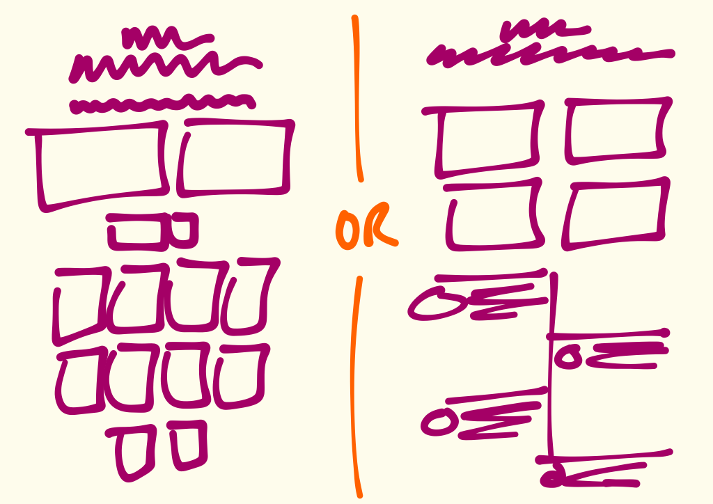
Even this late in the game, we’re still designing, redesigning, and debating. This is healthy product development.
You’re reading Signal v. Noise, a publication about the web by Basecamp since 1999. Happy !

Even this late in the game, we’re still designing, redesigning, and debating. This is healthy product development.
John Kranz
on 24 Aug 15What I’m curious about when I see mockups like this is whether the user would be given the option to pick either based on what they prefer. My sense from working with 37signals products is that one puts a line in the sand when it comes to UI design and only one option would be available to the customer (which probably makes supporting the product easier as well due to minimizing UI configurations).
J
on 24 Aug 15I just watched a piece on Vimeo by Mig -that Mig entitled, “Backwards.” (https://vimeo.com/channels/creativemornings)... a lo behold he exclaims that more or less “The seams are too tight and rigid in design to really appreciate the vocabulary of the mind’s view and acceptance of things in aesthetics…” [My Words; not his…] THEREFORE, he shouts: ‘Break Things. !” [Again: IBID, on the actual verbatim] Yet the message got acrossed.
-Maybe, therefore, you should just merge the two pieces you’ve listed here by cutting up the sections into identifiable portions; put them into a paper bag and pull them out one at a time and place them readily onto a paper in sequential order -only eliminating something when it seems redundant? (Er, just a Canadian thought here, based on being able to break the origination of order of design.)
Jason Fried
on 24 Aug 15@John Yeah these are more fundamental decisions about the values of the product, how it’s fundamentally organized, etc. The boxes aren’t just visuals, they have deeper implications, so choosing a UI on a per-customer basis wouldn’t really work.
george
on 25 Aug 15Go for the raspberry/pineapple looking one
This discussion is closed.