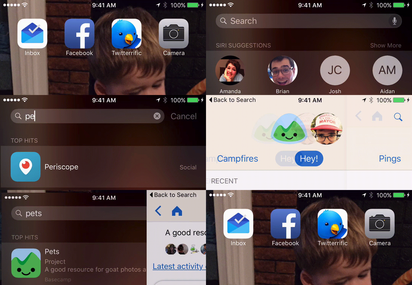
There’s an entire slew of new features available in iOS9 — but there’s one that you’ll be using every single day. It’s called Go Back to App and it’s all over the place. If you open an app from another app, instead of doing a full “flip” like you tapped the home button, iOS slides the app in and you get right to work. It happens so smoothly that it’s hard to even see happen:

This is going to change how iOS apps are made. Combined with Universal Links for opening up http:// and https:// links from Safari (or anywhere) inside your app, the reality for how apps are opened and work together has forever been altered. I know Apple loves calling features amazing — but this time they’re right.
It’s not just for apps. Back to is baked deeply into iOS. If you’re in Spotlight looking for something on your device, you’ll get brought back there. Here’s a preview of the new CoreSpotlight APIs working with the Basecamp 3 app:

It seems so simple, but I can guarantee you’ll be using it several times a day. It didn’t click for me until I tried out Facebook and Messenger. I’ve been using Paper since its release, but I decided to give the main Facebook app another chance after the iOS9 upgrade.
The middle icon — the most prominent one — of Facebook’s tab bar is Messenger. Jumping to another app in iOS9 makes this experience immensely less jarring, and well, smooth:

Back to is going to enable a new class of iOS apps. It’ll break up monolithic apps around a service into smaller apps that are easier to update, maintain, and conceptualize for users. It’s not a huge pain to flip to another related app. The worry about “oh, did they install that app?” still exists as a developer, but once installed, it’s super smooth.
I’d love to see this change promote a “fleet” of apps around services that each do one thing well instead of one app that does many things. Many services are there already. I’m confident more apps will ship in the next year that fully embrace Back to. It’s these under the hood, almost invisible changes that I love most about Apple’s polish and design. I can’t wait to see more.
This article was originally posted on our Medium publication, Building Basecamp 3.

Thomas
on 25 Sep 15Interesting points but I really hope the whole multi-app thing goes away. I still haven’t installed Facebook Messenger and I’m probably more likely to delete the Facebook app than install it. There is a level of overconfidence in the assumption that the user will just install some random number of apps because [boring technical reason that user doesn’t give a fuck about] that’s staggering.
(this isn’t entirely fair – I quite dislike Facebook at the best of times and probably wouldn’t be quite as venomous about it if another company tried… But I doubt it’d make me smile)
David Fitzgibbon
on 25 Sep 15This seems just like a ham fisted way of getting iOS to catch up with its competitors. They’re just stuffing it up in the corner, OVER other information. When I’ve used it, and the new app is loading, I’m never sure if the app is just taking some time, or if I have no connection. It’s awkward and jarring.
If getting back to where you were is that important they should bit the bullet and have a permanent back button. There’s a myth that iOS is really easy to use, and it was, but this seems like a symptom of making an 8 year old OS, that wasnt initially made for apps, work in an industry that’s totally changed.
It’s incredible that Apple has made iOS work for so long, and I applaud them for that. But to me, this is a sign of a creaking system that’s having difficulty keeping up with all it wants to do.
Jeannine
on 25 Sep 15I tested the “Go Back to App” I find it rather easy to use !
Jeannine du site defiscalisation-immobilier.biz
pwb
on 25 Sep 15I cannot stand when people do this but: back buttons have been in the web and Android since the very beginning. And Apple’s version seems like an after-thought with the small print squished in the upper left.
Henning von Vogelsang
on 26 Sep 15Mind you, people found their way back before the back button was introduced. They just double-pressed the home button. The introduction of the back button doesn’t really solve an issue, it just makes sure no one gets lost.
The problem is the positioning and size of this button, placed in an area that was reserved purely for top-level system indicators, such as battery life, network connection, etc. It was never meant to be an interactive area. This obfuscates the user experience and actually turns a potential solution into a usability problem.
Joël Cox
on 26 Sep 15Fred Wilson called this concept “App Constellations”. I personally love the idea of installing separate, more focussed applications à la carte.
Hugo Jenkins
on 28 Sep 15Coming in the new iPhone 7 – a dedicated button for this functionality! What a crazy innovation! Whatever will they come up with next?!
This discussion is closed.