Clickbank
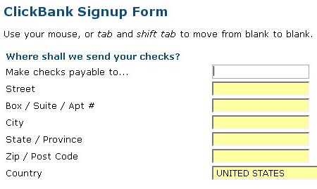
Brian Armstrong: “Clever wording on the first field of this signup form from
clickbank.com. I bet it substantially reduces people’s subconscious
aversion to filling out forms.”
Commerce Bank
Daniel Drucker on Commerce Bank: “Most useless icons EVER.”
Freshbooks
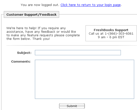
Nick Grossman on Freshbooks: “They have been determined to improve their product – since I’ve been a customer, they’ve steadily rolled out helpful changes. They are obviously listening to their customers. This caring and determination is exemplified by their new logout page, which doubles as a customer feedback form: otherwise unused space that catches people at a moment when they might have a constructive comment brewing. Brilliant!”
Btw, FreshBooks integrates with Basecamp for generating invoices, tracking time, etc.
Got an interesting link, story, or screenshot for Signal vs. Noise? Contact svn [at] 37signals [dot] com.


Dan
on 24 May 07Just signed up from freshbooks too check it out. Definatley one of the best usable/web 2.0 sites I’ve seen, I’m going to steal their feedback ideas. :D
Matt Fusfield
on 24 May 07To be fair, those are not the default icons for Commerce Bank…the default are more context relevant and their recent redesign is fairly easy to use.
Daniel Drucker
on 24 May 07Matt: They were the default for me when the new site got rolled out, as well as everyone else I know… I had to poke around to figure out how to get the more normal icons.
Aaron Blohowiak
on 24 May 07re: Daniel
I signed up for commerce a couple weeks ago, and my icons are self-explanatory.
Dan August
on 24 May 07But why have out-of-context icon in the first place? Why would you implement a feature like that?
Mike
on 24 May 07On top of the dorkiest icons, Commerce Bank (“America’s Most Convenient Bank”), doesn’t seem to have a bank or ATM within 30 miles of Chicago or any other zip code I know off the top of my head.
Kevin H
on 24 May 07That’s because Commerce is based out of New Jersey, with mostly branches in NY NJ CT and PA…
Those icons are indeed wack, but not the default. Funny thing is that their redesign is mostly window-dressing, the basic online banking functionality is IDENTICAL – forms are all the same, etc. They just changed the main nav…
Eric
on 24 May 07I truly love freshbooks. Been using it for about a year and they’ve made a number of great UI changes during that time. The logout -> feedback concept seems pretty unique (I’ve not seen it anywhere else) and is a nice touch.
Anonymous Coward
on 24 May 07Which hardly qualifies them as “America’s Most Convenient Bank.”
More like “America’s Most Convenient Bank (When You Are Standing In The Lobby of One of Our Branches in NY, NJ, CT or PA)”
Nick Grossman
on 24 May 07In a weirdly-related bit of customer service karma, I got a phone call last week from Mike McDerment, CEO of Freshbooks, who said he was visiting NYC for some meetings and wanted to take me out to dinner to talk about Freshbooks. His had asked his office for a list of NYC customers and he was making random calls to set up meetings.
I ended up meeting him out for drinks and talking about his business and software for a while—got to give him kudos for listening to his customers and and also got a few small gripes off my chest.
He said that they spend a lot of time on customer service - all of their designers and engineers do it - and he sees it as valuable training, not a burden on their time.
Anyway, further proof that they are on the right track.
Mrad
on 24 May 07sarcasm Aww, you don’t think flowers represent the various things you can do on a banking site?
pwb
on 24 May 07What’s the consensus on auto-tabbing between form feilds when possible?
I don’t like it at all. Since only some fields are fixed length, it creates an inconsistency. It remains a small sub-set of forms so users must be familiar with tabbing or clicking between fields. If you’re comfortable tabbing, you will frequently accidentally tab after already being auto-tabbed. And does it really add much value in the first place?
This discussion is closed.