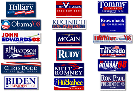
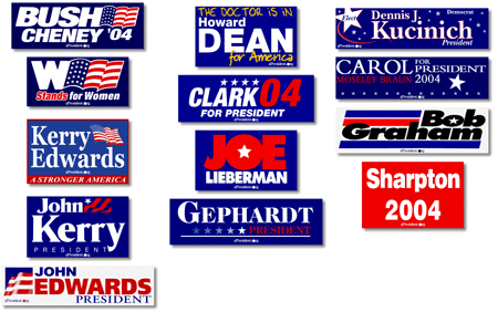
Apparently all presidential candidate logos must use red, white, and blue.
2008 logos:

2004 logos:

I know, I know. Gotta look patriotic and all that. But isn’t there some virtue in standing out from the crowd?
When every candidate uses the same color scheme, it ceases to convey patriotism or “a stronger America” and starts to reek of bureaucracy, design by committee, fear of change, and politics as usual.
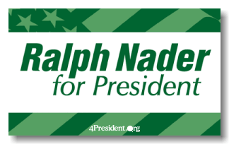
The last candidate to break from the r/w/b convention? Not surprisingly…

Logos from 4president.org.

Jeff
on 19 Jul 07I believe Carter used green in his campaign materials in 1980. Not a good precedent.
Chad
on 19 Jul 07Does this count?: http://www.georgewbushstore.com/200-6000.htm
Mike
on 19 Jul 07Mitt Romney’s looks like the Denver Broncos logo.
Karl N
on 19 Jul 07Well, yeah. I was going to say look at Green party logos. But that’s about as obvious for them as RWB is for the rest.
Nathan
on 19 Jul 07Chad right – Bush had the black ‘w’ sticker. I’d like to see a centrist use purple.
Quix
on 19 Jul 07Wow, that yellow text on Huckabee’s logo pokes you right in the eyeball like a dirty finger.
And how much did Sharpton pay his logo designer in 2004? A cup of coffee?
I like Lieberman’s…
Jared
on 19 Jul 07They also must have stars.
jharr
on 19 Jul 07Obama and McCain at least tried to do something a bit different. The rest apparently used “BumperSticker Pro 1.0”, that’s a PC-only app. :)
Dr. Pete
on 19 Jul 07Vilsack’s sticker makes me think of “V”; the 80’s miniseries about the friendly aliens who ripped off their faces to reveal that they were really evil lizard people. Not quite the theme a candidate should be shooting for.
Oh, and who the hell is Tom Tancredo?
Mrad
on 19 Jul 07Yes! Nader’s the man! He’s money in the bank!
Seriously, I’ve been disappointed in political signs for years. But I forgot just how bad it was.
Dan Boland
on 19 Jul 07But the best is Alan Keyes’ 2000 logo — taste that Comic Sans freshness.
Rex Hammock
on 19 Jul 07The Carter/Mondale campaign definitely used green. Heck, they even used a late 70s 2.0 type. A few years ago, there was an interesting essay in the AIGA Journal on this topic by Steven Heller called The Dreary Art of Presidential Elections.
Kjell
on 19 Jul 07Paul Wellstone, (almost) two term minnesota senator used green. Both his signs and big green campaign bus are still iconic here in MN. If only he were running for president this cycle.
Benjy
on 19 Jul 07It’s like they’re afraid if they don’t use red, white and blue with stars that they’d be labeled unpatriotic. I wish one candidate would actually buck this trend and actually invest in a graphic identity, unique colors, etc. Obama’s come closest so far, but even he falls back on the red, white and blue… Why not go with colors that stand for fresh, or middle ground, etc.? These just say business as usual!
Dave
on 19 Jul 07As much as I detest President Bush, those oval “W” stickers were clever.
Rex Hammock
on 19 Jul 07Oh, and speaking of Carter/Mondale and their use of green. Also in that 1976 primary season, a certain former governor of California ran for the nomination and used the color suggested by his last name.
Ernie Oporto
on 19 Jul 07So given JUST the logos are your sole piece of information, who would you vote for in the 2008 election?
Nate
on 19 Jul 07Obama’s logo is different… reminds me of Homestar Runner for some reason.
Josh Catone
on 19 Jul 07Ralph Nader didn’t really break from convention… he just stuck with the colors of the Green party (which he was the candidate for), while the rest go with the colors of the Democrats or Republicans (which have red, white and blue party colors).
I would say Obama has the most “convention-breaking” logo this year, since at least he has a clever play on the O from his name and the flag (using the O as the sun and the flag as a field). The rest of them didn’t even really try to be clever.
Josh Catone
on 19 Jul 07Oh, and Howard Dean used white, blue, and yellow last year. That’s at least breaking from the party colors (sorta). :)
Josh Catone
on 19 Jul 07These comments need a preview… of course I meant 2004, not last year. ;)
Benjy
on 19 Jul 07That small, McCain’s star looks like a pinwheel… spinning out of control, which is entirely appropriate for his campaign of late :)
Chris Brummel
on 19 Jul 07I can’t remember where I read this, but this stuff has been focus grouped TO DEATH. What they found that the absolute most succesful method is red, white, & blue. I read that they continually test this and it’s ALWAYS the same.
Strange, ‘cause I can’t stand it…
Andrew
on 19 Jul 07Cameron Barrett wrote about doing logo design for a presidential campaign back in 2004.
Chris
on 19 Jul 07Wellstone was an almost-three term senator, not almost two. If I still had a green “Wellstone!” bumper sticker, it would be on my car.
In the field there, it’s easy to stand out – Edwards’ green swoosh thingie is almost a bold move. (Ignoring Huckabee since he’s one of those ;-)
Mo
on 19 Jul 07As if their actions are not enough to portray the politics as usual, you want them to give us even more so of a warm and fuzzy feeling that they will be honest and caring using a variety of color schemes.
I think the observation I make is that no matter who you vote for and get into internet pissing matches over, just look at the logos they are all the same. You are just trying to vote for the better evil.
Oh and this doesn’t open the door for negative comments from readers outside of US, even in this sad state I will take over system over any other in the world.
Eric
on 19 Jul 07Notice the use of Communist Revolutionary Red by Sharpton. Very fitting.
Peter Glyman
on 19 Jul 07Wow…these guys need a serious web20 logo makeover. Just created a group on Flickr if anyone is interested in uploading some new innovative ideas for our presidential candidates.
http://www.flickr.com/groups/presidential_logos/
Eric
on 19 Jul 07Let’s also not forget Keith “Bush=Hitler” Ellison’s solid Hamasnik Green signs.
Tyson
on 19 Jul 07I also find it interesting who emphasized only their first name as their “brand” in both 2004 and 2008:
Hillary (2008) Rudy (2008) Tommy (2008)Everyone else uses their last name or both first and last. It looks like Hillary et al may see their first name as a way to “humanize” themselves, much like a college professor will ask you to call him “Bob” rather than “Dr. Professor Sir McSnootypants”
Dissenter
on 19 Jul 07Perhaps it’s time to dust off the old “37 Better” project and show us your vision of a better presedential candidate logo. C’mon, it’ll be fun.
carlivar
on 19 Jul 07“standing out from the crowd”?
This is democracy. The point is to appeal to the mainstream. Standing out from the crowd is a dangerous concept and something no candidate dares to do. It’s all about being centrist, appealing to the largest possible variety of people in vague, non-committal ways.
Except for Ron Paul’s platform that is. :)
ML
on 19 Jul 07Analysis of ‘04 designs in NY Times: Bush/Cheney “conveys masculinity and supremacy” while Kerry/Edwards “conveys congenial subservience.”
Mark
on 19 Jul 07Yeh, it’s monotonous—but it’s also the brand of the country they’re each looking to run.
Deep down, don’t we want our President to appear to be brand aware?
The other choice, explored by some of the candidates, is blue and yellow, a combination found primarily in the military. It’s a stretch, but even Nadar’s green comes off a bit as army regular.
Jason
on 20 Jul 07I know its a stretch, but there is some subtle goaste in the Lieberman logo.
Vikram Rajan
on 20 Jul 07This is quite ironic. Personal branding basically started with politicians. Yet they all seem to yearn toward the bland. (Except the radical few.)
I do like Obama’s logo the best… I love the use of the circle, indicative of his initial… the new dawn, over the Stripes… he used a circular sun – also reminiscent of his initial.
i heart huckabee (at least his colors)... at least he uses stand-out yellow.
~ Vikram Rajan
PersonalBrandMarketing.com
Mark
on 20 Jul 07The other side of that argument could apply to the designer, as well. The main key to success for any designer, in my opinion, is that they can show their client that they “understand the show” or can produce graphic design that’s not only nice and refreshing to look at, but also relevant and appropriate to the cause and need of the client.
Going to far out of the box does them no favors either. Just ask them folks who designed the London 2012 Olympic logo.
Dan Weinand
on 20 Jul 07Speaking of Minnesota politics, the two current Democratic frontrunners for U.S. Senate Al Franken and Mike Ciresi, are both rocking the blue and yellow albeit in very different ways.
In contrast our incumbent Republican Senator Norm Coleman is using the traditional red white and blue.
Luigi Montanez
on 20 Jul 07Vilsack’s logo was pretty bad-ass.
Rob
on 20 Jul 07I think Vilsack’s sticker looks very similar to a Tommy Hilfiger logo.
josh
on 20 Jul 07Al Franken’s isn’t bad, but it sure isn’t great either. It’s just safe. I like Ciresi’s, but it starts to look Seinfeldian in the oval layout. The Vilsack thing is hilarious.
I would say that most of the designs fail to be “relevant and appropriate to the cause and need of the client.” That’s the most telling aspect in all of this– almost all of it looks the same –signifying the closed system of American politics. Scary.
And I don’t think the lesson of the London 2012 is ‘going far outside the box is a futile effort,’ but that everyone will have some opinion of a logo so outlandish, so you’ve got to be willing to take some heat for an idea you really stand behind. The logo is radical but functional, and I think, strangely enough, most will be fine with it by the time the games come around.
Politicians need to remember that this identity is the face of their campaign. It’s importance is difficult to overstate. So why on earth would you position yourself as closely to other candidates as possible? Why would you try to market specifically to everyone, in some wretched oxymoron. Just go back to the beginning and think with a little educated ignorance. Does type have to be the focus of the campaign? Do we have to use red/white/blue? Does said type have to fill and dominate our system? And this doesn’t even begin to scratch the surfaces of possibilities in execution. Then we might see some meaningful branding that rich with ideas. The big type, flag layout has been done and, I’m sorry to say this, was executed best and most consistently by W.
Gayle
on 20 Jul 07In Canada, the left is orange (NDP), way left is green (Green), the centre is red (Liberal) and the right is blue (Conservative). Pretty much never changes; but at least they’re all different from each other. How can you even tell what party these guys all represent? Or does it even work that way?
Off-topic sorta – were there really a John Kerry, a John Edwards and a Kerry Edwards in ‘04? Confusing much?
I do like how Hillary’s sign just says “Hillary.” Like she’s Oprah or Madonna.
Mike
on 20 Jul 07Gayle, the reason Hillary’s just says “Hillary” is that her last name can be a bit toxic for many people.
The Vilsack logo is growing on me, I have no idea who he is but I’m diggin’ the whole 1984/post-apocalyptic/supreme leader thing he’s got going.
Amit
on 20 Jul 07The colour scheme even dominates the colours of the suits and ties G. Bush has on (or every president). always a dark blue suit with a white shirt and red tie for formal/catastrophic announcements and light blue tie for casual announcements.
Neil Scott
on 20 Jul 07Jeez, let’s go for maximum ugliness, guys!
If my design preferences count (they don’t, I know)m Obama should walk it.
jonhohle
on 20 Jul 07Ron Paul’s Revolution campaign (http://www.kubatana.net/images/love_revolution.gif) is pretty good, in my opinion.
i’ve seen them for months around the phoenix metro area and always thought they were urban art, until i noticed RP’s name above them.
Billary
on 20 Jul 07Hillary’s should be pink.
kirkaracha
on 20 Jul 07Biden’s looks like a license plate.
“W Stands for Women,” huh?
were there really a John Kerry, a John Edwards and a Kerry Edwards in ‘04?
They both ran for president, then Kerry picked Edwards as his vice-presidential candidate. (Then Edwards dropped off the face of the earth until surfacing for the vice-presidential debate.)
Mark
on 20 Jul 07Does using primary colours (red, blue) help keep the printing costs down? Considering they’ll probably print millions of the suckers (if they go into the final race), this might be a point to consider. Or not :)
Leo Klein
on 22 Jul 07“When every candidate uses the same color scheme, it ceases to convey patriotism or “a stronger America” and starts to reek of bureaucracy, design by committee, fear of change, and politics as usual.“
You talk a lot about usability on this site. Complaining about the use of Red, White & Blue for political logos makes about as much sense as complaining about the colors of a Stop Light.
People literally associate red, white & blue with a campaign. It may be boring but it’s part of connecting with the participants (i.e. “users”) in this very specialized sort of activity.
Brad
on 23 Jul 07Most of the logos look about the same except for the green party. After all the crap that’s happened over the past couple of years, I will probably be leaning towards Ron Paul even though his logo sucks. The red white and blue makes all of them look about the same. I am going to make one for Ron Paul and post it on my greensboro blog and send him an email and tell him to use it. I will post it sometime tonight when I finish it.
Todd W.
on 23 Jul 07That’s the first time I’ve seen the McCain logo in color. His logo and Web site have been monochromatic all the way back to his “exploratory committee” days (ah, seems like just yesterday!). Now, it seems to be black, gray and yellow, incorporating a star that looks an awful lot like a general”s or admiral’s rank insignia.
BradM
on 23 Jul 07I realize that he’s a year too young, but someone should have made the FRIED 08’ based on comments a few weeks back.
dnm
on 24 Jul 07This reminds me of the London Olympics logo controversy. You see that collage of dull generic samey campaign logos? Thats what Olympics logos since Munich and Mexico look like to me, thats why the London logo was a welcome change, Which went over a lot of peoples heads.
This discussion is closed.