A big chunk of our paid customers start out on the free plan and then upgrade to paying plans. It’s a bit of an art to figure out when, where, and how to suggest an upgrade. Too often and it’s irritating. Not enough and your customers may never see it. Too big and it’s annoying. Too small and people may miss it.
Before
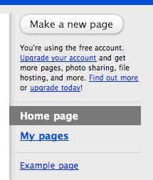
Here’s how Backpack used to let people know they could upgrade to get more pages, etc:

This message was always displayed right under the “Make a new page” button. It worked pretty well, but it was always there. It was too in your face.
The first time you go to click the “Make a new page” button you’re hit with a sales message right below the button. That’s not an impression we wanted to make.
After
A big part of the new Backpack upgrade was a focus on the experience. We wanted to make things smoother, more elegant, and more streamlined. This included the upgrade pitch. We think it’s more polite now.
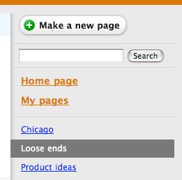
Here’s the new free account sidebar with a few pages:

You’ll see there isn’t an upgrade pitch under the “Make a new page” button. The free account includes 5 pages. This example account has 3 pages. We don’t need to tell people about upgrading to get more pages until they need more pages.
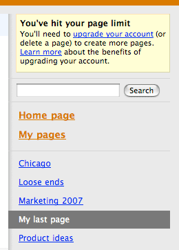
Now here’s the new free account sidebar after they’ve hit their 5 page limit:

Since they’ve hit their limit we replace the “Make a new page” button with a yellow “sticky” notice. We delicately explain they’ll need to upgrade (or delete pages) if they want to add more pages. We give them a link to upgrade or find out more.
Manners
Before it felt like you were walking into a store and a salesperson immediately came up to you and told you about today’s sale. That’s an unpleasant experience.
Now it feels like a helpful suggestion when the time is right. We think that demonstrates better manners. It’s how we’d want to be treated while evaluating something new. A quick sales pitch feels rotten. A natural pitch when it makes sense feels right.

Dhrumil
on 07 Aug 07Backpack is the only 37signals application that I don’t pay for. Only because I never used it enough, (until the upgrade).
Funny thing is I use to feel a little guilty seeing the old upgrade notice all the time.
I like the new subtlety. And since the upgrade I’ve been using the app like crazy. I’m at 4 pages and will be a paying customer in the next week.
Great post.
Karl N
on 07 Aug 07This is a perfect example of designing something for the user and not for you. Thank you for treating people right.
Micheal
on 07 Aug 07Flickr has been implementing this same concept with their free account regarding the number of photos you can upload.
See the Flickr upgrade message below.
Note, this is only displayed once you hit the 200 photo limit.
Flickr Upgrade Message
It’s perfect because you think to yourself, “oh dang, I hit the limit … okay, I’ll pay for the upgrade”.
DeanR
on 07 Aug 07How does 37Signals feel about “limited-time” (say, 30-60 day) free access to the full-range of site capabilities?
Is this somehow less user-centric than the never-expire access to a limited range of functionality?
Is it tough to enforce limited-time access (i.e., do people just use a different PC, IP address or login?) or is all that easy to track with cookies?
Thanks for the highly relevant post!
Mark
on 07 Aug 07Maybe I’m being picky, but I still find the message a bit cold. Wouldn’t something like:
You’ve hit your page limit. Would you like to upgrade your account to create more pages?
(BTW, I’ve happily paid for Backpack for ages :))
JF
on 07 Aug 07DeanR: I’m not a fan of time-limited trials. To me they pull the rug out from you and say “You can’t do this anymore until you pay us.” It’s like pulling the rug out from under you.
I’d prefer to give people access to just enough key functionality as long as they’d like and then they can decide on their own time if they want to upgrade.
I just feel like people should decide on their own schedule when to spend their own money.
JF
on 07 Aug 07Mark: Good feedback. We’re always tinkering with words. The message in this screenshot may not be the same message in a few weeks.
C Foss
on 07 Aug 07Another suggestion is to grey the button out, but not hide it. With the current iteration, if you’re already very familiar with the app you’ll know it’s missing. If not, you’ll probably spend 10 minutes hunting for the button you “thought was right here”.
David Svensson
on 07 Aug 07How do you decide the limits for the free accounts? If you give away too much you won’t be getting enough paying customers, and if you give away too little people won’t use your app in the way you intended.
JF
on 07 Aug 07David: I think at the end of the day it’s a gut feel judgement call. And don’t be afraid to make changes if what you thought would be good doesn’t turn out to be good. Just be fair and reasonable and I think you’ll do just fine.
Dan Kelly
on 07 Aug 07Hi JF,
I am a HUGE fan of 37signals’ approach to design and development. And, I found this an interesting change.
I think it’s fantastic that you let people TRY things before they buy, but are people who expect to get the store for free the ones you should be focusing your design?
What about the customers who are willing to pay for top quality service and want to get the most out of your service that they can.
Upgrading has MANY benefits, not just more pages. So, by encouraging all free users to upgrade at prime ‘points of contact’ you are actually helping them be more productive.
From a business owners perspective, has this increased your conversions from free to paying members?
dK
Rich
on 07 Aug 07I like the way you say something “feels rotten” or “feels right” in the design process.
waltkania
on 07 Aug 07It’s refreshing to see how you guys think through issues like this. I wish more companies did.
Not that you asked, but maybe it would be a tad softer to invert the message. Start with what the user wants:
You’ve hit your page limit. To create new pages you can either delete a page or upgrade your Backpack.
Ryan
on 07 Aug 07I love these posts. Design Decisions is probably my favorite series of any on the web. Always enlightening.
On a side note, I can’t wait for the new JavaScript libraries used in Backpack to be released—they’re really, really slick.
John
on 07 Aug 07I’d love to see a $20 per year plan with 10 pages and a few MB of file storage. I can’t justify the $60 for a Basic plan when I’m only using three pages and would occasionally like to throw in a file and use the calendar.
(And no, I don’t drink coffee, so I can’t give up a latte or two to pay for it…)
Dose of Reality
on 07 Aug 07I’ll tell you what’s really irritating…. products that offer a free version to get you hooked but don’t disclose what you don’t get buy not upgrading until you’ve been sucked in. For instance, I am trying to find where you disclose that the calendar function is only available to paying customers in your glitzy marketing page or signup page. Or the page limit that you speak of above…. where does it say that is a limit with a free account?
As far as I can tell the “design decision” above, while spun with great elegance, is just a way to further hide the upgrade option until someone is hooked rather than disclosing it up front.
Does it make you laugh inside to see all the people who follow your blog actually buy that this move was about being “polite” and “better manners” as opposed to boosting upgrade rates?
Ok, the new design with a message that only pops up is cute, but if you want to be such a great user advocate how about a little upfront disclosure?
David
on 07 Aug 07I think this would be improved by changing “delete a page” to also be a link, in addition to “upgrade your account” being a link. In that case, you’re making it equally easy to apply two different solutions to the same problem.
JF
on 07 Aug 07Reality:
1. It says “Included on all paying plans” in big text in the header on the backpackit.com/calendar page.
2. We say “The Backpack Calendar is included with pay accounts. The free plan doesn’t include the calendar” in the big bright yellow bar at the bottom of the calendar screen right under the Signup link.
3. We also explain this on the Calendar tab which is visible on all accounts—free and paying.
4. And finally we also clearly show the calendar is not included on free plans on the features chart on the Upgrade page which is linked in the “upgrade” message as well as on the account chart where you upgrade.
steve
on 07 Aug 07@Dose of Reality: it’s understood to most of us that a free product is limited and that upgrading brings more features. the nice thing 37signals is doing here is not slamming that fact in our face from day one as well as making it possible for a light user to never know s/he is using a limited product.
Micheal
on 07 Aug 07I would like to see the next product from 37signals be an e-mail client. Something like Google Apps, where I change my DNS (MX) record to point to 37s servers.
I’d pay for that in a heart beat. I see plenty of places where 37s could improve the interface of Yahoo Mail (Beta) and even Gmail.
Tim
ML
on 07 Aug 07Does it make you laugh inside to see all the people who follow your blog actually buy that this move was about being “polite” and “better manners” as opposed to boosting upgrade rates?
Being polite and making a sale aren’t mutually exclusive. We think treating a customer in a polite and thoughtful manner is a great way to get them to upgrade.
Dan Boland
on 07 Aug 07@ Dose of Reality: What, were you blindfolded when you signed up for Backpack?
I happen to like this change a lot. There’s nothing worse than being constantly reminded that you haven’t paid for what you’re using, whether it’s web-based or on the desktop. It tells me that folks with free accounts are still considered valuable and are respected—even though I haven’t paid a cent to 37signals for any other their products (I did attend a BoB workshop a couple of years ago, though), I still recommend their software to anyone I think can benefit from it. And it’s because of the little things.
Mrad
on 07 Aug 07Nicely done. Much less visual noise. Me likey.
Also, I’ve been using Highrise to manage my wedding invitation addresses. It’s the most I’ve worked with a 37signals app, and it’s been a joy, especially during this stressful time. The export CSV rocks. Mad Props.
Dose of Relaity
on 07 Aug 07@JF: OK, you are right. It’s there on the calendar detail page. So at least take this bit of usability feedback… I really did search the Backpack page (http://www.backpackit.com/) for it before posting and never even thought to click on the detail pages. It is not listed as a limitation under the calendar graphic on the main marketing page or the home page signup link that I suspect most people actually end up clicking (as opposed to the calendar detail page, but then I might be wrong).
And, while I am sure it is on the “upgrade” page, my point is that is too late (at least for this user… who wants to know upfront whether I will likely need to upgrade before I bother).
I am not trying to be a jerk. Just providing honest first-impression feedback given you raised the subject.
@Steve: yes, I agree. But, I would have expected it to be much easier for me to find what I was looking for (a simple page before I sign up telling me what I am getting in to). I find it hard to believe there are that many light users out there who are completely in the dark that they are using a limited product… and if there are, they will be even more irrate to find out once they hit the limit while in the middle of trying to do something.
Perhaps the sum of my feedback is this: there is a balance (the original point of this post) and perhaps it just swung too much the other way for my tastes in not being able to quickly assess the need for a potential upgrade in the future. That’s all.
Dose of Reality
on 07 Aug 07@ML: You are right. But, kinda missed my point. I was actually suggesting the new approach is potentially not as polite as you think it is. Either way, you have my feedback. Do with it what you will. I’ll leave you all alone now…. back to work! :-)
Stacy
on 07 Aug 07Seems like 37s removed the pricing for Backpack. All you can do is signup for free and learn about pricing AFTER you signup. Is that true or am I not looking in the right place?
Andrew
on 07 Aug 07I like what you say in the post. But I am getting rather fed up of being told I can only have 1 Highrise case unless I upgrade from the free account.
JF
on 07 Aug 07Seems like 37s removed the pricing for Backpack. All you can do is signup for free and learn about pricing AFTER you signup. Is that true or am I not looking in the right place?
That’s how Backpack has always been. You sign up for free and you can upgrade to paying down the road if you’d like.
Brandon Newendorp
on 07 Aug 07Excellent decision on your part – I love the idea of not pushing a sale on customers (or potential customers) all the time. It’s refreshing to see companies oriented this way these days.
Anonymous Coward
on 07 Aug 07ML said: Being polite and making a sale aren’t mutually exclusive. We think treating a customer in a polite and thoughtful manner is a great way to get them to upgrade.
Did it work? Are your conversions up? :-)
dK
Joshua Kaufman
on 07 Aug 07I’m not so sure about this one. This is akin to showing the “Post this comment” button, giving the expectation that they can leave a comment and then saying “Woops, sorry! You can’t actually leave comments!”
John Bjerke
on 08 Aug 07Definitely like the direction. A would agree with the above comments about greying out the “make a new page” button once the user has hit his/her page limit.
Another idea would be to include an easy way for the user to know how many pages he/she has left, even perhaps in the button itself “Make a new page (3 remaining)”
Neil Kelty
on 08 Aug 07A great improvement! Now, Basecamp…are you considering dumping that ugly upgrade message on my homepage? I know it’s only for the account owner – but it drives me nuts everytime I log in.
BTW, these posts are awesome. Keep them up!
ericyoung
on 08 Aug 07i hace little problem about the second design. users need to experience the error step before users recieve the upgrade tips. i think that the information is not sent directly.
Chris Shepherd
on 08 Aug 07Hi guys.
Do you think you could have done this from the start though?
ie you’re making money now – the hard-sell is not required? Will you get a drop in upgrades as a result?
Kim Siever
on 08 Aug 07I’m not sure I agree with a move like this.
From a user perspective, I would like to know in advance any limits to the number fo pages I an create with a free account. I certainly wouldn’t want my workflow interrupted as I am about to create 6 pages for something only to find out at the 5th page I need to rethink how I am going to organise my information.
Perhaps some sort of indicator on how many pages I have remaining would also be a nice addition.
JF
on 08 Aug 07A revision to the decision.
Dose of Reality
on 08 Aug 07I love it.
This discussion is closed.