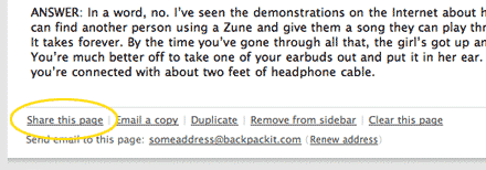
I just wrapped up a new UI for sharing pages in Backpack. Each Backpack page has a ‘Share this page’ link in the footer.

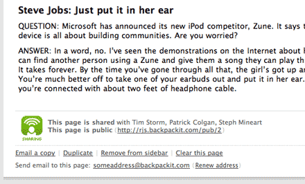
We decided that a block should appear above the footer when the page is being shared. The mockup will show the most complex state, where someone is sharing the page with their friends and sharing it via a public URL. People normally do one or the other, but we must accomodate the ‘both’ case.

This first take is rough. But right away there is good news. The elements are on the page, and I’m confident that the sentence approach (‘This page is shared with…’) will work well. However there are problems too.
The font size is small and the spacing awkward. The typical case will have only one line of text, and there will be too much negative space. The icon is bad, but that’s a placeholder for now. I’ll make a new icon when the HTML is right. The biggest problem is the block as a whole. It doesn’t hold together with a single identity. Whenever I run into this problem, I apply a casual design pattern. I think of it as the ‘handle’ pattern.
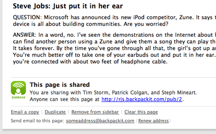
‘Handle’ is just my mental nickname for an element on the page with a double job. First, it works as a focal point in the visual hierarchy. That’s a fancy way of saying that some road leads the eye there. Second, it groups some lesser elements together and holds them as a unit. A black header reading “This page is shared” works great on both counts:

Now the block holds together with clear purpose. It will look even better in the typical case of one line instead of two. Since I liked the sentence style of the first design, I took it further. Rails has a helper called to_sentence that will easily cook out the first line, even with the ‘and’ at the end.
The last thing is a better icon. That tiny text has got to go. And sharing isn’t really about broadcasting, it’s more about agreement right?

Every screen and block takes an interesting path from concept to fruition. We plan to share more of these Design Decisions, and would love to see more processes from you as well. If you should post something, link me up at ryan at 37signals dot com.

Dan Boland
on 24 Oct 06Glad to hear that Design Decisions will become part of your regularly scheduled programming.
Shaun Andrews
on 24 Oct 06Ah, now I remember why I read this blog. Great post!
Carson
on 24 Oct 06Ryan, love this stuff, thanks for sharing, glad to hear there’s more coming.
Daniel Elessedil Kjeserud
on 24 Oct 06One of the best posts I’ve read in a while on SVN! Great job Ryan, keep it up!
Jean Moniatte
on 24 Oct 06Thanks for sharing. Please keep doing so. It is VERY helpful.
Robert Simplicio
on 24 Oct 06This is extremely helpful, and is reminiscent of the 37s/SvN 1.0 (e.g. before Basecamp).
Keep up the good stuff! It’s really all good stuff in my opinion, but this is the kind of stuff that’s just plain rare in my opinion. I know I’d love if this became a regular feature like the Sunspots, Fireside Chats, Screens Around Town, Fly on the Wall, etc.
JF
on 24 Oct 06We’re glad you like it!
We decided last week that we’ll be making “Design Decisions” a regular feature on SvN. Stay tuned for a lot more like this.
We’re going to be sharing a lot of the little things that we think make a big difference in UI design.
Ben Lundquist
on 24 Oct 06You might want to take a look at the way that this reads. With the bold header it seems that both lines of text are clauses for the statement “This page is shared” If I didn’t know better I would think that all shared pages are public. I know its a weird exception case but your approach might be locking people into that behavior instead of guiding them out?
“sharing isn’t really about broadcasting, it’s more about agreement right?” Well, sharing in Backpack is either of these, or both. Maybe both icons could be used, to help draw this distinction?
forrestRain
on 24 Oct 06What a great post. This blog is reaching the stage of “educational”
Wesley Walser
on 24 Oct 06Great post guys, glad to see some design related content. The other stuff is nice, but this is what I come here for.
Glen C.
on 24 Oct 06I like these types of “DVD commentary” things. They did it in Half Life 2: Episode 1 and now you’re doing it in design decisions. Excellent.
Jason Beaird
on 24 Oct 06I too like this style of post. It’s great to see another designers train of thought in motion. Look forward to seeing more.
Noel Hurtley
on 24 Oct 06Great post. I really enjoyed seeing the process of how you came to this decision.
I think this small change will certainly add more clarity to the Sharing feature.
Jeff
on 24 Oct 06Ben’s right.
My assumption was that the three people have the same access as the public, but perhaps with editing capability. But I had to guess that.
This is actually a good case study in focusing on the details to the exclusion of the big picture.
JF
on 24 Oct 06Ben/Jeff—this is made clear when you actually set up sharing. What you are looking at is the result of the set up, not the actual setup itself. It’s very clear what people can do when you set it up.
Matt
on 24 Oct 06To make the distinction clearer, perhaps replacing “You are sharing with X…” for “You are collaborating with…” would make the subtle distinction that, with X specific people, you are sharing with greater privledges (i.e. editing/modifying the page).
Mathias Stjernstrom
on 24 Oct 06Great post, i think we all love to see how you think, we want your brains browsable :-)
Where do you unshare a page? How about letting “Share this page” become “Unshare this page” when sharing?
Don Wilson
on 24 Oct 06I think I’ll become a regular reader again now that these Design Decisions are going to be frequent
Mr Funk
on 24 Oct 06Very nice. Good to see some of the iterative development, and the end result is concise and pleasing to the eye.
Jake Ingman
on 24 Oct 06Agreed with everyone—these are exactly the posts I look forward to.
Also what zhongyao said is pretty much right on.
Andy Crouch
on 24 Oct 06So how do you unshare with someone? Right now a little trash can appears when you rollover a name in the list of people who the page is shared with. That looks harder to do with the “sentence” approach.
Booga
on 24 Oct 06The new sharing logo reminds me of the “Socialist Unity Party Germany” logo. It was the former leading party in East Germany or as it was officially called “German Democratic Republic”. I was sixteen and living in Leipzig when the change happend and the wall came down. Will I ever see a handshake pic or graphic without thinking of this party?
Booga
on 24 Oct 06Forgot it, here is a link to the “SED” logo.
milo
on 24 Oct 06Booga is right, this logo really reminds me of a “Arbeiter & Bauern Partei” over here in Krautland.
dusoft
on 24 Oct 06zhongyao: totally agree!!! (and with everyone else too ;-)
Mrad
on 24 Oct 06Love the write up Ryan. I have to say though, my biggest concern would be if someone is sharing with an entire group of people, like 10 or so. Is that line gonna wrap, or will you have a “see all” link?
The shaking hands logo reminds me of a design project I did my sophomore year in college – a symbol systems project that required one for business.
Keep these articles comin’! A strong design process is HUGE!
Dean
on 24 Oct 06Article is great – though l’m not crazy about the icon. Reminds me too much of the overused stock photo of shaking hands (but is is better than your original icon).
Larry
on 24 Oct 06How do you unshare a page?
Matthew
on 24 Oct 06Do you click on the sharing icon to change sharing options?
Des Traynor
on 24 Oct 06Excellent post. Thanks for sharing it with us Ryan. Its inspirational to see how much work is put into what would appear to be a relatively small aspect of the BackPack UI.
Most web apps designers would typically have stopped far short of comp #1, your work and explanation is really good reading.
gwg
on 24 Oct 06I look forward to reading more posts of this type.
JF
on 24 Oct 06There’s more to sharing than just this image.
The purpose of this post isn’t to show how to turn on sharing, turn off sharing, add more people, delete people, the difference between public and private, etc.
The purpose of the post was to show a single design decision we made. This series of posts will be about one small design decision.
Nick
on 24 Oct 06Yes! Great post. I agree that more like this would be awesome.
Amazing how such a small change can really turn that element around.
Jeff
on 24 Oct 06I hope these articles continue. The amount of thought you guys put into the details is inspiring, and the discussion that follows is enlightening.
Even great design is subject to valid (and invalid) criticism. This might come as welcome relief to good designers who haven’t had the marketplace/peer validation that 37s has enjoyed.
Alvin
on 25 Oct 06Neat post! I love to get a sneak peek into how your design processes work over at 37signals, it’s not only fascinating but it opens up my work as a designer as well.
More please!
This discussion is closed.