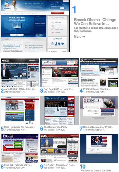
1. Obama
2. McCain
3. Paul
That’s the design rankings of candidate sites according to the accumulated ratings of pages tagged “election” at CommandShift3 (the Hot or Not of web sites):
According to CS3’s Amit Gupta, these are cross-site rankings (i.e. most of the battles occurred between an election-tagged site and a site tagged something else) which might eliminate some of the political bias you’d expect.
Keep in mind that, like Hot or Not, these ratings measure the superficial look of the contenders, not any sort of real substance. The most functional sites probably don’t win a lot of sleek home page contests.


David
on 08 Jan 08I’ve used several of these site’s and I have been most impressed with Ron Paul’s site. The running donation counter is awesome, and it’s incredibly easy to do whatever I need to.
Mike Rundle
on 08 Jan 08Ron Paul’s website is pretty nice too including some interactive Flash animations at the top. The money counter has been cool to check out as his donations increased.
Dustin Senos
on 08 Jan 08Barrack Obama’s site appears to take ‘red white & blue’ the least literally and ended up with a much clearer appearance. Weighting heavier on finding nice shades of blue rather then equally using red and blue is much friendlier on the eyes. Props++;
Seth
on 08 Jan 08At the risk of sounding like a fanboy Ron Paul’s site is ranked #2 now…plus if you look at the total number of “battles” Paul has around 664 and the rest are much lower.
Dustin Senos
on 08 Jan 08Upon a second look, it’s nice to see red used as a color to draw focus on Barrack’s site (the top red button) not just as a secondary color.
Wesley Walser
on 09 Jan 08Another RP fanboy, but I gotta give it to whomever designed Obama’s site, it’s absolutely beautiful.
Stephen
on 09 Jan 08It startling how much they all look the same. You guys need to add another colour to your flag, freshen things up a bit.
chibella burrito
on 09 Jan 08Fred08 is pretty weak. Obama’s is definitely tops. Hillary’s is nice… look at the ring on that finger! ;)
Gayle Bird
on 09 Jan 08Seriously, do they really all have to be the same colours? Yikes.
Tory
on 11 Jan 08McCain’s logo reminds me of the Thomson logo:
http://www.johnmccain.com/Images/mccain2_header_03.jpg
http://www.thomson.com/images/1054/logo_thomson.gif
JD
on 11 Jan 08HRC’s site is the best
Katie
on 14 Jan 08I think Mike Huckabee’s website is the best looking. It is also very easy to use and has great viral marketing tools.
This discussion is closed.