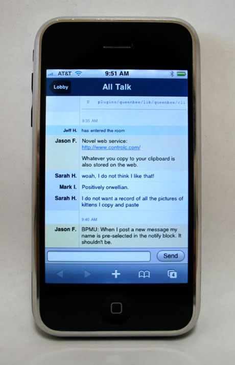
Today we officially announce that Campfire has been optimized for the iPhone. Just visit your Campfire site with Safari on the iPhone and you’ll automatically see the iPhone optimized version.

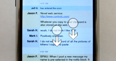
Note: To scroll back through the transcript you’ll need to use the two-finger scroll technique as illustrated below:

We hope you find Campfire for iPhone useful! Special thanks to Sam for taking on this project and making it happen.

Chad
on 30 Jan 08I noticed this a few days ago. Love it. Very cool
Douglas F Shearer
on 30 Jan 08Awesome! This puts campfire right up there as one of the most usable chat apps on the iPhone right now.
Why the two finger scrolling? I’m guessing there is some technical reason behind it, but can’t think what it might be.
Thanks.
SS
on 30 Jan 08Douglas, the technical reason for two-finger scrolling is that in order to keep the input field fixed at the bottom, we had to put the transcript in an HTML element with a fixed height and set its CSS “overflow” property to “auto.” On a desktop web browser this would be displayed as an element with scroll bars; on the iPhone it’s displayed like any other element, but you can use two fingers to scroll its contents.
Tim
on 30 Jan 08What does “BPMU” mean?
fitzage
on 30 Jan 08Fantastic.
Does this mean you also have an iPhone interface for Highrise in the works?
johnkeane
on 30 Jan 08Lovely.
The icon’s handsome – when’s Ta-da List going to get an iPhone icon?
Ryan Irelan
on 30 Jan 08Thanks for doing this. Any way we can get the input field to appear in widescreen mode, too? For me, it doesn’t show.
SS
on 30 Jan 08Ryan, there were some difficulties getting the input field to actually work in landscape mode, so we’ve disabled it for now. (For some reason Safari’s automatic scrolling would kick in and cause the page to jump around on every key press.)
Kris Black
on 30 Jan 08Is there a way to see the iPhone version of a chat room from my desktop web browser. Kinda like how you can see Google’s mobile versions of their Web apps by ending the URL with a ”/m”?
Example: http://www.google.com/m
Great work on getting this app iPhone compatible.
Jim Greer
on 30 Jan 08This is really nicely done. Just got my iphone yesterday (after giving up on a 3G version in the near future). I hate to admit that I emailed support to figure out how to scroll… they answered promptly.
Chris
on 30 Jan 08Just tested it on the iPhone, Good design work, looks nice and the chat works good too. I like how you move the input box above the keyboard.
added a review here: http://www.appsafari.com/chat/2574/campfire-on-iphone/
ceejayoz
on 30 Jan 08Kris, you could use iPhoney to see what it looks like on your regular computer.
Matt Radel
on 30 Jan 08Did you guys find yourselves adding any structural elements to the markup for the benefit of the iPhone, or where you able to simply apply a mobile Safari stylesheet?
Great work, btw.
Anonymous Coward
on 30 Jan 08Great! Really looking forward to an iPhone interface for Highrise!
Rich
on 30 Jan 08Sick!
Kris Black
on 30 Jan 08iPhoney works but it has a weird bug that causes a scroll bar to flash on and off in portrait view. Thanks for sharing.
I just wish I had a real iPhone!
Matt
on 30 Jan 08This makes me want to get Campfire… and an iPhone… Someday it will come to Canada.
Thijs van der Vossen
on 30 Jan 08You may want to add a note to the room list screen about the two-finger scrolling thing.
Brett
on 30 Jan 08This absolutely rocks and I love the iPhone icon.
Douglas F Shearer
on 30 Jan 08SS – Thanks for the reply. That’s a pretty neat solution to keeping the input-bar fixed.
Skuli
on 30 Jan 08Cant’ wait to see Basecamp iPhoneized…
Marc
on 30 Jan 08I find it interesting, Jason, that you thank an individual for their efforts in a given project. I’ve noticed it in the past—I’m pretty sure you did it on the QueenBee project. I like this level of personalism and it’s unusual in business.
The app looks great, will try it later on my touch!
Dave Conrey
on 30 Jan 08Please tell me you have plans for an iPhone ready Basecamp too.
Dave Rutledge
on 30 Jan 08I believe there’s a way to get a form input to be recognized by the iPhone as for email, changing their default keyboard layout to one that puts the @ and .com symbols in place of the spacebar.
A quick search through Apple’s Dev Center didn’t turn it up, but it would be a good thing to figure out for your log-in screen.
GeeIWonder
on 31 Jan 08Can’t believe no one has made a joke about the “two-finger scroll technique” and helpful diagrams yet. I mean, c’mon… surely somebody else here is as immature as me at the later hours of the day, no?
Alexander Poliakov
on 31 Jan 08Thank you guys! It’s just great and just what I needed!
Al
on 31 Jan 08I am a bit scared about the web slowly moving towards a device centric architecture. What happened to open standards? What happens if a kick a$$ open source iphone killer becomes mainstream this year? Does every site re-write all their web apps specifically for it? Or is it only because apple is so cool that sites will go to this length to support the iphone? What about firefox running on the iPhone this year?
Dave Rutledge
on 31 Jan 08Al:
The level of design changes needed to ‘optimize’ for the iPhone are pretty minimal, and would very likely do well on any future web-capable phone.
Aside from a few minor Apple-only tweaks (like the size/method to use a home-page icon) for the most part, this is sticking to web standards, and keeping small devices in mind, in general, rather than specifically the iPhone.
Sean
on 31 Jan 08Looks great—now how about Basecamp, Highrise, and Backpack!
Darren
on 01 Feb 08Meebo’s input works great in landscape mode.. hmm
Tony
on 02 Feb 08This is really cool.
Anne
on 02 Feb 08This is awesome…..
GadgetBoy
on 02 Feb 08Hooray! Something to look forward to for my iPhone.
Frank Gilroy
on 03 Feb 08Backpack next please!!!
Kevin Milden
on 04 Feb 08A dream come true. Thanks guys!
Lee Coursey
on 06 Feb 08Highrise Next Please!
This discussion is closed.