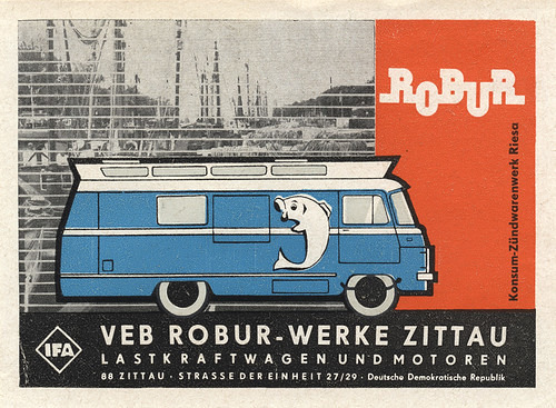
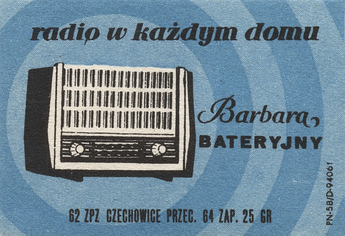
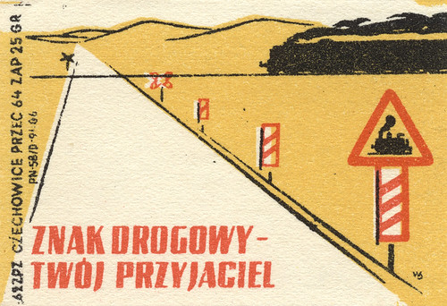
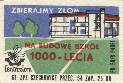
Art on a matchbox. Beautifully balanced, hand-drawn, great colors, cool type, simple imagery, appealing propaganda and advertising.
You’re reading Signal v. Noise, a publication about the web by Basecamp since 1999. Happy !
Art on a matchbox. Beautifully balanced, hand-drawn, great colors, cool type, simple imagery, appealing propaganda and advertising.


Riddle
on 15 Feb 08If you want to know what’s on them, here’s a quick’n’dirty translation:
2nd: Radio in every home 3rd: Road sign: your friend 4th: Collect scrap metal for construction of millenium (meaning: vast, spatial) schools.
Luke Lewandowski
on 15 Feb 08For those who don’t read Polish (2nd, 3rd and 4th matchbox):
2. “Radio in every household” (probably from the 50ties when Poland was rapidly electrifying and mass-producing cheap appliances based on Soviet designs… my grandma still has one like this somewhere)
3. “Road sign – your friend” This one is probably part of the back-then common propaganda to make peasants obey road signs or something… It sounds extremely funny
4. “Let’s gather scrap – to build schools for the millenium” “Millenium” here refers to 1000 years of the kingdom / state of Poland (counting from 966 – conversion to Christianity); this was as far as I remember a communist stunt to gain popularity. they promised to build 1000 schools across the country; they did. based on the same design (yes, every single one of them). I used to attend one many years ago. utterly impractical. made of grey concrete… they still haunt the neighborhoods in many cities
But nevertheless I agree with Jason: simplicity of the design is neat. :)
Christian
on 15 Feb 08For those who don’t read German (1st one): VEB (Volkseigener Betrieb (people-owned enterprise)) Robur-Werke in the city of Zittau. They advertise for the local truck and engine factory. Notice the line on the right side advertising for another factory in the city of Riesa producing spark plugs. IFA means Industrieverband Fahrzeugbau, thank you Wikipedia. Deutsche Demokratische Republik – a country I grew up in and doesn’t exist anymore. Strange…
Brad
on 16 Feb 08I love looking at retro design, but I wonder what people thought of these when they were firsts created. Were these considered good design in their time or were they just another package. Maybe fifty years from now people might draw upon our beer cans for design inspiration.
Keru
on 16 Feb 08I’m from Poland and I don’t like those polish designs. They are awful and remind me the years of communism. Jason, I’m very shocked you find that kind of stuff beautiful.
Florent V.
on 16 Feb 08And yet, Keru, these are indeed beautiful, notwithstanding the occasional propaganda. I think you might be culturally biased here. Jason lists some of the qualities of such design: beautifully balanced, hand-drawn, great colors, cool type, simple imagery.
I once used some fraktur-style font for a litterature-related thing. I was thinking early days of print, Gutenberg’s Biblia Sacra, etc. When I showed it to a German friend, she said no way. She associated that kind of type with nazi propaganda. People here in France didn’t.
Lukas Dryja
on 16 Feb 08Being Polish myself, its hard to hear that Kuru doesn’t like these designs. Particularly as they represent very well the time that they were created in. Comparing todays design of Poland and these old pictures, I wish these still existed.
There is nothing like strong composition, and love for the craft.
Great post Jason!
Gavalian Web design Studio
on 17 Feb 08Thanks man !!!
Frantisek Malina
on 20 Feb 08This is the typical socialist art – there was the only way to do the art right. You can’t blame Keru from being sick of it. My mother/father/granny/older sister would tell you they hate the pictures. I wouldn’t recommend to use this sort of design for a client from central/eastern Europe, Russia, China of Cuba… These people are not ready for it yet. It will be a different story in 15 years.
Keru
on 20 Feb 08Let me show you something. This is a new just-opened polish swimming pool somewhere in the 70s. Look at the design and quality of details. This was made by the same kind of people that made these matchbox designs. Btw. I’m not sick of communism because I don’t remember much. I’m in my mid 20s. I’m just sure and feel these graphics are very poor work. Fonts and colors are random and crappy. Details are misplaced, logos are ugly and those id numbers kill the whole reception.
Keru
on 20 Feb 08Pool
Ania
on 22 Feb 08At first sight, I also found those little packages cute and sweet, and spontaneously agreed with Jason‘s description. Here, I especially like the washed-out colours and the effect of mismatched print layers. And I am touched to see an original work of print from the 50s, which I am very fond of, and that from Poland, where I have grown up.
At second glance though, I feel compelled to back up Keru’s point of view because as a graphic designer I realise, hand-produced or not, the typography on these boxes is really crappy. Have a closer look at the word Barbara (2nd picture) – very badly balanced indeed (sorry Jason, it just is, ;-). Or in the last picture: the text on top intersects the roof of the building. Now is this good graphic design?
Also, I totally agree with Frantisek, that in ex-communist countries especially older people would not find quotations of this style appealing. Those of my Polish relatives who are older than 40 are most likely to find these boxes ugly and maybe even unnerving.
I generally love retro-stuff, the aesthetics appeals to me. And some of those products are really beautifully designed. Just think of Braun’s electronic devices from the 60s, etc. You can see they come from a time and place, where real craftsmanship mattered ;-). But unfortunately this doesn’t apply that well to retro-products from former Eastern European countries. For example even if we might have a weakness for Eastern German objects and prints – which, living in Berlin, I find all over the place – they are mostly not well-designed. But we go for it nevertheless. In German there even is a word for this phenomenon: “Ostalgie” = east + nostalgia. I guess these little pieces of print here speak to us along those lines.
This discussion is closed.