Farecast
Farecast, an airline ticket price predictor, shows this infobox that explains whether you should buy now or wait for a fare drop. The clear “Wait” message is backed up nicely by the low fare history.

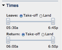
Another nice touch: The site offers time sliders that let you dial in the exact time range that works for you. You can also choose by take-off or landing time.

Newsvine
Ian Hall writes:
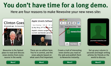
Check out Newsvine’s sweet “you don’t have time for a long demo” intro. It definitely sparked something in me.

ExpanDrive
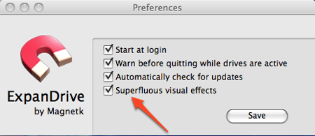
Do you like superfluous visual effects? Then you’ll love ExpanDrive.

Isn’t this kind of like asking, “Should we show you unnecessary text?”

Tyler Karaszewski
on 17 Mar 08The thing about superfluous visual effects is that, regardless of their usefulness, people really like them. There are entire industries around creating them. See: videogames, screensavers, fireworks, fashion, the action genre in Hollywood. Certainly none of these things make software simpler, but that’s not what they’re for.
The unnecessary text field is also alive, but is far less popular: lawyers, government regulations, safety warnings, etc.
I’d imagine it’s far easier to sell a “fireworks” feature in software than a “boring legalese” feature, which is why I don’t really think that a “superfluous visual effects” settings is much like a “should we show you unnecessary text” button.
GeeIWonder
on 17 Mar 08The unnecessary text field is also alive, but is far less popular: lawyers, government regulations, safety warnings, etc.
I think there’s an argument to be made that this text is far more necessary than most.
Wasn’t there a ‘superfluous’ option a while back in SaT than people (including the poster) dug? Something about unnecessary luxuries?
Adam
on 17 Mar 08Eudora (on the Mac, at least) had a preference called “Draw Trendy 3D Junk.”
The developer clearly had an issue with modern GUIs, since they have often snuck in such comments into release notes and obscure corners of the application…and because the application itself is so incredible ugly, though quite functional.
Matt
on 17 Mar 08There’s a similar option in Quicksilver for the Mac as well, with the same wording.
benjy
on 17 Mar 08I like the fact that they’ve added the option, it funny and adds personality, just like how friendly copy-writing can sometimes be longer than is absolutely necessary, but more enjoyable in the long run.
@ Tyler, I don’t really agree the way you have lumped videogames in with screensavers and fireworks. Sure there are plenty of videogames that can be compared with the simple visceral pleasure of hollywood action films, but generally speaking videogame are the medium of gameplay, where the art is creating applications that are emotionally & intellectually engaging.
GeeIWonder
on 17 Mar 08Thanks Matt for refreshing my memory…
Here it is
Tony
on 17 Mar 08“Do you like superfluous visual effects?”
Is this just smooth transistions between states? If so, then yes I do like “superfluous visual effects”. It makes for a nicer user experience, as demostrated by apple products. It’s nice that they allow you to turn it off though incase you’ve got a crappy machine that is bogged down by animations.
Peter
on 17 Mar 08Kind of off-topic, but doesn’t that ExpanDrive logo look a little too familiar?
Wolf
on 17 Mar 08Quicksilver has the same option (screenshot). Please two kinds of people, I guess.
carlivar
on 17 Mar 08The slider interface is overused. It is fine for fuzzy inexact things but for something specific like time I do not think it is the most efficient interface.
BillB
on 18 Mar 08I use TOAD (Tool for Oracle Application Developers) to edit/run SQL at work, which by default makes a “ribbit!” sound when launched. When first launched after installation, a dialog box pops up that lets you set or unset some common options, including the “TOAD croak” – the text states something like “Although most people enjoy the sound, if TOAD can’t get access to the sound system at startup it will hang.” I don’t know of anyone here who has ever turned the sound off.
Fabian Neumann
on 19 Mar 08I like the no-time-for-a-demo shot from Newsvine. Sometimes I think creating screencasts has become much too easy these days. If I want to know what a new site or software is about I do not want to wait for a video just to see ghostlike cursor and mouse movements and hear guys muttering in voiceover. Just gimme plain old screenshots or a feature list—at least optional, please.
This discussion is closed.