Quick start at TripIt
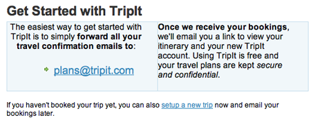
TripIt.com has a neat way to get customers started: Just forward a confirmation email to [email protected].

Randy Peterman wrote:
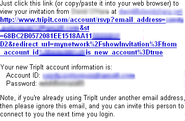
Attached is a screen capture (plus photoshop blurring) of an email I received from TripIt.com. I was impressed with their email’s removing the need for me to create an account to use their service: it was already created for me! That’s a great way to reduce trepidation by simply staying ahead of the creating an account takes time excuse. Users can easily evangelize their friends because the cost of entry is so small.

How it works: You forward flight and hotel confirmation emails and it automatically processes them. It then offers related maps, directions from airport to hotel, weather for your travel dates in both locations, etc.
Theocacao
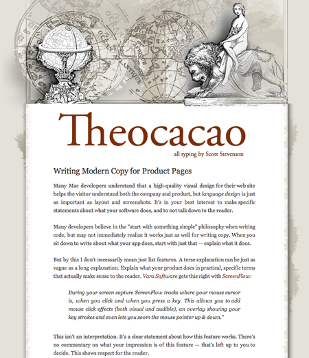
Theocacao has a nice combination of lush ornament and minimalism.
Gmail
This bold submit button in Gmail is a simple but effective way to make a default button stand out.
![]()
Making a UI to input “Availability”
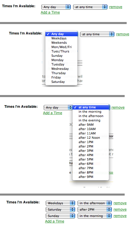
Brian D. Armstrong sent a link to an article he wrote about “interesting UI decisions to show someone’s ‘availability’ both in time and location.”
For scheduling I made two drop down menus. The first drop down shows days, and the second shows time. The choices force the results to be consistent and gives them some flexibility in how detailed they want to get. It also doesn’t let them get TOO detailed. This is good and intentional.
Have an interesting link, story, or screenshot for Signal vs. Noise? Contact svn [at] 37signals [dot] com.


Will
on 31 Mar 08That ARCHIVE button on Gmail hardly stands out at all to me.
It took me awhile of looking at your screen capture to see what you were actually talking about.
It’s nice that the effect is subtle, but I’d argue it’s too subtle and easy to miss as the “default.”
aaa111
on 31 Mar 08Did you notice that the Brian D. Armstrong’s site, College Student Tutors, is kinda ripping off 37signals design?
Especially http://www.collegestudenttutors.com/about and http://www.collegestudenttutors.com/accounts/pricing.
Tim
on 31 Mar 08I still don’t understand what “archiving” does in Gmail.
Maybe I’m alone on this.
Matt Radel
on 31 Mar 08@ aaa111: Gooood call! I think I’d call that a straight rip. Heavily inspired at the least.
Erik
on 31 Mar 08Wow! Seriously, what is it about college students and plagiarism? 37signals does great design, but they don’t do the ONLY design…
Brian Armstrong
on 31 Mar 08Hi Guys,
I fully admit I copied most of the design (even if it wasn’t outright with any copy/paste or images).
Just wanted to get something up quick that looked good. And design isn’t really my forte so I usually just try to get ideas from other people.
If I’m stepping on anyone’s toes at 37Signals just shoot me an email I’m happy to change it. Certainly didn’t want to offend anyone over there, I’ve learned a ton from you guys.
Brian Armstrong
Nathan
on 31 Mar 08The key to understanding GMail’s paradigm - and it’s a completely different one - is to realize that there’s only one folder in the entire system. One folder, that’s it: it’s called “All Mail”. You can see it in your list of, well “folders”, between Drafts and Spam.
Every single other “folder” is actually a “Smart Folder”: you may be familiar with this from iTunes smart playlists or smart mailboxes in Apple Mail.app or even “tags” found on del.icio.us or Flickr. In GMail’s case, your “Inbox” is actually only a smart folder for all the mail in “All Mail” tagged with “Inbox”, your mail in “Sent” tagged with “Sent”, including Drafts, Spam and every “Label” you create (those are just smart folders, too, pulling from the same gigantic “All Mail” archive).
When you “archive” an email, that simply removes the tag “inbox”—that’s it. You either keep an email or you don’t. I use the inbox as a staging area / to-do list: every email that comes in, I decide I either want to keep it (even if the chance of needing it is remote) or delete it. The binary nature works great… if an email remains in my inbox, it means that I need to take some action. I routinely reach Inbox Zero this way…
Harry
on 31 Mar 08I was wondering if it was a 37signals backed production for a while?
Jurjen
on 31 Mar 08Excerpt from: Startbreakingfree.com
Ed Knittel
on 31 Mar 08I don’t think this is exactly what Brad was expecting when he sent a link about “interesting UI decisions”.
Interesting UI Decision: Copy someone’s interesting UI decision.
Dude, your footers are EXACTLY the same.
Jared
on 31 Mar 08It’s not like they’ve discussed design rip-offs previously.
Oh wait…
Christophe
on 01 Apr 08Imagine getting an art homework assignment at school. When the day comes to hand it in, you say to the teacher, “sorry, art isn’t my forte, so here’s a photocopy of a Picasso.” Does that sound acceptable to you?
If design isn’t your forte, find a designer.
This discussion is closed.