Last week we released a redesigned project switcher in Basecamp. The project switcher lets you move between projects when you are inside another project without having to go back to the Dashboard.
A video
The best way to get a feel for the change, and why we made the change, is to watch a before and after video (below).
NOTE: Unfortunately the text on the video is distorted when scaled down to the size required to fit in this post, but you can watch the full size version which will bring it all into focus.
How we got there
Ryan started by mocking up the first version of the idea. It was a two column list of the last 20 projects you accessed. The grouping by client was derived from the project list in the Dashboard sidebar. It was basically a miniaturized version of that list.
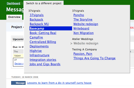
Then we added a “(continued…)” blurb at the top of the second column if the client’s projects spanned two columns:
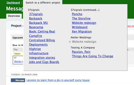
The idea was OK, but it wasn’t really clear enough. All the projects were still being treated equally. 20 most recent is nice, but there are probably a few on that list that are accessed a lot more than the others.
I mocked up a new version with more recent projects on the left and the rest on the right:
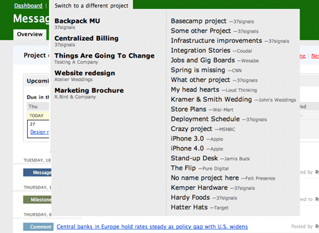
This direction also introduced a new way to label the projects. Instead of grouping them by client like we do on the Dashboard, we could just include the client name after the project name. It took up less space and was more direct.
We thought it might help to explain the difference between the two columns so we added red labels to the top of each column:
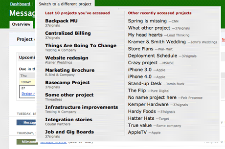
Then we were looking at it and we said… Hmm, it’s still a bit messy. And it’s getting pretty wide too. We could do better.
So we combined the original idea of a pulldown menu with the new idea of prominently displaying the last 5 projects. Last 5 on top, the rest below in a pulldown:
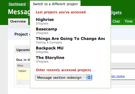
We loved this direction. But it was a little narrow so we widened it to account for longer project names and to give the menu a little more presence.
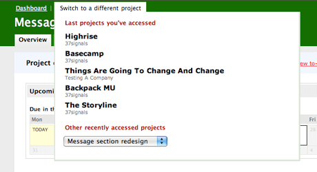
Nice. Then it was on to the UI polish. We touched up the type, spacing, proportions, hover states, targets, got rid of the subtle border color, and added a wide shadow behind the menu to give it some depth.
The final version:
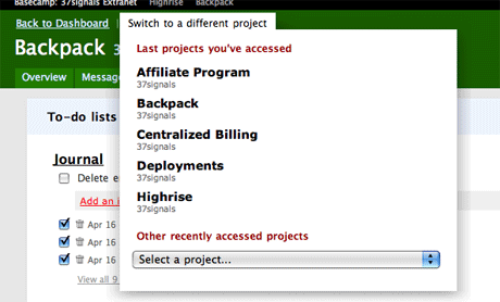
Also worth noting is that it took an extra day or two to get this working in IE 6/7. And then a few more hours post launch to deal with some lingering IE issues.
The end
We hope you enjoyed a look at the design process, trial and error, and thinking behind the new project switcher in Basecamp. So far the customer reaction has been overwhelmingly positive. Thanks everyone!

Noah Everett
on 17 Apr 08My favorite posts from this blog are the ones that show this kind of stuff. The “How To’s” or the design processes.
Thanks for sharing.
Ted
on 17 Apr 08Poncho?
JF
on 17 Apr 08Ted, we’re working on our own line of comfortable precipitation wear.
Matt Radel
on 17 Apr 08Well done guys. I really love the screencasts – it makes the presentation very personal.
Interesting that you chose to simply crop long project names instead of going to a ”...” after so many characters. I always thought it looked odd to have half a character at the end of a line of text.
Keep up the great work guys!
Peter Urban
on 17 Apr 08Nice work and thanks for sharing the design process. I wonder what the % breakdown is of people switching between their let’s say 5 most recent projects and other projects in their list.
Tobin Harris
on 17 Apr 08I agree. These blog posts are brill :) It’s amazing to see the thought processes behind elegant features.
I was so inspired by this post I even blogged about it :) [http://www.tobinharris.com/2008/4/16/features-need-love-too]
Simon Nielsen
on 17 Apr 08Cool to see that you addressed one of the only really ugly bits in basecamp :)
great result!
Eric Anderson
on 17 Apr 08I love the new feature and really appreciate your effort to explain your design decision. That being said after using the feature for a few days I find I am constantly annoyed by the popup. My mouse tends to travel to who knows where when I start reading so the popup ends up popping over what I am reading.
I still love the feature but wish it was a opt-in thing. So if I click “Switch to a Different Project” I get the popup. If I just mouse over the area it doesn’t popup.
Aaron Kassover
on 17 Apr 08Thanks for sharing your thought process in these posts. It’s great that you put so much thinking into these details. I’ve got to be honest, though… I’m not a big fan of this update for two reasons:
First, it forces me to think. The order of the list constantly changes so I’m constantly having to look, read, and think. I used the old switcher primarily when a client called me with a question. In one click, without any thinking or reading, I could jump to the project the client was calling about. True, there’s still the “Other recently accessed projects” drop down, but I don’t get there until I’ve read through the list to see if the one I’m looking for is there.
Second, I always categorize things as client first and project second. Your design does the opposite. I understand that for you guys, the client is always the same so listing it first wouldn’t be very useful. But for us (and I assume many services firms), we often have projects with very similar names, like “email campaign”, for many different clients. Emphasizing the project name first only adds to the need to stop, read, and think.
This might not be the right place for this, but as long as we’re talking about the design details I thought I’d throw them into the discussion.
JF
on 17 Apr 08The order of the list constantly changes so I’m constantly having to look, read, and think.
Actually it doesn’t if you continue to access the same set of projects. Most people are moving between the same projects most of the time so we maintain the order of the items in the list. Helps with muscle memory. But yes, if your top 5 change all the time then the list is going to change.
Bruno Figueiredo
on 17 Apr 08Didn’t you guys forgot to add a link to “All your projects”?. I mean, the list is only for the most recently assessed ones.
JF
on 17 Apr 08Bruno, all your projects are on the Dashboard.
vertigo
on 17 Apr 08Just as we were starting to get rid of multi-level menus in some desktop apps they rear their ugly head together with constantly changing “frequently used” lists. Ms Office dynamic menus at their worst. And in top of the line web apps. Sorry to see that happen.
(Don’t take this the wrong way. I love Your work I just think this is a major usability mistake):
Wes
on 17 Apr 08@Aaron:
I’m like you, Aaron. I have a lot of different clients. In fact, I put the client’s name at the beginning of the project so I could click on the list, type the first couple letters of the client and it would select their project so I could hit enter and jump to it.
This kinda breaks that workflow.
That said, I like it. I still click on it when I move my mouse up there, as I haven’t unlearned the old way yet.
Richard Medek
on 17 Apr 08I like the design concept, but what is killing me is the hover action versus the click action.
The issue with hover effects is that they appear regardless of a user’s intention. I realize hovering and getting something magical to pop up is the status quo, but things are starting to get silly. I can’t check my Gmail account without twelve contact info boxes popping up; I can’t even look at MSNBC without a submenu that’s half as large as the page covering anything I was attempting to read.
The “click” is where it’s at. The click says, “I want something to happen.” The hover is getting beat up.
Matt Henderson
on 17 Apr 08Like many others, I also don’t like that the menu appears on hover-over. Its has inadvertently popped up enough now to be annoying.
Joel
on 17 Apr 08I love that you share this kind of information. I learn so much from seeing how others achieve their end goal, even for a small feature like this. I’m still getting used to it, but sharing the design process really helps me appreciate it. I was also surprised by how much increasing the target area around the header links helped the efficiency of my navigation within Basecamp. Thanks for sharing!
JF
on 17 Apr 08I was also surprised by how much increasing the target area around the header links helped the efficiency of my navigation within Basecamp. Thanks for sharing!
We’re happy you like it, Joel! Little things like the space around a link can have a real impact on the experience.
Matthew Scott
on 18 Apr 08Jason,
Love the improvements here.
Thanks again for the great interview together last month.
Aside question-what program did you utilize to screencast this video?
Matthew Scott
JF
on 18 Apr 08FYI, we changed the switcher to be activated on-click instead of on-hover.
Stjernstrom
on 18 Apr 08I just love these “Design Decisions” they are your best posts by far! Keep it up!
Richard Medek
on 19 Apr 08Thanks! I was hoping you guys would do the right thing. ;)
Myles de Bastion
on 21 Apr 08It boggles the mind just how many hours designers and developers pour into just getting IE to “obey” standards with the rest of them.
We should pool resources and through a Union sue Microsofty for such a monumental drain of time, money and resources their browsers have afflicted upon us!
This discussion is closed.