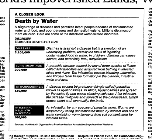
“No graphic in human history has saved so many lives in Africa and Asia,” says NY Times columnist Nicholas Kristof about an infographic in a ‘97 Times article that spurred Bill and Melinda Gates to take action on public health.
in september i traveled with bill gates to africa to look at his work fighting aids there. while setting the trip up, it emerged that his initial interest in giving pots of money to fight disease had arisen after he and melinda read a two-part series of articles i did on third world disease in January 1997. until then, their plan had been to give money mainly to get countries wired and full of computers.
bill and melinda recently reread those pieces, and said that it was the second piece in the series, about bad water and diarrhea killing millions of kids a year, that really got them thinking of public health. Great! I was really proud of this impact that my worldwide reporting and 3,500-word article had had. But then bill confessed that actually it wasn’t the article itself that had grabbed him so much—it was the graphic. It was just a two column, inside graphic, very simple, listing third world health problems and how many people they kill. but he remembered it after all those years and said that it was the single thing that got him redirected toward public health.
No graphic in human history has saved so many lives in africa and asia.
The piece says that Jim Perry, a veteran graphics editor, produced the chart. Too bad the actual graphic isn’t shown though. It’d be interesting to see. Update: The chart is below (source).

Contemporary graphics specialists
In the same piece, Steve Duenes, graphics director for The Times, lists some of the departments top influences (other than Edward Tufte). Includes some interesting links for you infographers (?) out there:
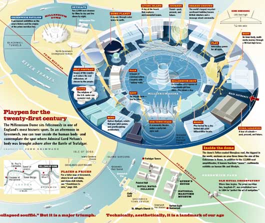
There are other contemporary graphics specialists who have influence here, including John Grimwade, who started at The London Times and now works at Condé Nast. John has produced terrific diagrams for travel stories along with other gems. And there’s Nigel Holmes, who spent a long time at Time magazine. His graphics are infused with wit, and he brings a a sense of humor to what might otherwise be a clinical field of statistical figures. There are computer scientists like Ben Shneiderman at the University of Maryland and Martin Wattenberg at IBM whose visualizations and interactive applications have set an extremely high bar for data-rich presentations.
And there are older sources of influence and inspiration like the graphics done in Fortune magazine in the 1940’s, and “Powers of Ten,” a short film by Charles and Ray Eames probably influences every New York Times map that adjusts its scale to zoom in. Of course, there are other artists whose work may not be tied to statistical data, but who take imaginative leaps with maps, grids, color and connections, and they exert a little pull. Saul Steinberg, Sol LeWitt and Mark Lombardi come to mind, but there are others.
 A diagram by John Grimwade.
Related: Designing “in the pocket” [SvN]

Andrew
on 21 May 08Gosh, if that graphic were real, I’d be crushed right under the New Town Stage about now.
Snowflake Seven
on 21 May 08Social Design Notes identified the graphic in question in their blog post titled Water Table.
Calling it a “graphic” is a stretch. Its just a basic textual table.
Micheal
on 21 May 08I believe this is the article mentioned above.
Unfornuately, the infographic is not in the article.
Micheal
on 21 May 08I found the infographic.
For some reason I was expecting a bar/pie chart. It’s nice to see how a well worded, simple pullout like this can have such a huge impact on the world.
GeeIWonder
on 21 May 08No graphic in human history has saved so many lives in Africa and Asia
What an idiot.
juyter
on 22 May 08“graphic” is not a stretch, a “basic textual table” is visual. try to increase text line-height by 500 percent in this table and we have a good idea how visual it is. “graphic” dont meant “picture”.
But maybe too much simple, i note one “small” graphic design improvement : title legend (Disorder/ Deaths) should be a visual helper (Disorder : black background color and Death : bold)
Macboy
on 22 May 08But Gates got filthy rich by ripping off people with Windoze crap! Scumbag!
Wilfried
on 22 May 08Hello, For me, there is no real design in this table. If you change a component, or add color, you become a design work. Text is enough…
chris
on 22 May 08Love this article!
On the same topic, sort of, Treehugger.com has a graphic of the day that shows which Industries are most effected by climate change:
http://www.treehugger.com/files/2008/05/graphic-of-the-day-climate-cost-impacts.php
Hope that one can lead to as much good as the ones above.
caustic
on 22 May 08cool. the economist recently had an article about the influentialness of graphic awesomeness. check it out.
reading is for suckers, go straight to the pictures
This discussion is closed.