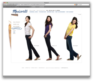
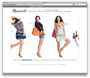
Fashion label Madewell has a really cool site.
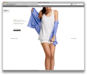
90% of it is photos of the products and each piece in the collection has a video showing a person moving in it. Overall it’s a beautiful example of minimal nav and total focus on the content.
Also, Flash is used in a refined way. There’s a lot of hovers and interactivity, but it’s not too much. Just enough to make things interesting.
And the deeper you dig, the more neat stuff you’ll find: This scrapbook-style nav is fun and this calendar is really fresh too. Kudos Madewell!
[FYI: J. Crew launched Madewell as “a hipper, little sister” of the brand.]


Mr Oz
on 11 Jul 08Gosh. This post is very un37signalish...
Paul M. Watson
on 11 Jul 08Seems fairly 37signalish to me. Taking design inspiration from anywhere, not just the Web 2.0 neighbourhood. I like it.
Brad
on 11 Jul 08As focused a site as this is, I can’t help but wonder why they didn’t think through the implementation. Most, if not all, of the animated effects can be replicated in searchable, fine-grained DHTML. Links could have been shared amongst potential customers and their inventory could have participated in Google, ThisNext or other generalized product searches. Layout could have been liquid, so my 12” laptop wouldn’t require scrolling to show more than the tops of their videos.
As it stands, all that can be googled, bookmarked, or shared is:
Madewell1937.com doesn’t turn up in the first 30 of the 222,000 results for one of their offerings, a pair of metallic suede gladiator sandals, nor does it show up in the 20 results when “Madewell1937” is added to the query. And these results are inclusive of Googledobe’s latest Flash search tech.
I think what’s missing is the 99% perspiration part.
Carl
on 11 Jul 08I remember a lingerie site doing that as well. They had 4 models with different body shapes. You could select them to model the clothes. They would walk up, turn around… interesting stuff from a eh…web design perspective.
Carl
on 11 Jul 08Ah… here is the site: http://www.knickerpicker.com/dressing-room.asp
PS
on 11 Jul 08Dammit Carl you beat me to linking the best website in the world… :)
I’ll have to point to the ASOS website instead – they do a good job of filming a lot of their products (click ‘view catwalk’).
Raphael Campardou
on 11 Jul 08Thanks Carl. While reading, I thought of this lingerie site too. I never could find it again…
I really like the fact that they have different models. Not everyone is a Top Model…
Will
on 11 Jul 08Keep in mind Brad that not every brand lives or dies by Google rank, as hard as that may be to believe.
At some point, having users who know the brand and can navigate their way to it without needing a search engine outweighs the fear that someone can’t type in a search for “sparkly shoes” and find you.
If I want a shirt from JCrew, I’ll go to jcrew.com, rather than trying to find that shirt via a search engine. And while Madwell isn’t exactly a household name yet, the same will also be true of them one day probably.
I’m not saying your points are invalid, but that the powers that be obviously were more interested in a unique user experience on the site than optimizing it for search engines. How worthwhile are most generic clothing product searches online anyways? There are so many results that even if your site was as SEO’d as it could be, you’d still be in the mix with an unimaginable number of other things.
This site stands out because it didn’t dumb down due to search engine worries. Sure, there are usability trade offs to be made, but unless you’re someone who argues that Flash has no place on the web, then there’s absolutely nothing wrong with that.
Brad
on 11 Jul 08@Will: You’re assuming that the powers that be actually made an intentional decision to avoid findability. Also, it’s not as simple as being in Google or not. If you want to take advantage of the collective effects of sharing links, community wish lists, or even old-school editorial recommendations, you are going to have to offer more than a URL to a Flash Black Box. You will need a fine-grained architecture that will let a new brand benefit from the “semantic” web.
In reality, I wouldn’t even say that the agency responsible for this site was intentionally opting out of findability. They probably only went with what they knew (Flash) and the powers-that-be didn’t know enough to question them.
The real opportunity cost here is that a very similar user experience could have been had with DHTML without any of the adverse Flash side effects. Maybe they’ll be buying a Super Bowl ad to drive traffic :,p
Killian
on 11 Jul 08I like when you hit the madewell looks link you start at the right end of the scroll and fly left… the little scroll bar could have been missed so this was a cool way to discover more content.
Brad
on 11 Jul 08That nav is a perfect example of needless Flash. Apple.com uses the same effect for navigating its products at its top, but their solution is semantically effective and accessible with or without Javascript.
John Dowdell
on 11 Jul 08If they got you to talk about it, they’re adding inbound anchor text…. ;-)
jd/adobe
Brad
on 11 Jul 08New for CS4, I presume :,D
Will
on 11 Jul 08That’s easily as big an assumption as you’re claiming I made when I suggested that they intentionally ignored search-ability. Neither of us knows. But when you’re dealing with a company the size of J. Crew, I would imagine they’re using agencies that competently know what they’re doing, and don’t just decide to build key sections of a site in Flash on a whim.
I’ve worked with a lot of clients in the past who, when you told them a Flash site would result in issues with searching and linking, said “we don’t care.” And they understood what they were agreeing to. It’s not like one would have to be poorly informed to choose Flash.
If people can’t link to the product, they’ll link to whatever page they see the product on. Other users will figure out how to get there once they hit the Flash Black Box. Just because you can’t link DIRECTLY to the product doesn’t mean people can’t and won’t link to the site.
There are plenty of sites, HUGE ones out there, that are Flash Black Boxes as you call them. Some of the biggest brands you can think of. Because they’re not blogs – they’re not living or dying by links in and out. They attract visitors by their sheer existence, not because somebody’s MySpace profile linked to them, or they were mentioned on a blog.
Not being able to deep link didn’t keep 37Signals from pointing us all to Madewell. Yet somehow we’re all able to discuss the site (and could discuss the clothing if we wanted to).
I absolutely agree. Every aspect of this site could have been built with DHTML and accessible code and web standards. But it wasn’t, and that doesn’t mean that it’s a failure. It’s a disappointment to those of us who frequent 37signals and talk about these kinds of things. But to the typical person who will probably browse the Madewell site looking for clothes, they’ll never notice it, and the site is different than most they’ve ever seen before which is why it works. That stands out in their minds, not the fact that they couldn’t find the site via a Google search, or didn’t know where to link to when they were talking about one of the skirts on their blog.
This site is much more interesting to me than a thousand generic ecommerce sites with deep linking and reviews and digg buttons.
Of course I would have liked to see them build it in such a way that they got all of the unique functionality while still being accessible. But the fact that they didn’t doesn’t make the site less successful as a concept.
Anonymous Coward
on 11 Jul 08@Brad
I just googled, and yahood “madewell”, it was the first thing that came up on both searches. I think a preteen looking for these cloths that they just saw in their fashion mag wouldn’t have a problem finding it.
Many teens like Flash, and are very good at figuring it out quickly. Most of them play Flash based games. Most of the teens I have talked to about wensites think the semantic web is boring and old looking. Maybe, just maybe they built the site to the audience instead of a web designer trends.
Maybe they wanted it done in a day which is possible with flash cause you don’t have to think about all the browser issue prevelant in the DHTML code to make a girl dance. How would you do that animation by the way??? You said the animation was possible with DHTML, but I have never seen it play video clips without the use of another technology? Just curious if DTHML has changed that much?
Anchovy Dave
on 12 Jul 08To Anonymous Coward’s point:
I am thinking this was a time issue. In my experience most larger companies like J.Crew do not have the time to build a semantically perfect (and it has to be perfect) website. They want it tomorrow, and if you can’t deliver, they go else where and you are forever forgotten.
I think this is big part of the reason a lot of large companies go with agencies that develop this way. Wrong or right, they are making a lot of money, a lot more than I am building semantic sites.
Jake
on 12 Jul 08Great site up until I clicked on madewell looks and got a short burst of motion sickness. warning: If you don’t do well on roller coasters or family car rides don’t hit that link.
Gilbert Lee
on 12 Jul 08How about Vision Street Wear? I love how they used video for their product “shots”. It’s not the best video but it’s perfect for the audience.
Brad
on 12 Jul 08@Will It sounds like we are arguing shades of the same side. Good concept. Disappointing implementation.
@Anchovy Dave Most of the semantic benefits can be had while still far from perfection. According to Opera, only 15% of the top 40 corporate websites are valid xhtml. There are even several Flash techniques such as SwfObject that could have allowed for searchability and deep-linking.
It is the number and varieties of avenues that weren’t taken that tells me that there is some missing effort. As for why those efforts were missing, we are all only speculating. For all we know, this is only a temporary site, since all of the product pages provide only a telephone number for orders.
RS
on 12 Jul 08Gilbert: Love those video product shots on Vision Street Wear. Thanks for the link.
JF
on 12 Jul 08Wow, that Vision site is amazing. I second RS’s thanks for that link.
Milan Andric
on 14 Jul 08One nice implementation I recently saw is http://www.hotstudio.com/ which has a tag with semantic html in it. Perfect for search engines to gobble up. I cannot imagine a simpler/cost effective way to provide SEO on a flash site. Also deep linking is not that big of a problem, there are libraries (might call them hacks) like SWFAddress that allow this.
Milan Andrci
on 14 Jul 08oops, I meant to type “has a <noscript> tag with semantic html in it” ...
Anonymous Coward
on 14 Jul 08sdfasdf
RF
on 14 Jul 08Another hugely impressive Flash black box is: http://www.madeinmtl.com/ (from 06—see the comments)
It lists places to eat, stay, dance, or do whatever in Montréal. It has a tasteful way of presenting maps + photos + ratings + blurbs on each place, and a clever categorization scheme; try out the series of dropdowns on the top right of the screen.
It’s sort of like they’ve tried to apply ideas from catalog design to Montreal. I think its biggest problem is that it doesn’t naturally new visitors to start browsing for places to go. There’s a search box and all, but most of the screen is taken up by today’s featured place to go. It’s a great search/review site but disguised as an only semi-interesting blog.
Matt Radel
on 14 Jul 08What I really dig about the Madewell site is how well it lets the clothes speak for themselves in a larger than life way, with huge images that spill off the edges of the page. The site is quick and I’d agree with 37signals that the use of Flash is very tasteful – though I find the moving up and down of an image (when viewing a look) based upon cursor position to be quite irritating.
As some have already mentioned, my biggest disappointment is with the SEO – it’s stupid easy to feed search engines and users friendly alternate content with something like SWFObject. Very nice site though.
Stan
on 15 Jul 08It falls into two of the most basic of Flash site design problems.
1) Mystery meat buttons – can’t tell what a button/icon does without having to click on it first (I will give them some credit for including very tiny text links almost the same color as the page background )
and
2) You can’t sent anyone a link to anything but the top most pages.
Try to pass on a link to a specific page on the Denim Q&A set of pages and you fail. All that wil lbe sent is the top level link
Tends to frustrate users who (like me) can’t post or send a direct link to the page they are talking about.
I’ll just chalk this site up as another one of those failed, “looks pretty – but is frustrating as hell for the average person to actually to use” design school experiments.
Simon
on 15 Jul 08@stan
1 I would argue is not relevant here as I would expect madewell’s research probably shows the target audience are more passively browsing and hoping to be surprised and/or delighted by what’s available rather than needing the fastest route to content they expect to find. 2 though I would agree with. Should use swfaddressThis discussion is closed.